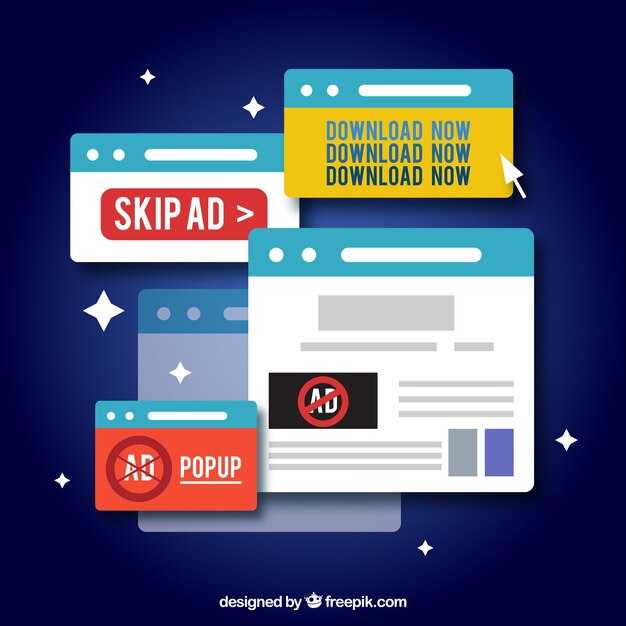
أمثلة على النوافذ المنبثقة في المواقع الإلكترونية - كيفية استخدام النوافذ المنبثقة بفعالية


تأكد من أن النافذة المنبثقة تقدم قيمة واضحة في ثوانٍ. اقتراح قيمة موجز يساعد المستخدمين على اتخاذ قرار سريع ويقلل من الاحتكاك. لا يمكنك الاعتماد على جدران طويلة من النص؛ بدلاً من ذلك، قدم ما يحصل عليه المستخدم في سطر واحد ودعوة واحدة للعمل. هذا النهج يخلق الثقة ويبقي الزوار على الصفحة أثناء مسح العرض. لقد ثبت أن هذا النهج يقلل من الارتداد.
التوقيت مهم. استخدم محفزًا مناسبًا: بعد 5–7 ثوانٍ، أو عندما يقوم المستخدم بالتمرير بنسبة 40% من الصفحة. النافذة المنبثقة التي تظهر مبكرًا جدًا تشتت الانتباه؛ أما التي تُحفز عند نية الخروج فتقلل من الإزعاج وتحترم المستخدم تمامًا. تظهر الاختبارات أن النوافذ المنبثقة عند نية الخروج تستعيد ما يصل إلى 15% من الزيارات المهجورة عند دمجها مع عرض مناسب.
اختر بين أنواع النوافذ المنبثقة التي تتوافق مع هدفك. للنشرات الإخبارية، قدم قيمة وبسيط اختر لتخصيص المحتوى (اختيار الموضوع) وزرين زرين: دعوة أساسية للعمل وخيار ثانوي. للاتصال أو الدعم، قدم نموذجًا قصيرًا مع حقلين وزر إرسال مرئي. كل خيار يخلق مسارًا مباشرًا للعمل الأساسي الذي تريده في ثوانٍ.
التصميم مهم. استخدم ألوانًا متباينة، زر دعوة واحدة للعمل، وحقولًا قليلة لمنع الاحتكاك. النموذج الذي يحتوي على ثلاثة حقول أو أقل غالبًا ما يحقق إكمالًا أعلى. احتفظ بالنص قصيرًا وموجهًا نحو العمل؛ يتعلم الناس بسرعة ما يجب فعله، ولا يجب أن تغطي النافذة المنبثقة المحتوى لأكثر من بضع ثوانٍ. النافذة النظيفة تبرز دون صراخ بينما تبقى مفيدة، بفضل التباعد والخط الدقيقين.
اختبر عدة إصدارات لتعلم ما يعمل وما يجب تجنبه. قم بإجراء اختبارات A/B على التخطيط والتوقيت والنص عبر صفحات وأجهزة عديدة. تابع معدل الاشتراك، ومعدل النقر، والتفاعل بعد النقر. الإعداد المناسب يمنع العرض الزائد ويحترم تفضيلات المستخدم؛ إذا تم تجاهل النافذة المنبثقة أو إغلاقها بسرعة، انتقل إلى إصدار أخف أو أوقفها بعد عدة عرضات.
ابقَ مركزًا على هدف المستخدم؛ نافذة منبثقة موعدة جيدًا تقدم قيمة، وتلتقط تفاصيل الاتصال، وتدعم التحويل دون تعطيل الرحلة. هذا النهج الأساسي يساعدك على توسيع التفاعل، وتعلم ما يرن صداه، والحفاظ على تجربة سلسة عبر الأجهزة والسياقات.
أمثلة نوافذ منبثقة للمواقع: استخدامات عملية وأسئلة شائعة
دعنا ننفذ استراتيجية نافذة منبثقة جاهزة وبسيطة على الصفحات الأمامية مع عرض واحد وفعل تسجيل واضح. استخدم حجمين: 420x320 و600x450؛ كلاهما يشمل رابطًا وبضعة أزرار للمتابعة. أدرج توقيتًا بسيطًا، مثل 6–8 ثوانٍ، أو أحفز بعد التمرير لشخص يظهر التفاعل. هذه الخطوة الصغيرة تساعد المصممين على قياس مقدار التفاعل وكيفية رد فعل المستخدمين. إذا كنت بحاجة إلى المزيد، أضف إصدارًا ثانيًا بنبرة مختلفة واختبر تأثيره.
تشمل الاستخدامات العملية تسجيل النشرات الإخبارية، وتذكيرات السلة، وتأكيدات الحضور في الفعاليات، وطلبات الردود السريعة. على صفحات السلة، أظهر بعد إضافة العنصر، مع رابط إلى السلة وبضعة أزرار للمتابعة أو الاستمرار في التسوق. يمكن لصفحات المدونة تقديم مورد قابل للتنزيل، مع نموذج قصير. ينمو تفاعلهم حقًا عندما تتحدث النافذة المنبثقة بنبرة ودية وتستخدم نصًا موجزًا يحترم نية المستخدم. لا تقلل من تأثير التلميح الخفيف، ويمكن للمصممين أيضًا تعديل الألوان والأحجام والنص ليتناسب مع علامتهم التجارية.
أسئلة شائعة
س: كم عدد النوافذ المنبثقة التي يجب تشغيلها؟ ج: ابدأ بـ1 على الصفحة الرئيسية أو صفحة المنتج، ثم أضف ثانية على صفحة ذات قيمة عالية إذا كنت بحاجة إلى تفاعل أكثر. س: كم الوقت الذي يجب الانتظار؟ ج: استخدم نافذة توقيت تحترم تدفق المستخدم: 5–10 ثوانٍ على سطح المكتب، 3–6 ثوانٍ على الهواتف المحمولة. س: أي الأحجام تعمل بشكل أفضل؟ ج: ابدأ بحجمين واضبط بناءً على بيانات الأداء؛ تابع كمية التحويلات لكل حجم ولكل صفحة. س: ماذا عن الوصولية؟ ج: ضمن إدارة التركيز والتنقل بالكيبورد؛ قدم فعل إغلاق واضحًا وعلامة وصولية لقارئات الشاشة.
قائمة تحقق فنية: استخدم إضافة لنشر النوافذ المنبثقة دون كود ثقيل؛ احتفظ بالواجهة الأمامية سريعة التحميل حتى لا تبطئ الصفحة. أدرج أيضًا خيارات نية الخروج والتوقيت، وتأكد من تلبية متطلبات الموافقة. أماكن الإصدارات: ضع على الحافة اليسرى للشاشات العريضة، أو في الوسط على الهواتف المحمولة. قم بإجراء اختبار مستخدم قصير مع مستخدمين حقيقيين وجمع تعليقات من المصممين والمسوقين والمطورين لتعديل التصميم والمحتوى. تأكد من تتبع النتائج بشكل صحيح وتجنب تجربة مستخدم صعبة من خلال تقديم فعل إغلاق سهل.
أمثلة عملية للنوافذ المنبثقة وتنفيذها
استهدف الزوار للمرة الأولى بنافذة ترحيبية واحدة تركز على القيمة تظهر بعد 6 ثوانٍ، تقدم خصمًا بنسبة 10% مقابل بريد إلكتروني أو تسجيل دخول. هذا النهج الأصلي يتعلم اهتمام الزائر، ويهدي التفاعل، وبيانات اليوم ستعزز التحويل من خلال التركيز على فعل واحد. احتفظ بالمظهر خفيف الوزن ووصوليًا، حتى لا تغضب المستخدمين أو تحجب المحتوى.
-
نافذة منبثقة عند نية الخروج: أحفز عندما يخرج المؤشر من منطقة العرض نحو شريط المتصفح. الأنواع: نافذة مع إدخال واحد ودعوة واضحة للعمل. المظهر: بطاقة مركزية مع خلفية مظلمة وفعل أساسي واحد. الهيكل: عنوان، سطر فائدة، حقل بريد إلكتروني/تسجيل دخول، مربع موافقة، ودعوة للعمل. التوجيه: بعد التسجيل، وجه إلى صفحة ترحيب أو منطقة الملف الشخصي. ما يظهره: عرض مركز يشد الانتباه دون المبالغة. المقاييس للتتبع: معدل التسجيل، معدل التفاعل، وتأثير الارتداد.
-
مقدمة قائمة على التمرير: تظهر بعد وصول المستخدم إلى 60–70% من الصفحة لالتقاط الاهتمام عندما يكون التفاعل مرتفعًا بالفعل. الأنواع: انزلاق أو لافتة صغيرة. المظهر: لوحة حافة غير مزعجة لا تغطي المحتوى المهم. الدروس المستفادة: تخصيص العرض لموضوع الصفحة الحالي وإظهار الآخرين ذوي السلوك المشابه. المقاييس: ارتباط عمق التمرير، التسجيلات لكل صفحة، ووقت التحويل.
-
ترحيب متأخر زمنيًا لتسجيل الدخول: يحفز الزوار المتكررين أو المستخدمين المسجلين على تسجيل الدخول للحصول على مزايا أو الوصول إلى العناصر المحفوظة. الأنواع: نافذة أو بطاقة داخلية ضمن منطقة المحتوى. المظهر: مدمج مع خيار تسجيل دخول معروف (بريد إلكتروني أو اجتماعي). الهيكل: اقتراح قيمة، حقل تسجيل دخول أو زر، وفعل ثانوي للمتابعة دون تسجيل دخول. التأثير: يعزز نشاط الحساب والتخصيص في الملفات الشخصية، مما يزيد من الاحتفاظ والإمكانيات البيع العرضي.
-
خادم انزلاقي مع تلميحات الملف الشخصي: يظهر عند التفاعل (نقر على منتج، إضافة إلى السلة، أو التمرير في صفحة طويلة). الأنواع: انزلاق من الجانب، إغلاق اختياري. المظهر: تلميح صغير ودي يمكن أن يقترح استطلاعًا سريعًا أو عرضًا. السلوك: يستخدم الإجراءات السابقة على الموقع لتخصيص النص، مدعوًا المستخدم لبناء ملف شخصي أو تعديل التفضيلات. الفائدة: يحسن بيانات التقسيم والاستهداف المستقبلي.
-
بوابة شاشة كاملة للمحتوى المميز أو تسجيل الدخول فقط: تحجب الوصول حتى يسجل المستخدم الدخول أو ينشئ ملفًا شخصيًا. الأنواع: طبقة نافذة مع دعوة قوية للعمل أو تدفق تسجيل دخول مخصص. التوجيه: بعد تسجيل الدخول، وجه إلى المحتوى المطلوب أو لوحة تحكم المستخدم. التفاعل: يبقي المسار بسيطًا، مع خيارات إلغاء واضحة وإعادة محاولة. هذا النهج يمكن أن يعزز التحويلات المؤهلة بشكل كبير لكنه يجب أن يقتصر على الأقسام ذات القيمة العالية لمنع الاحتكاك.
خطوات التنفيذ والهيكل
-
حدد الهدف والجمهور: قرر ما إذا كان الهدف التقاط العملاء المحتملين، أو تسجيل الدخول، أو الوصول إلى المحتوى، وقسم حسب نوع الزائر (جديد مقابل متكرر، اكتمال الملف الشخصي). هيكل رسالتك لتتوافق مع الهدف واحتفظ بالفعل مفردًا.
-
اختر النوع وترتيب المحفز: اختر من نافذة، انزلاق، لافتة، أو شاشة كاملة اعتمادًا على تخطيط الصفحة ومخاطر التعطيل. حدد ترتيبًا واضحًا للمحفزات (مثل التأخير الزمني أولاً، ثم نية الخروج إذا لم يكن هناك فعل). يجب أن تكون قواعد التوجيه دقيقة لتجنب النهايات الميتة.
-
صمم المظهر والهيكل: صيغ نصًا موجزًا، فعل أساسي واحد، وخيار إغلاق ثانوي. استخدم تسلسلًا نظيفًا: عنوان، سطر فائدة، حقل إدخال (إذا لزم الأمر)، ودعوة للعمل. حافظ على الوصولية: فخ التركيز، تسميات aria، والتنقل بالكيبورد.
-
خطط لالتقاط البيانات والخصوصية: اطلب فقط البيانات الأساسية، قدم إلغاءًا، وربط بتفضيلات الخصوصية. لمحفزات تسجيل الدخول، فضل تسجيل الدخول الاجتماعي الخفيف أو تسجيل الدخول بالبريد الإلكتروني لتقليل الاحتكاك. ضمن أنك تستطيع منع المحفزات المتكررة لنفس المستخدم ضمن جلسة أو زيارة.
-
اختبر وقيس: قم بإجراء اختبارات A/B على النص والتخطيط والتأخير. تابع معدل التحويل، معدل التفاعل، وتأثير المدة على الصفحة ومعدل الخروج. استخدم التوجيه لتحليل التفاعل بعد تسجيل الدخول واكتمال الملف الشخصي كمؤشرات للنجاح.
أفضل الممارسات للمظهر والسلوك والقياس
- حدد فعلًا أساسيًا واحدًا لكل نافذة منبثقة لتعزيز التركيز والتحويل.
- احتفظ بمظهر خفيف الوزن مع أوقات تحميل سريعة؛ تجنب حجب المحتوى الأساسي أو الوسائط.
- احترم الوصولية والتنقل بالكيبورد؛ ضمن أن قارئات الشاشة تقرأ الرسالة بوضوح.
- قدم مسار إغلاق واضحًا وتذكر تفضيل المستخدم لقمع التكرارات لفترة محددة.
- استخدم بيانات السلوك لتخصيص الرسائل؛ حدث النص للشرائح والملفات الشخصية المختلفة.
- اختبر التوقيت ونوع المحفز والتصميم عبر أنواع الأجهزة لتعظيم التفاعل دون زيادة الارتداد.
- استفد من التوجيه بحكمة: بعد تسجيل الدخول أو التسجيل، أرسل المستخدمين إلى صفحات ذات صلة (ملف شخصي، لوحة تحكم، أو المحتوى الأصلي الذي حاولوا الوصول إليه).
- راقب المقاييس مثل معدل التحويل، وقيمة الطلب المتوسطة، والتفاعل مع الآخرين في قمعك؛ حسّن بناءً على الأدلة.
- احتفظ بالنص واضحًا وقابلًا للعمل، مركزًا على القيمة التي يحصل عليها المستخدم اليوم بدلاً من الوعود العامة.
اختر النوع المناسب للنافذة المنبثقة لهدفك: تسجيل النشرات الإخبارية، أو العروض الترويجية، أو الردود
اعتمد نهجًا رباعي الأنواع: ربط كل هدف بنافذة منبثقة مخصصة–تسجيل النشرات الإخبارية، العروض الترويجية، الردود–ودخول علامة تجارية خفيف على كل صفحة.
تستفيد تسجيل النشرات الإخبارية من صندوق إضاءة رسومي يظهر بعد تفاعل قصير، ليس على كل صفحة دفعة واحدة. احتفظ بالنموذج بالبريد الإلكتروني فقط، قدم اقتراح قيمة واضحًا، وأضف ملاحظة خصوصية. استخدم بيانات الملف الشخصي لتخصيص الرسالة حتى لا تزعج العملاء الذين اشتركوا بالفعل، مما يضمن تفاعلًا سلسًا بدلاً من الاحتكاك.
تزدهر العروض الترويجية مع انزلاق أو شريط لافتة على صفحات المنتجات والتسعير الرئيسية. أظهر عرضًا محدود الوقت مع قيمة نسبة أو خصم بسيطة، إشارة بصرية قوية، وفعل أساسي واحد. استفد من السياق من خلال محاذاة العرض مع محتوى الصفحة حتى يشعر بالصلة بدلاً من العام، مما يحسن التفاعل دون إنشاء تشتيت للعلامة التجارية.
تعمل نوافذ الردود بشكل أفضل كاستطلاعات سريعة أو استطلاعات مصغرة بعد تفاعلات ذات معنى–تأكيد الشراء، استفسار الخدمة، أو الدردشة بعد الدعم. حدد ثلاثة أسئلة، قدم خيار تصنيف بالإضافة إلى حقل تعليق واحد، وقدم خيار رفض سهل لمنع الإزعاج. ضع الدخول حيث لا يحجب الإجراءات الحرجة وتابع معدل الإكمال لقياس القيمة.
قواعد عملية تمنع الاحتكاك: استهدف حسب نوع الصفحة وتاريخ المستخدم، احتفظ بالحقول قليلة، واختبر أربع إصدارات (تخطيط، نص، لون، توقيت) لقياس التأثير. يجب أن يظهر كل دورة اختبار رفعًا عمليًا في التفاعل دون المساس بالخدمة أو إدراك العلامة التجارية، ويجب استخدام البيانات لتحسين الرسائل المستقبلية بدلاً من التقليل من شأنها.
من خلال محاذاة النوع والتوقيت والعرض مع الهدف، تستفيد من التفاعل عبر كل صفحة وتخلق تجربة مترابطة للعملاء. تابع المقاييس للتأكيد على أنك تمنع الحواجز الدخولية غير الضرورية بينما تحافظ على نبرة ودية ومفيدة–حتى تدعم النافذة المنبثقة المناسبة التسويق، لا مجرد الضجيج. التوازن السليم بين القيمة والإيجاز يحقق نسبًا معنوية من التسجيلات والعروض الترويجية والردود التي تقوي ملف علامتك التجارية وخدمتك.
التوقيت والمحفزات: نية الخروج، التأخير، وتلميحات قائمة على التمرير
نفذ نوافذ منبثقة عند نية الخروج على صفحات السلة لتقديم خصم واستعادة المبيعات المفقودة. استخدم فعلًا واضحًا واحدًا مثل "ادعِ الخصم" وخيار إغلاق مرئي لتقليل الاحتكاك. الغرض هو التقاط الفرصة قبل مغادرتهم؛ أظهر الرسالة نفسها عبر الأجهزة، واعتمد على كوكيز لتقييد التكرارات حتى لا يزعجهم.
منطق المحفز: يجب أن تطلق نية الخروج عندما يتجه المؤشر نحو عنصر الإغلاق أو ينتقل إلى علامة تبويب أخرى. احتفظ بالتلميح بصريًا غير مزعج؛ مدعومة بـjetpopup، تبقى هذه القواعد خفيفة الوزن ومتسقة عبر الأجهزة.
استراتيجية التأخير: طبق تأخيرًا قصيرًا بعد تحميل الصفحة لتجنب مقاطعة المسح الأول. تأخير 4-6 ثوانٍ على سطح المكتب و3-5 ثوانٍ على الهواتف المحمولة يعمل جيدًا؛ اختبر الإصدارات لترى أيها يقلل من الرفض. إذا تمرروا، يمكن تطبيق القاعدة نفسها لتلميح ثانٍ.
تلميحات قائمة على التمرير: أحفز بعد قراءة 40-60% من الصفحة، ثم أظهر تلميحًا مدمجًا وبصريًا نظيفًا. قدم فعلًا أساسيًا واحدًا (خصم) وزر إغلاق؛ تابع الإجراءات لتحسين زيادة التحويلات.
النص والمرئيات: احتفظ بلغة إيجابية وموجزة؛ أضف غمزة لتليين العرض. أظهر مجموعة صغيرة من الفوائد: خصم، شحن مجاني، أو وصول مبكر. استخدم كوكيز لتجنب تكرار نفس المجموعة من التلميحات ضمن جلسة.
التخصيص حسب تسجيل الدخول والأجهزة: أظهر رسائل مخصصة للمستخدمين المسجلين؛ عدل النبرة حسب الجهاز؛ ضمن التجربة نفسها عبر الحواسيب المحمولة والأجهزة اللوحية والهواتف.
القياس والتكرار: تابع الإجراءات مثل النقر على الخصم، الإغلاق، والمشتريات؛ هدف لزيادة معدلات التحويل؛ قم بإجراء اختبارات A/B على التخطيط واللون والنص عبر تكاملات أسلوب jetpopup.
أفضل الممارسات لتجنب التلميحات المزعجة: احتفظ بالتلميحات قليلة، حدد واحدة لكل عرض صفحة، استخدم حدًا تردديًا متسامحًا، واحترم إشعارات الكوكيز.
أنماط التصميم والنص التي تتفاعل دون إرهاق
ابدأ بنافذة منبثقة خطوة واحدة غير مزعجة تظهر بعد أن يقضي المستخدم حوالي 15 ثانية على صفحة أو زار صفحتين، تقدم خصمًا متواضعًا للاشتراك وتبقي الخيار سريعًا وواضحًا. استخدم الخصومات استراتيجيًا لتعزيز القيمة المتصورة دون إنشاء حروب أسعار.
عالج رغباتهم بالكشف التدريجي، مما يجعل الخيار سهلًا: أظهر حقل البريد الإلكتروني واقتراح قيمة حاد أولاً، ثم دعِ التفضيلات إذا أرادوا المزيد.
أحفز في السياق، مثل على المواقع ذات السلال: عند إضافة المستخدم للعناصر، قدم حافزًا صغيرًا للاشتراك وإكمال الشراء، مع خصم عند الدفع؛ بمجرد الاشتراك، يتلقون تسلسل ترحيب قابل للتخصيص. استخدم الإلحاح ببيانات مثل 'اليوم فقط' لكن بدلاً من الإزعاج، احتفظ بالنبرة ودية ومفيدة.
أنماط نص أصلية وموجزة تدفع العمل وتشجع على التسجيل: احتفظ بالجمل قصيرة، أبرز القيمة، وقدم دعوة واضحة للعمل مثل 'اشترك' أو 'احصل على خصومات'. ربط مع صوت علامتك التجارية لتجنب الصوت العام؛ فائدة محددة في المتناول تجعل التأثير ملموسًا.
الاختبار والقياس: قم بإجراء اختبارات A/B على التوقيت (15 ثانية مقابل 30 ثانية)، النص (مركز على الفائدة مقابل الميزات)، والعرض (تجربة مجانية مقابل خصومات)؛ تابع المقاييس: التسجيلات، رفع الإيرادات، ومعدل الإلغاء؛ ضمن حدود التردد لتجنب التلميحات المفرطة؛ استخدم البيانات لتعزيز النتائج.
عدل النهج حسب نوع الموقع: مواقع الإعلام عبر الإنترنت، فئات التجارة الإلكترونية المحددة، ومواقع الخدمات كلها ترد على عروض مختلفة. احتفظ بالتلميحات خفيفة الوزن ووصولية، قدم إغلاقًا واضحًا، واستخدم خطوات صغيرة بدلاً من لافتات ثقيلة لبناء الثقة؛ إذا تم بشكل صحيح، يرفع النمط معدلات الاشتراك ويعزز ولاء العملاء.
تقسيم الجمهور: تخصيص العروض والرسائل لمستخدمين مختلفين
قسم الزوار حسب السلوك وعدل النوافذ المنبثقة لكل شريحة لرفع الاستجابة. حدد المجموعات: زوار جدد، عملاء متكررون، هاربون السلة، مستخدمون يتصفحون المنتجات، ومشترون ذوو قيمة عالية. لكل، صيغ عرضًا ملموسًا ورسالة موجزة تتوافق مع نيتهم عبر نقاط الاتصال التجارية الإلكترونية وعبر الإنترنت. استخدم تحية أسلوب لوحات الترحيب للزوار الجدد لدعوة التفاعل وجمع البريد الإلكتروني باختيار واحد. ركز على الإجراءات التي تحركهم للأمام وتجنب التحميل الزائد.
يستجيب الزوار الجدد لترحيب خفيف وتلميحات استكشاف تربط بالكتالوج. أظهر تحية أسلوب لوحات الترحيب، شرح ما تقدمه، وقدم عرضًا أوليًا أو موردًا مجانيًا. استخدم بيانات التصفح لإظهار الفئات الشائعة وأفضل المبيعات، واحتفظ بالخطوة التالية صريحة: استكشف، أضف إلى السلة، أو اشترك للتحديثات. لهذه الطلبات، اسأل ما هو ذو الصلة بهم وعدل العروض وفقًا لذلك.
يرى العملاء المتكررون رسائل تعكس الإجراءات السابقة: أظهر العناصر المعروضة مؤخرًا، اقترح مشتريات مكملة، وقدم حافز ولاء. استخدم قوة مشترياتهم السابقة لبيع عرضي ودعُهم للانضمام إلى قائمة بريد إلكتروني للوصول المبكر. إذا تصفح المستخدم مرارًا دون مشتريات، نشر عرضًا محدود الوقت لإكمال السلة. عندما يشترون، أحفز رسالة ترحيب بالعودة أو بيع عرضي للمشتريات المتكررة.
يحفز هاربو السلة في دقائق مع تذكير وحافز قوي، بالإضافة إلى رابط إلى السلة لإكمال الشراء. استخدم رسالة واضحة تؤكد على ما تركوه وراءهم وكيف ينطبق العرض عند الدفع. إذا غادروا مرة أخرى، جدول متابعة بعرض مختلف أو فيديو توضيحي قصير لتعزيز المعلومات عن المنتج وفوائده.
اختبر وقيس لتحسين النتائج: قم بإجراء تنويعات اختبار عديدة على نبرة الرسالة والتوقيت والعروض. تابع معدل الاشتراك بالبريد الإلكتروني، معدل استعادة السلة، المشتريات، والإيرادات لكل زيارة لقياس التأثير في نظام علامتك التجارية. نفذ حدود تردد لمنع الإرهاق وضمن أن التجربة تبدو مفيدة بدلاً من الإلحاح. كرر بناءً على بيانات هذه الاتصالات لزيادة التحويلات عبر القمع بأكمله.
أسئلة شائعة: أسئلة شائعة حول النوافذ المنبثقة والإعداد
ابدأ بهدف محدد ونهج واحد: حدد نافذة منبثقة موعدة جيدًا تتوافق مع شريحة جمهورك لتعظيم التفاعل.
حدد كمية المقاطعات: حد التأثيرات الأولية بأربعة لكل جلسة وتوقف عن الإظهار بعد تفاعل المستخدم؛ هذا يقلل من الإزعاج ويحافظ على الثقة.
التصاميم والرسائل مهمة: اختر تصميمًا واحدًا يناسب أسلوب موقعك، احتفظ بالنص موجزًا، وأدرج رابطًا واضحًا إلى نموذج التسجيل أو حقل التقاط البريد الإلكتروني؛ اختبر أربع تنويعات باستخدام نفس الأساس لتعلم أي تصميم ينتقل بشكل أفضل واستغل الفرصة لجمع البريد الإلكتروني.
سواء اختبرت المحفزات، اختبر كلا الخروج والتمرير لتعلم أي نهج يحقق تفاعلًا أعلى؛ تجاهل لحظة جيدة يهدر التفاعل، أي خيار يمكن أن يناسب جمهورك عند قياس النتائج.
قدم قيمة حقيقية: هدية أو خصم، مع نهج إرشادي يدفع نحو بيع إضافي أو عرضي ذو صلة في اللحظة المناسبة، وقدم سياسة تبادل بسيطة لتهدئة المستخدمين.
الموضع والاستهداف: استهدف صفحات محددة وملفات مستخدمين؛ أظهر النوافذ المنبثقة للزوار المتكررين أو الواصلين من مصدر معروف، مع زر إغلاق واضح؛ أدرج رابطًا لإيقاف التلميحات المتكررة عند رفض المستخدم.
القياس والتكرار: راقب التفاعل، معدل النقر، تسجيلات البريد الإلكتروني، والتحويلات؛ تعلم من البيانات واضبط الكمية والتصاميم وقواعد الاستهداف وفقًا لذلك لتحسين النتائج.
| السؤال | الإجابة |
|---|---|
| ما هي أفضل تردد للنوافذ المنبثقة؟ | حد بأربع تأثيرات أولية لكل جلسة مستخدم لتقليل الإزعاج والإرهاق. |
| هل يجب على النوافذ المنبثقة جمع البريد الإلكتروني؟ | نعم، استخدم نموذجًا خفيفًا مع الموافقة؛ ربط مع بيانات الملف الشخصي وسياسة الخصوصية، وأرسل المشتركين عبر البريد الإلكتروني. |
| أي التصاميم تعمل بشكل أفضل؟ | ابدأ بتصميم واحد يتوافق مع موضوع موقعك؛ قم بإجراء تنويعين لتعلم أيها يحول بشكل أفضل. |
| أين يجب وضع النوافذ المنبثقة؟ | استخدم نية الخروج على الصفحات ذات الحركة العالية والمنشورات الغنية بالقيمة؛ اختبر الموضع على صفحات المنتجات لتفاعل أعلى. |
| كيف أتعامل مع البيع الإضافي والبيع العرضي؟ | قدم هدية أو حزمة ذات صلة عند الدفع؛ تجنب التلميحات المفرطة واحتفظ بالعرض مرتبطًا بالنشاط الأخير. |
| كيف أوقف إظهار النوافذ المنبثقة؟ | قدم عنصر تحكم إغلاق سهلًا وخيارًا للإيقاف؛ احترم اختيار المستخدم وقمع التلميحات بعد الرفض. |
| ما الذي يجب قياسه؟ | التفاعل، CTR، التسجيلات، وتأثير الإيرادات؛ تابع كمية التحويلات واضبط النهج وفقًا لذلك. |
Ready to leverage AI for your business?
Book a free strategy call — no strings attached.


