David is a full-stack engineer and technical writer who makes complex technology accessible. He covers AI tools, developer workflows, SaaS reviews, and emerging tech trends. 15 years building products, 500+ articles published. Ex-Amazon, ex-Stripe.
ls -la ./david-park/
{# Browsers pick the smallest supported format (AVIF → WebP → JPEG)
AND the closest width for the layout. Cards render at ~320 px on
mobile, ~400 px on tablet, ~480 px in the 3-up desktop grid; 320 /
640 / 960 cover those at 1× / 2× / 2×-large-desktop. `sizes`
tells the browser the slot is roughly one-third of viewport on
large screens. #}
Begin with three daily routines mapped into three segmentations: eco-friendly commuters, busy parents, and mindful travelers. This framing surfaces topics and values that drive…
{# Browsers pick the smallest supported format (AVIF → WebP → JPEG)
AND the closest width for the layout. Cards render at ~320 px on
mobile, ~400 px on tablet, ~480 px in the 3-up desktop grid; 320 /
640 / 960 cover those at 1× / 2× / 2×-large-desktop. `sizes`
tells the browser the slot is roughly one-third of viewport on
large screens. #}
Begin with a single, measurable objective and three indicators to track actual progress: set a target like increasing qualified trial sign-ups by 20% within 8 weeks and monitor…
{# Browsers pick the smallest supported format (AVIF → WebP → JPEG)
AND the closest width for the layout. Cards render at ~320 px on
mobile, ~400 px on tablet, ~480 px in the 3-up desktop grid; 320 /
640 / 960 cover those at 1× / 2× / 2×-large-desktop. `sizes`
tells the browser the slot is roughly one-third of viewport on
large screens. #}
Build a lean, local feedback hub to gather insights directly from your audience to sharpen understanding of what customers want. Equip a small field team or use quick digital…
{# Browsers pick the smallest supported format (AVIF → WebP → JPEG)
AND the closest width for the layout. Cards render at ~320 px on
mobile, ~400 px on tablet, ~480 px in the 3-up desktop grid; 320 /
640 / 960 cover those at 1× / 2× / 2×-large-desktop. `sizes`
tells the browser the slot is roughly one-third of viewport on
large screens. #}
Apply a structured template for your competitive analysis from day one to save time and deliver actionable insights. This general guide helps you ground decisions in sources…
{# Browsers pick the smallest supported format (AVIF → WebP → JPEG)
AND the closest width for the layout. Cards render at ~320 px on
mobile, ~400 px on tablet, ~480 px in the 3-up desktop grid; 320 /
640 / 960 cover those at 1× / 2× / 2×-large-desktop. `sizes`
tells the browser the slot is roughly one-third of viewport on
large screens. #}
Recommendation: Start with Power BI if your team relies on Microsoft tools; choose Tableau when you need cross‑platform analytics with richer visual storytelling. Power BI…
{# Browsers pick the smallest supported format (AVIF → WebP → JPEG)
AND the closest width for the layout. Cards render at ~320 px on
mobile, ~400 px on tablet, ~480 px in the 3-up desktop grid; 320 /
640 / 960 cover those at 1× / 2× / 2×-large-desktop. `sizes`
tells the browser the slot is roughly one-third of viewport on
large screens. #}
Enable real-time alerts for your most-used currency pairs to see rate changes as they happen. These alerts run on your device and push quick updates, so you don’t miss moves that…
{# Browsers pick the smallest supported format (AVIF → WebP → JPEG)
AND the closest width for the layout. Cards render at ~320 px on
mobile, ~400 px on tablet, ~480 px in the 3-up desktop grid; 320 /
640 / 960 cover those at 1× / 2× / 2×-large-desktop. `sizes`
tells the browser the slot is roughly one-third of viewport on
large screens. #}
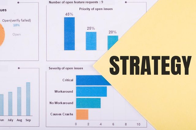
Strategy Framework with Real-World Examples") *Decide the target market first: determine where you access customers, which departments will support early experiments, and which…
{# Browsers pick the smallest supported format (AVIF → WebP → JPEG)
AND the closest width for the layout. Cards render at ~320 px on
mobile, ~400 px on tablet, ~480 px in the 3-up desktop grid; 320 /
640 / 960 cover those at 1× / 2× / 2×-large-desktop. `sizes`
tells the browser the slot is roughly one-third of viewport on
large screens. #}
Recommendation: Start with a clean GTM container, map your pixel deployments, and run a validation plan before publishing. Below you will find actionable steps to keep your…
{# Browsers pick the smallest supported format (AVIF → WebP → JPEG)
AND the closest width for the layout. Cards render at ~320 px on
mobile, ~400 px on tablet, ~480 px in the 3-up desktop grid; 320 /
640 / 960 cover those at 1× / 2× / 2×-large-desktop. `sizes`
tells the browser the slot is roughly one-third of viewport on
large screens. #}
Begin with a data-driven pilot to test immersive experiences, focusing on click paths, zero friction onboarding, and clarity of value. Run two scenarios, measure engagement and…