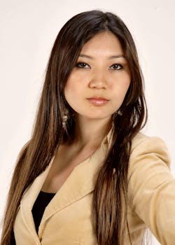
Sarah is a former Google AI researcher with 12 years of experience in machine learning, NLP, and autonomous systems. She leads KeyGroup's AI engineering division, architecting AI workers and automation pipelines for enterprise clients. Published in NeurIPS and ICML. Stanford CS graduate.
ls -la ./sarah-chen/
{# Browsers pick the smallest supported format (AVIF → WebP → JPEG)
AND the closest width for the layout. Cards render at ~320 px on
mobile, ~400 px on tablet, ~480 px in the 3-up desktop grid; 320 /
640 / 960 cover those at 1× / 2× / 2×-large-desktop. `sizes`
tells the browser the slot is roughly one-third of viewport on
large screens. #}