Email Newsletter Format - Do's and Don'ts for Effective Campaigns


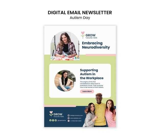
Keep the structure simple and readable from the first glance. A single-column layout around 600–650 px wide, with a clear header, generous line height, and crisp margins helps readers skim quickly. This design reduces the chance of a mistake during scrolling and makes your message easy to absorb. To maintain attention, place the most important details at the top and use white space to separate sections.
Do: Keep subject lines short and action‑oriented. Write in plain language, use short sentences, and keep readability high. Instead of heavy blocks of text, use brief paragraphs; instead, use plain language and short sentences. Include one or two visuals that support your message, but keep file sizes small and rely on testing to choose what works. Put links in obvious places and ensure readers can tap them easily. Build a rhythm across sections so readers don’t feel overwhelmed.
Don't: Overload a newsletter with images or long blocks of text. Break the rhythm with tiny fonts, inconsistent alignment, or vague language. Avoid vague calls to action and too many bold claims that seem sensational. If you must include multiple links, group them clearly and test that they work on mobile and desktop. Don’t forget to test the final read before sending.
Testing and details: Use real subscribers for quick checks and confirm readability on mobile. Verify that every image has alt text and that the image load won’t break the layout. Use the right tools to measure open rates and click paths, then translate the results into concrete changes. This reality matters for campaigns aimed at a young audience, where quick inspiration and easy access to content drive engagement.
Consistency and next steps: Create a simple template you can reuse and keep the testing habit. Maintain the same structure and tone across issues, so readers recognize your voice without effort. Keep your copy concise, your links working, and your visuals clean, because steady details build trust and improve response over time.
Email Newsletter Format: Do's and Don'ts for Campaigns - DO Use High-Quality Images
Use a single, high-quality image per section to anchor your message and boost recognition. A clear image supports your goal, reduces hesitation, and makes your sender stand out. Keep it crisp, centered, and properly cropped for mobile screens to prevent blurriness that hurts notice and trust.
Choose a lightweight image and test across clients. Aim for under 200 KB and a width of 600–800 px; use responsive sizing so the image scales from hundreds of pixels on mobile to larger displays on desktop. For photos, use JPEG; for graphics with few colors, PNG; consider WebP where supported to improve quality without increasing file size.
Alt text matters: provide descriptive text for each image to improve accessibility and deliverability. The alt text should explain what’s in the image and how it relates to the content, so readers who can’t load the image still get the message and connect with the story. Use concise language that can be noticed quickly.
Verify hosting reliability: host the image on a trusted domain, keep links stable, and check that links aren’t broken in previews. Those steps help avoid broken image icons that frustrate readers and hurt experience. If the image fails to load, ensure there is accompanying copy that conveys the value and includes a clear click target like a button, so those who rely on text still get your message.
Placement and context: place an image near a strong CTA; anchor text or a button should clearly indicate the next step. Ensure the click targets are easy to tap on mobile; make buttons visually distinct with color and contrast. Testing across devices helps confirm that the image doesn't push the message out of view and that the CTA remains visible, preserving deliverability and engagement across hundreds of recipients.
Keep balance: pick an image that reinforces the message but doesn’t overwhelm the copy. If you use a hero image, ensure the alt text and surrounding copy deliver the full value without requiring the image. This approach improves experience and avoids relying on visuals alone to convey the offer.
Accessibility and analytics: mark each image with alt text that describes the scene and purpose. This helps those scanning quickly and improves notice among readers and email clients. Meanwhile, keep the overall file size low to maintain fast loading, which supports better engagement for readers in mobile contexts.
Visuals and Image Strategy
Begin with one clear hero image at the top that communicates the offer and value. Keep the file size under 150 KB and the width around 600–700 px, with a 16:9 aspect ratio. Add alt text that describes the scene to support recognition and accessibility.
Limit the number of visuals to maintain easy load and a clean reader experience. Use a number: one hero image plus up to two supporting images; this keeps the layout simple on mobile and desktop.
Fonts and typography: use 1-2 web fonts; set body text to 16–18 px with 1.4–1.6 line height; ensure high contrast between text and background; minimize font change and keep headings clearly distinct.
Customizable templates: choose a customizable layout that allows quick swaps of imagery to match the sender's palette. Using this approach, prepare 2-3 image variants and run a test with a tool to determine which earns a higher score from readers.
Placement of ctas: align images to support ctas near the edge and along the mid-text block to guide actions. This point helps refine the flow and lifts reader engagement.
Optimization and performance: use lazy loading, compress images, and avoid auto-playing media. Use short lists for quick references–opens, clicks, recognition score. Track metrics such as opens, clicks, and a recognition score; what the reader wants comes through when alt text and visuals align with the message; use the results to adjust visuals to what readers want.
Donts clutter the header with multiple visuals or logos; keep a single focal image and a simple brand mark to preserve recognition.
Use High-Quality Images with Alt Text for Accessibility
In writing alt text, you should describe the subject and the story the image supports, ensuring readers with images blocked still grasp the meaning. Open readers will benefit from alt text that adds value rather than repeats the header.
Follow these practical steps to improve readability and engagement without slowing the open rate, while keeping captions simple:
- Choose visuals created in high resolution but optimized for email. Keep heavy files under 150 KB and ensure the width is at least 600 px for desktop, with responsive scaling for mobile.
- Alt text guidelines: for each image, describe the subject first, then the action or result. Keep it simple, usually 1–2 short sentences, and aim for 125 characters or less. Whats most relevant to the copy should be included, and avoid phrases like "image of" or "picture of."
- Decorative visuals: if the asset doesn’t add information, set alt="Email Newsletter Format - Do's and Don'ts for Effective Campaigns" to prevent clutter for screen readers. This helps readability for those reading with images blocked.
- Fonts and readability: pick web-safe fonts and ensure high contrast; alt text does not replace visuals but supports understanding when images fail to load. Use simple layouts that guide the eye to the header and main copy.
- Context near the header: place an image close to its header to reinforce the message; add a short caption that adds value without duplicating the alt text.
- Whats the best practice? Definitely test across major clients to verify alt text is read in sequence with the visuals; adjust if needed so readers who look at the header still get the gist.
- Reminding teams: include alt text as part of the design brief; connect writers and designers early; ensure each visual has alt text created before final delivery.
- Measurement and follow-up: monitor readability and engagement, and look for improvements in open rates when alt text is consistently applied and visuals are well balanced with copy. Almost every client benefits from this alignment.
Align Image Resolution with Email Width and Layout

Design every image to 600px wide to fit the main email column, and provide a 2x version (1200px) for high-DPI screens. This keeps the layout consistent and speeds load times across hundreds of addresses. A crisp image above the fold leads with a strong hook and grabs attention, while irrelevant visuals stay out of frame.
Keep file sizes small: target 80-150 KB per image, depending on the content type. Use appropriate formats: JPG for photos, PNG for logos with transparency. For high-DPI displays, provide a 2x image to preserve detail; tools in your workflow allow tuning of quality without noticeable losses. Store image addresses in your CMS or CDN to speed up delivery.
Make images responsive by setting width: 100%; height: auto; in inline styles so the image scales with the layout. Use descriptive alt text to keep attention where images are blocked. The image should support the message, not overwhelm it. Remember to verify which links the images point to and ensure they use the correct addresses. This need informs how you balance visuals and copy.
Creativity should shine without sacrificing performance. Use multiple images when useful, but avoid clutter. The donts include oversized GIFs, heavy overlays, and branding that distracts readers. Most businesses see success when visuals stay aligned with the layout and your core message, loaded quickly across devices for thousands of subscribers.
Followed by a quick cross-client test, confirm that each image aligns with the layout on mobile and desktop. Check load times, clarity, and that image addresses resolve correctly. Lead with crisp visuals above the fold, and keep the rest clean to maintain reader focus. Remember to gather metrics and iterate based on what your audience wants most.
Don't Rely on Images for Key Messages; Provide Textual Alternatives
Always provide a concise textual version of the core messages in the email body; the same information should remain visible even if images fail to load, and this text sends the intended meaning without delay. With a staggering reach across thousands of sends, this approach keeps you visible in crowded inboxes.
Structure with headers and short lines. Break heavy contents into digestible chunks, and place a 3–5 line recap under each header so many readers seem to skim first and still grasp the substance. This setup supports reading on small screens and helps younger audiences stay engaged while your friends scan for the call to action.
For every graphic, include textual alternatives: a caption, alt text, or a dedicated text block that repeats the key messages. If an image contains a link, show the address in plain text near the image so readers can copy it down when images are blocked. This keeps thousands of subscribers engaged and avoids lost directions.
Designing the newsletter with accessible text boosts the reading experience across headers and sections, and the same information remains consistently clear, whether the layout is simple or feature-rich. Readers won’t have to decode visuals to understand the ask, absolutely improving staying power across devices.
In tests with gabys and gaby from diverse backgrounds, textual cues improved reading comprehension. Many subscribers from young audiences and their friends respond faster when anything important is stated plainly in lines and captions. If a message seems uncertain, adjust the copy so anything crucial appears in plain text as well.
| Element | Benefit |
|---|---|
| Plain-text equivalents for images | Preserves meaning, aids accessibility, reduces drop-offs |
| Clear headers + short lines | Facilitates scanning and quick understanding |
| Plain-text links/addresses | Keeps references usable without image loading |
Avoid Large Files; Compress Images Without Visible Loss
Compress images to under 100 KB for most visuals. Resize to a maximum width of 600 px before export, then save in a modern format such as WebP or AVIF with a fallback JPEG or PNG.
For photographs, export WebP at quality 60–75%. For simple graphics, use PNG-8 or WebP when transparency isn’t required. If you must use JPEG, set quality to 60–70% and enable progressive rendering to improve perceived speed.
Strip metadata and color profiles to shave 5–20 KB per image. Disable embedded ICC profiles and EXIF data during export. This keeps decoding fast on mobile networks without compromising display on most clients.
Test across Gmail, Outlook, and Apple Mail at 100% zoom. Verify legibility of text and color accuracy; if artifacts appear, re-export with a lower quality or a different format.
Automate the process in your workflow: run assets through a compressor such as Squoosh or ImageOptim and store optimized versions alongside originals. If hosting on a CDN, enable content negotiation for WebP/AVIF with a reliable fallback.
Limit the count of large assets per email; aim for one main image and a few small icons under 20 KB each to keep load times fast and the experience smooth for readers.
Test Images Across Major Mail Clients and Devices
Test images across multiple major mail clients and devices to ensure visuals render correctly and the opening banner remains legible.
Employing a curated image set stored in a gabys folder speeds verification and makes the likely impact on readability across platforms easier to measure. This approach supports making informed adjustments after feedback.
This supports keeping a cohesive story across devices and inboxes, since users see a different opening depending on client settings. Potentially, some clients will show subtle color shifts or spacing differences that affect readability; capture these in your notes.
- Most rendering differences occur across Gmail (web/app), Outlook (Windows/mac), Apple Mail (iOS/mac), Yahoo, AOL, Proton Mail, and Samsung/Android mail apps. For each, verify display, alt text, and whether the banner scales to a suitable width–most layouts target 600–650 px.
- Test across multiple widths: 320 px, 360 px, 600 px, and 768 px to cover open on mobile and desktop. Maintain a 600–650 px base width and provide a 2x variant for high-density screens.
- Check image loading behavior: many clients block external images by default. Ensure the opening line conveys the core message via alt text that describes the thing shown.
- File formats and sizes: use JPEG for photos, PNG for logos or flat graphics; avoid animated GIFs unless needed. Keep total payload under 150 KB per image and under 500 KB per email section to preserve load times.
- Inline styles approach: apply width and height inline to guide rendering, since many clients ignore head or external CSS. This helps keeping visuals stable across environments.
- Retina readiness: provide a 2x image (~1200 px wide) and pair it with a 1x version; use the same naming scheme to simplify management.
- Asset management: keep assets in the gabys folder and maintain a dedicated tests subfolder to avoid irrelevant files. Document results in a central place for the team.
- Progress check: run the test with a multiple team members; gather feedback in a single place; then adjust the banner visuals accordingly, making the final version stronger for the next opening.
Avoid sticking to a single hero image; include multiple visuals to compare performance across clients.
Remember to document results and notes in a shared folder so team members can reference issues and decisions easily.
For young brands, speed and clarity matter; open rates improve when visuals align with the opening message and the thing your reader sees first is meaningful.
📚 More on Email & Advertising
- How to Design an Email Newsletter to Maximize Engagement (2026)
- 5 Steps to Successful Email Marketing Campaigns with Examples
- 20 Must-Know Email Marketing Statistics - Use Data to Boost Your Campaigns
- 7 Effective Ways to Integrate Email Marketing with Social Media
- ConvertKit The Complete Guide - Master Email Marketing &
Ready to leverage AI for your business?
Book a free strategy call — no strings attached.


