Parhaat sivukarttaesimerkit – Sivukartan sivun suunnittelun mestaruusopas


Aloita visuaalisella sivustohakemistolla, joka on linjassa uiux-tutkimuksen kanssa. Käytä lisäosia sen luomiseen ja ylläpitoon, merkitse sitten puuttuvat osiot ja rikkoutuneet linkit suojataksesi käyttäjän virtausta ja muunnoksia.
On useita tyyppejä rakenteita: hierarkkinen, sekventiaalinen ja aiheperusteinen. Jokainen vaikuttaa visuaaliseen selkeyteen ja vaikutukseen siihen, kuinka nopeasti vierailijat pääsevät olennaisiin sisältöihin. Tilanteessa, jossa on monia tuoteryhmiä, valitse hierarkkinen lähestymistapa tuodaksesi esiin 3–5 kärkikategoriaa ensin; se on nopea voitto käyttäjille.
uiux-näkökulmasta kartan tulisi toimittaa johdonmukainen visuaalinen kieli, selkeä murupolku ja globaali hakemisto, joka toimii eri sivustojen yli. Pidä uusimmat mallit käytössä ja tarjoa mitattavaa vaikutusta käyttäjän aikaan muunnoksissa. Menneissä projekteissa tiimit ylenivät yllättyneinä siitä, kuinka monta käyttäjää törmäsi umpikujiin; tämä lähestymistapa vähentää sitä riskiä ja auttaa käyttäjiä pääsemään sisältöön nopeasti.
Huomautus Todellisissa palveluprojekteissa puuttuva ankkuri voi viedä vierailijan polun raiteiltaan. Käytä tietopohjaista lähestymistapaa auditoidaksesi, kuinka sivustoja navigoidaan, ja rakenna uudelleen osioiden ja kategorioiden mukaan, joihin sivustot luottavat. Createlyn ja creately-tyyliset kaaviot voivat nopeuttaa tätä vaihetta pitäen kartan visuaalisena ja toiminnallisena sidosryhmille.
Aika-arvoon liittyy; tähtää käyttöönottosuunnitelmaan, joka mahdollistaa kartan päivittämisen uusimmilla tiedoilla ja tarjoaa jatkuvaa ohjeistusta tiimeille. Seuraa vaikutusta mittareissa ja säädä palvelu-työnkulkua sen mukaan, jotta sivustot pysyvät linjassa käyttäjien tarpeiden ja tyyppien sisällön kanssa, jota tuet.
Käytännölliset asettelumallit visuaalisille sivukarttasivuille
Aloita ruudukkovetoinen runko: sijoita pääosiot vaakasuoraan riviin ja linjaa alaryhmä ryhmä alle. Tämä vaihe pitää tarpeet etulinjassa, tukee sujuvaa vieritystä ja tekee rakenteesta välittömästi skannattavan selaukseen.
Rakenna html-semantiikalla ja malleilla: käytä ul/li-puita solmuille, aria-attribuutteja saavutettavuuteen ja uudelleenkäytettäviä malleja murupolkumaisiin lohkoihin. Tämä lähestymistapa auttaa järjestämään sisältöä ja pitää yksityiskohdat johdonmukaisina osioiden yli.
Sovella erityisesti visuaalista kieltä, joka korostaa alaryhmäperheitä: väritys ryhmän mukaan, kuvakkeet tyypin mukaan ja typografian hierarkia. Vaikutus on pienempi kognitiivinen kuorma ja nopeampi löytö, mikä inspiroi käyttäjiä tutkimaan enemmän portfoliota.
Käytännöllisiä malleja, joita voit sekoittaa: 1) korttilaatat, joissa jokainen kohde linkittyy syvemmälle tasolle; 2) kaksisarakkeinen asettelu pysyvällä vasemmalla raidalla navigointiin; 3) harmonikkasoitot yksityiskohtien paljastamiseen ilman poistumista; 4) mosaiikkiruudukot laajille ryhmille. Jokainen vaihtoehto pitää sisällön saavutettavana ja toimii sekä työpöydällä että mobiilissa.
Jos polku tuntuu kadonneen, lisää murupolut ja tiivis yleiskatsaus; tarjoa pääsy koko outlineen mistä tahansa pisteestä. Creately-henkinen lohko auttaa prototyyppaamaan nopeasti ja pitää lähestymistavan tehokkaasti strukturoituna.
Suunnittele uudelleen tietopohjaisella kartalla: seuraa, mitä katetaan, merkitse aukot ja säädä hierarkiaa vaiheen ja tarpeiden mukaan; pidä muutoshistoria, ja testaa, kuinka uusi asettelu suoriutuu vierityksen alla. Tuloksen täytyy olla tehokas, selvällä vaikutuksella käyttäjän selaamiseen ja pääsyyn.
Tunnista ydinosiot ja niiden visuaalinen hierarkia sivukarttasivulle
Aloita kolmitasoisella rakenteella: pääkategoriat ylhäällä, kansio alateemoille kunkin alle ja sisällöt kunkin kansion sisällä. Tämä pitää kaiken selkeänä, skaalautuvana ja helposti skannattavana käyttäjille ja editoreille yhtä lailla, tullessaan läpi yhden yhtenäisen näkymän.
Valkotaulu luuranko, sitten käännä se strukturoiduksi verkkosivuksi: kartoita kukin kategoria näkyvälle kortille, kukin kansio alanosuuden lohkolle ja kukin kohde napsautettavalle linkille. Käytä ylhäältä alas rytmiä, jotta pääosiot tulevat ensin, toissijaiset kohdat siististi pesitettyinä ja kaikki yhteydessä selkeiden linkkipolkujen kautta.
Visuaalisen hierarkian säännöt: pääkategoriat tulisi olla suurempia ja lihavampia; alakategoriat istuvat alle pienemmällä typografialla; käytä värillisiä täytteitä tasojen erottamiseen; ylläpidä johdonmukaista välistystä roskan välttämiseksi. Pidä sisällöt täynnä relevantteja kohteita ja esitä asiat rauhallisella tavalla ohjataksesi silmää.
Kategoriat tulisi pitää pieninä ja keskittyneinä; vältä ylikuormittamasta mitään yksittäistä kansiota; jos jokin ei kuulu, siirrä se oikeaan kansioon; jos merkki tai linkki katoaa, sijoita se viipymättä; esitä kaikki loogisissa pienissä ryhmissä; kukin kohde näyttää toimintakehotteen, kuten linkin tai lähetä-painikkeen.
Käytännön vinkkejä: tee valkotaulutilaisuus yhteyksien luonnosteluun, sitten toteuta verkkosivulle selvällä kahden-kolmen tason syvyydellä; käytä kansioita rakenteen heijastamiseen ja löydettävyyden parantamiseen; lisää sisällysluettelo, jota voidaan suodattaa tai etsiä; seuraa päivitysten tiheyttä ja säädä rakennetta pompun vähentämiseksi; käytä uiux-arvostelujen oivalluksia virtauksen parantamiseen.
Ylläpitoprosessi: nimeä omistajat, aseta kuukausittainen tarkistus, seuraa muutoksia näkyvän historian kautta ja säilytä johdonmukaisuus yhdellä nimentäkonventiolla; tämä parantaa uiux:ää ja tehostaa oivalluksia ajan myötä.
Tulos: strukturoitu asettelu, joka esittää kaiken selkeästi, tehostaa oivalluksia vierailijoille, parantaa uiux:ää ja tarjoaa nopean polun vierailijoille tietojen kutsumiseen.
Valitse ruudukko-, puu- tai taulualasettelu ja perustele valinta
Suosittelen responsiivista kolmisarakkeista ruudukkoa useimmille e-kaupan katalogeille; se on optimoitu nopeuteen ja saavutettavuuteen, parantaa matkaa laskeutumissivulta kassalle ja pitää etusivun johdonmukaisena laitteiden yli.
-
Ruudukkoasettelu
- Miksi se toimii: nopea yleiskatsaus tuotteisiin, intuitiivinen skannaus ja helppo integrointi etusivun hero-osioiden ja valikoiden kanssa. Shopifylle ja HTML-pohjaisille kaupoille ruudukko hyödyntää tuotekortteja olemassa olevista resursseista ja välttää pesityssyvyyden, joka hidastaa käyttäjiä.
- Miten toteuttaa: tähtää 1-sarakkeiseen asetteluun puhelimilla, 2 sarakkeeseen tableteilla, 3-4 työpöydillä; ylläpidä yhtenäisiä kuvien kuvasuhteita; varmista, että kaikissa kuvissa on alt-teksti; käytä semanttista listaa (ul/li) ruudukkosäiliön ja CSS-ruudukkotaukojen kanssa jätteen vähentämiseksi.
- Toiminnallisia vinkkejä: lataa optimoituja kuvia, tarkista latausajat perusanalytiikalla, seuraa pomppua ja muunnosta kategoriahubien kohdalla; säädä tekstitiheyttä ja suodattimia jätteen vähentämiseksi ja matkan selkeyttämiseksi.
-
Puuasettelu
- Miksi se toimii: vahva taksonomia tukee syviä kategorioita ja brandeja; ihanteellinen, kun sinulla on monia alakategorioita tai konfiguroitavia suodattimia; murupolut parantavat navigointia muuttuville katalogirakenteille.
- Miten toteuttaa: kartoita ylimmän tason hierarkiat pesitettyihin listoihin, käytä romahtavia osioita saavutettavuuteen ja tarjoa robusti suodatuskerros; linjaa olemassa olevien (tai manuaalisesti kuratoitujen) valikoiden kanssa rikkoutuneiden polkujen välttämiseksi.
- Toiminnallisia vinkkejä: tarkista, että kullakin solmulla on vakaa URL, seuraa ryömimissyvyyttä ja indeksoitavuutta SEO:lle ja ole tietoinen suorituskyvystä, jos syvyys kasvaa; ylläpidä taksonomiaa keskitetyssä paikassa ajautumisen estämiseksi.
-
Taulualasettelu
- Miksi se toimii: loistaa editoriaaliselle sisällölle, promootioille ja sisäisille työnkuluille; tiimit voivat vetää ja pudottaa kohteita kampanjoiden, banierien tai tuotelanseerausten heijastamiseksi; auttaa visuaalista suunnittelua yhdellä näytöllä.
- Miten toteuttaa: käytä Kanban-tyylistä rakennetta sisällön lohkoille ja banierille; pidä tuotteen linkit saavutettavina korteista; varmista johdonmukainen korttikoko asettelun siirtymisen estämiseksi.
- Toiminnallisia vinkkejä: lataa resurssit jaettuun kirjastoon, tarkista saavutettavuus ja näppäimistönavigointi, ja seuraa, kuinka taulun kohteet ohjaavat käyttäjän matkaa promosta tuotteen yksityiskohtaan; käytä omistetulle etusivulle tai kategoria-alustukselle, joka muuttuu viikoittain.
Määritä nimentäkonventiot ja metatiedot navigoinnin parantamiseksi
Ota käyttöön yksi nimentäkonventio kaikille navigointisolmuille kartan yli: käytä kebab-case-etuliitteitä julkisille merkinnöille ja tasopohjaista sisäistä nimeä, kuten area-alarea-kohde tai main-01-02, osoittamaan sijaintia. Tämä vähentää arvausta mahdollistaen tehokkaat muokkaukset tekijälle. Hyödynnä tokeneita kuten offer ja category tarkoituksen ilmaisemiseen ja pidä otsikot johdonmukaisina flowmapp-työnkulkujen ja milanote-taulujen tukemiseksi. Linjaa termit yleisimpien käyttäjämatkojen kanssa, koska muutokset pysyvät ennakoitavina mahdollistaen nopean tunnistamisen liittyvistä kohteista tietopohjien yli.
Metatiedon kaava: kullekin solmulle tallenna otsikko, suhteellinen kuvaus ja joukko tageja. Kontekstista riippuen käytä 'piilotettu'-lippua piilottaaksesi kohteet päänavigaatiosta sopivissa tapauksissa pitäen ne saavutettavina auditoinneille ja sisäiselle tiedolle. Sisällytä 'linkitetty' suhteet ja tarkista orpoja solmuja kartan täydellisyyden ylläpitämiseksi. Lisää kanoninen etuliite, kielitagi ja version merkki auttaaksesi hakua ja kertomaan käyttäjille, mitä odottaa vilkaisulla.
Kuvakkeet ja tila: nimeä tasokohtaisia kuvakkeita tyypin (kategoria, ominaisuus, offer) ja tilan (luonnos vs julkaistu) välittämiseksi. Tämä visuaalinen vihje nopeuttaa navigointia useimmille käyttäjille antaen nopeamman suuntautumisen ja vähentäen klikkauksia. Käytä suhteellista asemointia alatasojen heijastamiseksi ja varmista, että linkitetyt suhteet ovat kaksisuuntaisia aina kun mahdollista orpojen kohteiden välttämiseksi. Dokumentoi kuvakevalinnat Milanotessa tai flowmappissa, jotta tiimit jakavat yhteisen kielen.
Työnkulu ja vaihe vaiheelta: määritä nimentämalli, jota sovellat jokaiseen kohteeseen: taso-alue-kohde-tila. Esimerkiksi: main-landing-cta-offer-v1. Tämä on täydellinen versionhallintaan ja nopeaan muutosten tunnistamiseen. Säilytä luettavuus mobiiliystävällisillä näytöillä käyttäen ytimekkäitä merkintöjä, jotka sopivat pienille näytöille. Käytä piilotettuja kenttiä kokeilujen pitämiseen pääpolun ulkopuolella mutta valmiina tarkistukseen.
Validointi ja ylläpito: suorita nopea auditointi muutosten jälkeen varmistaaksesi, että kaikki linkit ovat yhteydessä eikä orpoja kohteita jää. Varmista näkyvä linkkipolku vanhemmasta lapseen. Käytä analytiikkaa ja käyttäjävirtahavaintoja kertomaan, tukeeko navigointi muunnostavoitteita. Ajasta säännölliset tarkistukset, erityisesti muutosten jälkeen, linjauksen ylläpitämiseksi tietopohjien ja tiimien yli.
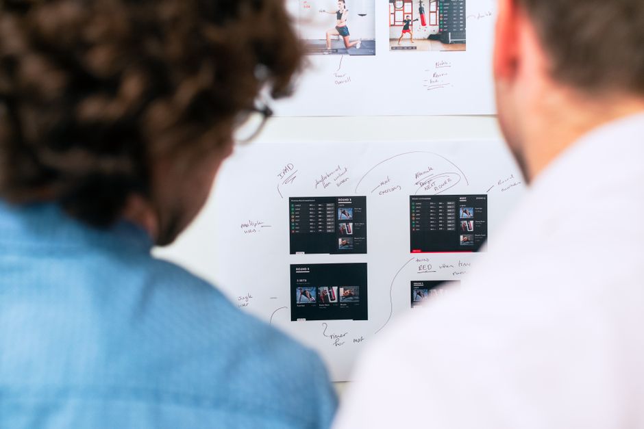
Sisällytä muistiinpanot ja annotaatiot yhteistyöhön
Käytä yhtä lyhyttä tiedostoa kansiossa muistiinpanojen, linkkien ja päätösten tallentamiseen. Yhden lähteen pitäminen juurikansiossa pitää kaikki linjassa; nimeä se notes.md ja strukturoi se osioilla tell, päätökset, kysymykset ja linkit. Tämä tapa pitää kaikki linjassa ja välttää tylsää edestakaisin tiimien yli. Automatisoi tuonnit miro-tauluista ja valkotaulun vientien avulla voit liittää linkitettyjä resursseja ja pitää kaiken keskitetysti saavutettavana.
Linkitä resurssit ja viitteet taulun yli sisältämällä murupolku tiedostoon ja viittaamalla relevantteihin näytteiden kaavioihin. Käytä miroa reaaliaikaisiin annotaatioihin flowchartiin ja liitä kuva tai vie lyhyenä tiedostona, joka istuu kansiossa. Pidämme puhtaan virtauksen ja varmistamme, että jokainen kansio käyttää samaa annotaatiolähestymistapaa.
Määritä muistiinpanojen tyypit: päätökset, kysymykset, estot ja parannukset. Taggaa kukin kohde kategorioilla kuten kehitys, ecommerce tai koko yhtiö. Tämä parantaa löydettävyyttä tiimien yli ja parantaa selkeyttä; kerro sidosryhmille, mitä muuttui päivittämällä relevantti kohde. Valinta rytmistä on vaihtoehto, joka sopii projektin tahtiin. Päivitysten tiheys tulisi kirjata tiedostoon johdonmukaisuuden ylläpitämiseksi.
| Type | Purpose | Tool/Location | Owner | Frequency |
|---|---|---|---|---|
| Decision | Capture outcome and rationale | notes.md; folder root | PM | Daily |
| Question | Log open items to resolve | notes.md; linked on board | Eng Lead | Milestones |
| Blocker | Flag risks slowing progress | miro board, notes.md | Product/Tech | As needed |
| Reference | Link to sample assets | folder/sample-links.txt | Content Manager | Always |
Disiplinoidun, linkitetyn muistiinpanojärjestelmän pitäminen kehityssyklin yli pitää tylsät tehtävät pois tieltä ja antaa tiimien keskittyä vaikuttaviin tuloksiin. Kaiken virtauttamalla murupolkujen, flowchartien ja ristikittaisten linkkien kautta yhtiö voi parantaa yhteistyötä työn tyyppien yli ja varmistaa linjauksen ydintavoitteiden kanssa ecommerce-pinon yli.
Varmista saavutettavuus ja responsiivinen käyttäytyminen laitteiden yli
Aloita mobiiliensin asettelulla ja pidä ydinnavigointi pääalueella, näkyvänä pienillä näytöillä. Käytä kolmitasoista rakennetta: otsikko, pääsisältölohkoja ja tiivis alatunniste; pidä välistykset suhteellisina ja fokusindikaattorit näkyvinä. Ensimmäinen renderöinti tulisi esittää olennaiset ohjaimet; hyvä käytettävyys seuraa ennakoitavasta järjestyksestä.
Alasvetovalikot täytyy olla näppäimistösavutettavia: avaa Enter/Space:lla, navigoi nuolilla, sulje Escape:lla, varmista fokusjärjestys loogisena tauko pisteiden yli.
Kuvat ja videot vaativat saavutettavia media-attribuutteja: alt-teksti kuville, kuvatekstit ja litteroinnit videoille; lataa optimoituja resursseja latauksen vähentämiseksi; ota laiska lataus käyttöön.
Typografia ja visuaalinen hierarkia: mobiiliensis fonttikoot, skaalautuvat yksiköt (rem/%), ja vältä kovakoodattuja pikseleitä; testaa luettavuus tutkijoiden kanssa; varmista värikontrasti > 4.5:1.
Suorituskyky ja aitous: palvele suhteellisia resurssipyyntöjä; pidä sivut kevyinä; mittaa google Lighthouse:lla; seuraa muunnossignaaleja kuten ensisijaisia CTA:ita otsikossa ja alatunnisteessa.
Testaus ja iterointi: valitse pieni joukko skenaarioita, testaa kolmella laitteella ja käytä käytettävyyden tuloksia kertomaan hienosäädöistä; olemme käyttäneet createlyn kaavioita käyttäjävirtojen kartoittamiseen.
Relume-henkinen komponentit toimittavat saavutettavia lohkoja ja johdonmukaisia malleja kiihdyttäen toteutusta säilyttäen käytettävyyden.
Alatunnisteen linkit tulisi olla toiminnallisia ja napakoita; käytä suhteellisia URL:eja ja varmista ohituslinkit kohdistuvat pääsisältöön; ne ovat vankkoja avustavalle teknologialle.
Ready to leverage AI for your business?
Book a free strategy call — no strings attached.


