Kuinka käyttää Canva AI:ta - 10 AI-ominaisuutta kokeiltavaksi Canva Magicissa

Aloita mahdollistamalla AI-generoidut mockupit etusivun suunnitteluun ideoiden validoimiseksi ennen kuin investoit aikaa. Luo kolme kokoa: 1080x1080, 1920x1080 ja 1080x1920 kattamaan sosiaaliset postaukset, verkkobannerit ja vertikaaliset tarinat. Tämä lähestymistapa kasvattaa luottamustasi ja estää sotkun työvirrassasi; ratsasta ideoiden aalloilla ja tarkista kukin variantti sijoittelun suhteen eri kokojen yli. Tulokset ovat uskomattomia ja näyttävät nopeuden, jonka voit saavuttaa, erityisesti lyhytmuotoiselle sisällölle, jota luot säännöllisesti. Jos koordinoit managerien kanssa, tarkista edellisen viikon luomansa outputit odotusten kalibroimiseksi.
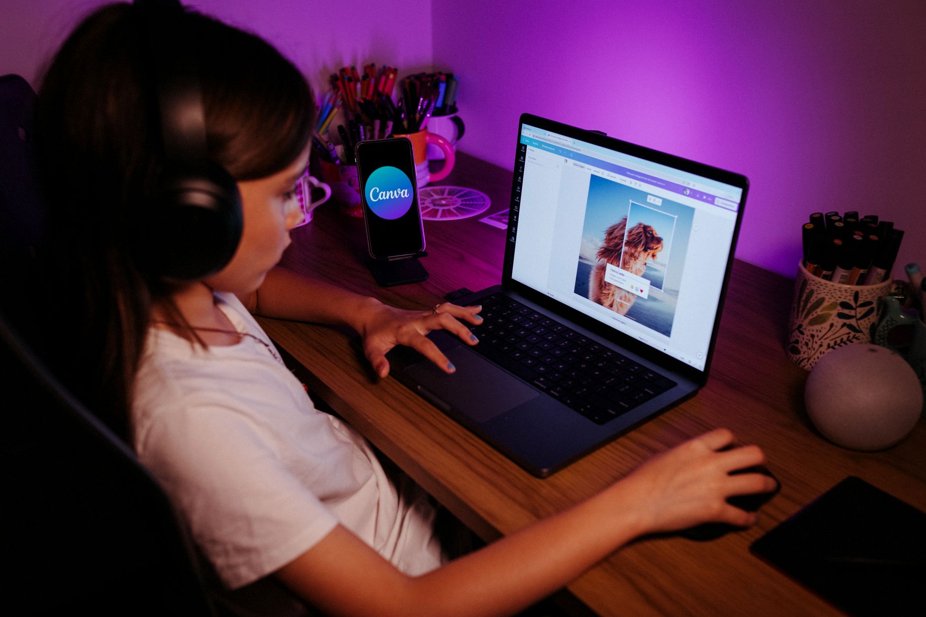
Tässä ovat konkreettiset vaiheet kymmenelle AI-ominaisuudelle, joita voit testata Magic-sovelluksessa. Ominaisuus 1: Automaattiset asetteluehdotukset, jotka rakentavat kolme erilaista etusivukompositiota yhdestä otsikosta ja kuvasta. Toiminta: syötä otsikkosi ja pääkuvasi, tallenna parhaat kolme varianttia ja vertaa niiden sijoittelua eri kokojen yli. Ominaisuus 2: Värin ja typografian yhdistely, joka kunnioittaa brändipakettisi. Toiminta: generoi kolme palettia ja sovella niitä kolmeen mockupiin; pidä vaihtoehto, jolla on vahvin kontrasti luettavuuden vuoksi. Ominaisuus 3: Älykkäät kuvansäädöt automaattisella rajausella keskeisille alueille; testaa neljää rajausvaihtoehtoa eri sijoitteluihin ja konteksteihin. Ominaisuus 4: AI-generoidut kuvatekstit sosiaalisiin postauksiin; tuota viisi vaihtoehtoa ja valitse tihein, sitten käytä niitä lyhytmuotoisissa videoissa tekstityksinä. Ominaisuus 5: Mockup-kohtaukset, jotka sijoittavat tuotteet realistisiin ympäristöihin; kokeile neljää kohtauksen vaihtoehtoa ja valitse se, joka demonstroi mittakaavaa. Ominaisuus 6: Videointro-mallipohjat lyhytmuotoisille klipseille; testaa kolme variaatiota ja kierrä fontteja rytmin luomiseksi. Ominaisuus 7: Automaattinen koon muutos ja rajaus vaakasuuntaiselle, neliömäiselle ja pystysuuntaiselle muodolle; tarkista kohdistus kolmessa koossa. Ominaisuus 8: Ruudukko- ja asettelunhallinta vedä-ja-pudota-kohdistuksella; säädä välistykset kahdeksan pikselin lisäyksinä johdonmukaisuuden vuoksi. Ominaisuus 9: Omaisuuksien tunnistaminen ja nopea haku; aseta viisi tunnistetta per omaisuus, jotta managerit löytävät ne nopeasti. Ominaisuus 10: Nopeat vientiasetukset sosiaaliselle, verkkoon ja tulostukseen; tallenna kolme asetusta ja hakea ne yhdellä klikkauksella. Jokaiselle ominaisuudelle mittaa vaikutusta yksinkertaisella KPI:lla, kuten säästetyn ajan tai sitoutumisen nousulla, ja säädä työvirtaasi säännöllisesti. He arvostavat selkeää polkua konseptista vientiin.
Ota käyttöön toistettava rutiini momentumia ylläpitääksesi. Aloita 15 minuutin briefingillä tavoitteiden asettamiseksi, sitten suorita 3 nopeaa tutkimusta käyttäen kymmentä AI-ominaisuutta; valitse yksi suunta kehittääksesi ja jaa se tiimille. Päivittäinen 5 minuutin tarkistus auttaa managereita näkemään, mikä toimii; nimitä yksi omistaja mockupeille ja toinen omaisuuksille, jotta he eivät tee duplikaattityötä. Tämä toiminto pitää prosessisi ennustettavana samalla kun antaa tilaa kääntymiselle, kun tulokset ohjaavat uuteen suuntaan, joskus paljastaen paremman sopivuuden brändille.
Seuraa edistymistä yksinkertaisilla mittareilla, joihin voit luottaa viikoittain. Pidä elävä hylly viidestä parhaasta mockupista per projekti ja kierrä niitä kahden viikon välein pysähtymisen välttämiseksi. Tavoittele 20-40 %:n vähennystä tarkistussykleissä ja 10-25 %:n nousua sitoutumisessa lyhytmuotoisissa postauksissa käyttäessäsi AI-avusteisia kuvatekstejä ja visuaaleja. Tallenna parhaat mallipohjasi, jotta voit käyttää niitä tulevissa projekteissa; tämä auttaa tiimiäsi kasvattamaan tehokkuutta nopeasti ja estämään duplikaattityötä. He huomaavat eron säännöllisissä asiakaspäivityksissä ja sisäisissä tarkistuksissa.
Käytännöllinen Canva AI -opas kestävään monetisointiin
Aloita 30 päivän pilotilla: julkaise kolme pakettia (postimallipohjapaketti, 15 sekunnin videomallipohja ja animaatiointro) ja automatisoi toimitus kahteen kanavaan. Seuraat tuloja ulottuvuuksien yli: hinta, määrä, säästetty aika ja tilaajakv, käyttäen luotettavaa analytiikkaa. Pienen kirjaston hallinta vähentää tuotantoaikaa tulevissa projekteissa.
- Vaihe 1 – Määritä monetisointitavoitteet ja kohdeyleisön kipupisteet. Kartuta vähintään kolme tuotelinrajaa: postimallipohjat, lyhytmuotoiset videot ja liikeanimaatioylitykset. Määritä ulottuvuudet ja kokorajat jokaiselle alustalle ja aseta kuukausittaiset tulotavoitteet, jotka voit mitata.
- Vaihe 2 – Rakenna mestarikirjasto uudelleenkäytettävistä omaisuuksista. Luo skaalautuvia mallipohjia intuitiivisilla ohjaimilla ja johdonmukaisella visuaalisella kielellä. Sisällytä paikkamerkit tekstille, logoille ja väreille tuotannon nopeuttamiseksi useiden postausten yli.
- Vaihe 3 – Hyödynnä generatiivisia ominaisuuksia skaalaamiseen ilman realismista luopumista. Generoi variaatioita värimaailmille, typografialle ja animaation ajoitukselle säilyttäen tuotannon laadun realistisena ja vastaavana palautteeseen menneistä kampanjoista.
- Vaihe 4 – Automatisoi julkaisemis- ja monetisointityövirrat. Ajasta postaukset, toimita omaisuudet liikkeellä ollessa ja laukaise maksetut lataukset tai pääsy yksinkertaisen kassan kautta. Käytä luotettavaa tukea ostajille ja reaaliaikaisia tilapäivityksiä.
- Vaihe 5 – Käytä kevyttä koodausta tai ei-koodauksen vaihtoehtoja virtojen mukauttamiseen. Tiedä, milloin luottaa sisäänrakennettuun automaatioon ja milloin lisätä pieni skripti reunatapauksille. Seuraa keskeisiä mittareita ulottuvuuksien yli, kuten sitoutumisprosentti, muunnosprosentti ja keskimääräinen tilausarvo.
- Vaihe 6 – Tarjoa tasoisia paketteja ja resursseja. Aloita sisääntulopaketeilla, sitten upsell suuremmilla paketeilla ja jatkuvalla pääsyllä. Seuraa suorituskykyä ja iteroi käyttäen asiakaspalautetta; vaihtoehtoisesti testaa uusia muotoja, kuten mikro-oppimisvideoita tai purtavia rullia.
- Vaihe 7 – Mittaa vaikutusta ja iteroi vakavalla, data-vetoisella lähestymistavalla. Käytä yksinkertaista kojelautaa menneen suorituskyvyn ja nykyisten tulosten vertailuun; varmista, että säilytät luotettavan keskittymisen kannattavuuteen ja asiakkaan elinikäiseen arvoon kanavien yli.
Magic Write: Generoi kuvatekstejä ja mainostekstejä
Generoi viisi kuvatekstivaihtoehtoa ja kolme mainostekstivarianttia tuotteen lanseeraukselle Facebookissa. Valitse kaksi testattavaksi, tallenna voittaja ja pidä loput dokumentissa uudelleenkäyttöä varten. Tämä lähestymistapa säästää aikaa ja rakentaa kirjaston, josta voit ammentaa tulevissa postauksissa.
Määritä kohdeyleisösi ja tavoitteesi yhdellä rivillä, sitten pyydä outputtia eri tyyleissä – ystävällinen, rohkea ja tiivis – kattamaan sijoittelut syötteissä ja korteissa. Pidä pieni koodausprompt-pankki onnistuneiden sävyjen uudelleenkäyttöä varten usein. Promptin laatu pysyy korkeana selkeillä rajoituksilla.
Sopeuta teksti jakamalla tuotetiedot, edut, todisteet ja tila sävyn mukauttamiselle. Jos et ole varma, kumpi variantti suoriutuu parhaiten, suorita nopea kysely kollegoiden kanssa sävyn ja pituuden vertailuun ennen lopullista leikkausta.
Kokeile pyytämällä sekä lyhyitä että pidempiä versioita ja pyydä variaatioita, jotka sopivat vaihteleviin taustoihin ja brändeihin. Tämä auttaa näkemään, miten teksti luetaan eri kuvien ja asettelujen kanssa.
Täytä paikkamerkit, kuten [Tuote], [Etua] ja [CTA], sitten vie tulokset dokumenttiin. Säästää aikaa, pidä muutama purtava vaihtoehto ja luo pieni pakka sävyjä ja kortteja visuaalien parittamiseksi.
Automatisoi luovutukset Zapiereilla työntääksesi kuvatekstit sisältökalenteriisi tai tiimichattiin ja tapaa tiimikavereita tarkistukseen. Jos luotat ChatGPT:hen, liitä luonnos hienosäätöön, sävyn muutoksiin ja CTA:n tiivistämiseen.
Seuraa suorituskykyä ja etsi kuvioita tulevien outputtien parantamiseksi. Rakenna elävä kirjasto riveistä, jotka liittyvät brändiisi ja taustoihisi, ja käytä tätä peliä pitämään Facebook-tekstit tuoreina samalla kun kehität tuotteen valmiimpia variaatioita. Päivitä vanhempia rivejä, kun päivität visuaaleja.
Text to Image: Luo sosiaalisia grafiikoita ja brändivariantteja
Aloita yhden selkeän konseptin brändi-identiteetillesi ja valitse hillitty värisuunta. Generoi neljästä kuuteen graafista varianttia, jotka sopivat eri postauksen kokoihin ja konteksteihin, sitten valitse vahvin perusta viitteeksi.
Kirjoita tiiviit promptit, jotka kuvaavat kompositiota ja tunnelmaa laajoja ideoiden sijaan. Käytä spesifejä vihjeitä, kuten rohkeita viivoja, korkeaa kontrastia tai pehmeitä gradientteja ohjataksesi kuvaa ilmeeseesi. Tarkista, miten kukin tulos skaalautuu mobiilissa ja suuremmalla näytöllä varmistaaksesi logoijen ja keskeisten merkkien luettavuuden.
Hienosäädä säätämällä värıyhdistelmiä, typografian kohdistusta ja negatiivista tilaa. Vertaa variantteja vierekkäin, sitten valitse pääversio ja kaksi vaihtoehtoista eri verkostojen käyttöön. Merkitse kukin tiedosto selkeästi ja pidä pääkansio, joka pitää nykyiset omaisuudet, jotta muutokset pysyvät linjassa.
Vie useissa muodoissa (PNG postauksiin, SVG logoille) ja luo nimentämiskäyttö, kuten BrandName_Logo_Main ja BrandName_Logo_Alt. Tallenna omaisuudet sivustosi omaisuusalueelle ja käytä niitä uudelleen postausten yli.
Käytä näitä vaiheita nopeuttaaksesi työvirtaasi ja pitääksesi visuaalisi linjassa brändi-identiteettisi kanssa.
Magic Design: Automaattiset asettelut ja brändin mukaiset mallipohjat
Automatisoi pääsuunnitteluvire käyttäen AI-vetoisia automaattisia asetteluja, jotka ovat ankkuroituina yhteen brändipalettiin. Luo mestariasettelu, joka sopeutuu tekstin pituuteen ja kuvan suhteeseen, sitten käytä sitä uudelleen postausten yli takauttaaksesi johdonmukaisuuden samalla kun vähennät manuaalista säätöä.
Tämä ominaisuus on yksi päätyökaluista; niitä kutsutaan Auto Layoutseiksi, ja ne järjestävät automaattisesti otsikot, rungon kopion, kuvat ja logot säilyttäen marginaalit, peruslinjarytmin ja kohdistuksen helposti.
Monilla vaihtoehdoilla ruudukon tiheydelle, marginaaleille ja typografian skaalalle voit mukauttaa kunkin asettelun ilman tyhjästä aloittamista, tuottaen tuloksia ainakin yhtä nopeasti kuin manuaaliset menetelmät. Jopa kirjoitetut kuvatekstit sopivat puhtaasti otsikoiden ja visuaalien viereen.
Paletti-vetoiset mallipohjat ylläpitävät brändin yhtenäisyyttä; vaihda mediaa samalla kun pääasettelu pitää kohdistuksen ja typografian johdonmukaisena, varmistaen hyvän ilmeen postausten yli.
Aseta työvirrat julkaisemaan automaattisesti tilisi yli kanavissa, toimittaen brändin mukaisia visuaaleja minimillä syötteellä.
Käytä tarjottuja oivalluksia edellisistä kampanjoista mallipohjien säätämiseen, ja voit leikkiä variaatioilla löytääksesi, mikä resonoi, sitten lukitse näkökulma, joka sopii brändillesi.
Yksi käytännöllinen kohta: pidä yksi totuuden lähde brändillesi ja käytä muutamaa ydinasettelua kampanjoiden yli. Tämä automatisoi työtä, vähentää virheitä ja auttaa kasvattamaan seuraajia.
Magic Edit & Background Remover: Prompt-pohjaiset muokkaukset ja puhtaat taustat
Lataa kuvasi suoraan Canvaan, avaa Magic Edit ja valitse Background Remover. Käytä tiiviitä promptteja muokkausten ohjaamiseen: "poista tausta, säilytä subjekti, terävät reunat, säilytä vaatetuksen rakenne, neutraali valkoinen tausta." Tämä tuottaa puhtaan leikkauksen sekunneissa. Käsittelyn jälkeen lataa PNG läpinäkyvällä taustalla kerrostamiseen tai PNG/JPG kiinteällä taustalla mallipohjille.
Promptit reunojen hallintaan: määritä "tiukat reunat hiuksille ja vaatteille, ei haloja, pidä etuelementit ehjinä." Jos työskentelet hankalien kulmien kanssa, käsittele uudelleen hienostetulla promptilla, kuten "tarkista reunat uudelleen, korjaa karheat kohdat." Pidä promptit lyhyinä ja kohdennettuina välttääksesi teknologian taustalla olevan työkalun toimintojen ylikuormituksen.
Taustavaihtoehdot merkitsevät: valitse puhdas valkoinen, musta tai neutraali harmaa tausta tai aseta tausta väriin, joka sopii mallipohjiisi. Vaatteiden ja tuotteen kuvauksissa merkitse rakenne ja kuvio; voit säätää valaistusta pyytämällä pehmennettyä taustaa tai tasaista sävyä eteen. Uudelleen lataaminen on nopeaa, jos tarvitset toisen kierroksen.
Työvirtatiedot: ylläpidä tilin läsnäoloa järjestämällä omaisuudet työtilasi kulmaan käyttäen kansioita teemoille, valitsemalla mallipohjia tulevien muokkausten nopeuttamiseksi. Tarkista ehdot ja hinnoittelu suunnitelmassasi tietääksesi, kuinka monta vientiä voit tallentaa kuukaudessa ja kuinka monta resurssia voit käyttää. Parhaiden käytäntöjen muistiinpanot auttavat oppimaan nopeammin ja parantamaan tuloksia ajan myötä.
| Prompt-malli | Mitä saat | Vinkit |
|---|---|---|
| poista tausta, pidä subjekti, terävät reunat, valkoinen tausta | puhdas leikkaus ihanteellinen etupuolen tuotekuville | aloita yksinkertaisesti; jos haloja ilmestyy, hienosäädä reunojen keskittymistä |
| poista tausta, pidä subjekti, läpinäkyvä tausta | eristetty subjekti komposiitteja varten | tarkista hiukset ja hienot yksityiskohdat; zoomaa kulmiin |
| poista tausta, korvaa värillä #f5f5f5 | yhtenäinen tausta luetteloille | sovita mallipohjan väripalettiin |
| poista tausta, lisää pehmeä varjo, ei taustaväriä | noussut subjekti tuotekohtauksiin | käytä varjo-promptteja säästeliäästi välttääksesi ylipimeyttämisen |
| säilytä vaatetuksen rakenne, pidä etuelementit | rikkaat vaatekuvat säilytettyine kankaan yksityiskohdineen | vältä ylisiliyttämistä; suosi korkeampaa rakenteen uskollisuutta |
Paletin generaattori ja brändipakettiehdotukset
Logosi lataaminen paletin generaattoriin tuottaa viisi ydinväriä ja brändätyn aloituspaketin, jonka voit soveltaa verkkosivustoille, sosiaalisiin postauksiin ja dokumentteihin, säästäen paljon aikaa suunnittelun valmistelussa.
Tallenna ja nimeä kukin värimalli Brändipaketissa: Primary, Secondary, Accent ja Neutral. Kirjaa hex-, RGB- ja CMYK-arvot yhteen dokumenttiin ja pidä kirjoitettu käyttöopas, jota tiimit voivat seurata.
Pidä paletti intuitiivisena järjestämällä värimallit nopeaa skannausta varten: Primary ensin, sitten secondary, sitten neutraalit. Luo muokatut variaatiot vaaleille ja tummille tiloille ja tallenna ne varianteina pysyäksesi brändättynä sovellusten yli.
Testaa kontrastia painikkeen tarroissa ja otsikoissa yleisissä kokoisissa; YouTubelle validoi thumbnail-väritasapainon 1280x720 -ulottuvuuksissa.
Anna nopea promptti tiimille: kuvaile, miltä paletin tulisi tuntua sosiaalisissa postauksissa ja mainoksissa, sitten säädä skaalaa ja trendejä pysyäksesi relevanttina samalla kun ylläpidät johdonmukaisuutta.
Työkaluvinkki: pidä keskusdokumentti värikoodeineen, käyttöesimerkeineen ja yhden sivun oppaana; jaa PNG:na tai SVG:na suunnittelijoille ja lataa omaisuudet brändikirjastoon.
Lopullinen tarkistuslista: varmista luettava kontrasti, vahvista ulottuvuudet jokaiselle kanavalle ja varmista, että paletti pysyy brändättynä asettelujen yli, koska johdonmukaisuus merkitsee.
Ready to leverage AI for your business?
Book a free strategy call — no strings attached.


