Google PageSpeed Insights レポート - 詳細なガイド


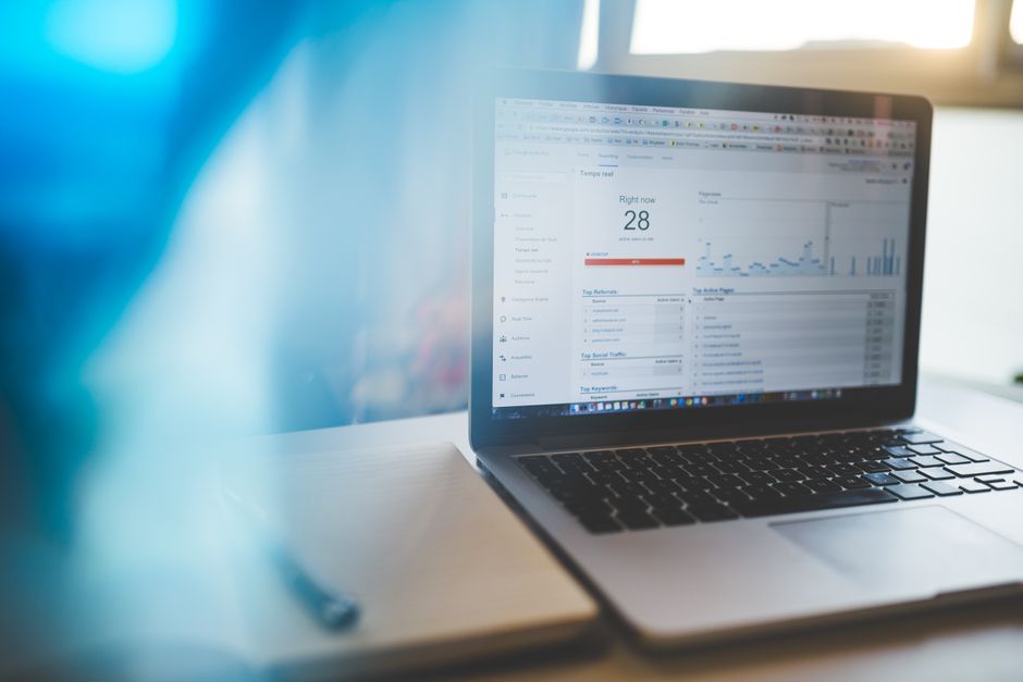
今日、PageSpeed Insightsレポートを実行し、ページを最も遅くする上位3つの問題を修正してください。 その結果は、主要なパフォーマンスシグナルの時間ベースの平均を反映しています。レポートのヒントを使用して、実行可能なボトルネックをターゲットにし、測定可能な改善を達成してください。
バックグラウンドチェックで、過剰なリソースとレンダリングをブロックする問題を特定してください。分析は時間漏れが隠れている場所を示し、チャートはデバイス間の時間シフトを説明し、最初に修正するものを優先順位付けするのに役立ちます。一部のケースでは、主な問題はレンダリングをブロックするCSSです。このビューは各変更の意味を明確にし、何が価値があるかを明らかにします。
具体的な最適化を選択し、それらをテストしてください:画像効率を向上させるために次世代フォーマット(WebP/AVIF)に切り替え、gzipまたはBrotli圧縮を有効にし、レンダリングをブロックするクリティカルな要素をインライン化します。非クリティカルなスクリプトを遅延し、メディアリクエストの数を制限してください。これらのステップは、典型的なページで読み込み時間を20–40%短縮し、モバイルでの過剰なCPU作業を削減できます。サードパーティスクリプトの問題に対処して遅延を最小限に抑え、デバイスが異なる場合でもページをレスポンシブに保ちます。これにより、より一貫した結果が得られ、モバイルでより多くの改善が示されます。
テスト戦略:異なる時間に繰り返しテストを実行し、実際のデバイスで実行してください。LCPを2.5秒未満、FIDを100ms未満、CLSを0.1未満を目標として測定してください。チャートを使用してビフォー/アフターを比較し、最も意味のある改善をもたらす修正に焦点を当ててください。選択して、デスクトップとモバイルの両方の設定でテストを実行し、デバイスの特定の問題をキャッチし、リロード中にキーボードナビゲーションがスナッピーなままであることを確認してください。
インタラクションまでの時間を厳密に保つために、バックグラウンドタスクを削減し、非クリティカルな要素での過剰な作業を避けてください。メディアリクエストや大きなバックグラウンドアセットが見られた場合、主なコンテンツがレンダリングされた後にそれらを遅延させてください。結果は、視聴者が感じられる高速な体験となり、サイトの評判とエンゲージメントのために努力する価値があります。
PageSpeed Insightsデータを高速なページに変換するための実践的なステップ
PSIのブロック要因を監査し、今すぐクリティカルパスを修正してください。特にレンダリングをブロックするリソースで、First Contentful Paintを遅らせるものを。目標を設定:LCP <= 2.5s、CLS <= 0.1、TBT <= 300msで、各変更の明確なベンチマークを作成してください。シンプルなチャートでベースラインを追跡し、数日間の進捗とビフォー/アフターの比較を確認できるようにしてください。
最もクリティカルなCSSをインライン化し、非クリティカルなCSSを遅延させて初期ペイロードを削減してください。これにより、実践で最初のレンダリング時間を20–40%短縮できます。変更をLCPとCLSにマッピングして影響を測定し、どのルールが針を動かしたか、そしてなぜかを説明する軽量ガイドを使用してください。ルールが回帰を引き起こすように見える場合、同じコンテキストで元に戻して再評価し、変更をユーザーパスに集中させてください。
JavaScriptをトリミング、遅延、または非同期でロードしてください。コア体験に寄与しないサードパーティスクリプトをロードせず、残りは主なコンテンツが表示された後にロードしてください。保持する必要があるサードパーティスクリプトについては、ページが視覚的に準備された後に実行を遅延させ、ユーザーインタラクションでのみロードすることを検討してください。このアプローチは長時間タスクの長さを削減し、正しいアセットが早く表示されるのを助けます。
画像を最適化:圧縮、WebPまたはAVIFへの変換、遅延ロードを有効にして、ユーザーがスクロールする際にアセットが表示されるようにしてください。画像バイトを意味のあるマージン(サイトによるがしばしば20–60%)で削減することを目指し、視覚品質を維持し、最大のオンスクリーン画像がコンテキストに適した最小フォーマットを使用していることを確認してください。
srcsetとsizes経由でレスポンシブ画像を提供し、ビューポートとネットワーク条件に基づいてフォーマットを切り替えるシンプルなルールを適用して、高品質な画像が高コストのバイトを避けられるようにしてください。これにより、視覚ストーリーを維持しつつ、モバイルデバイスのペイロードを低下させ、LCP改善の頻繁なドライバーとなります。
キャッシング戦略を採用し、ペイロードを最小化:CDNを使用し、動的ペイロードをスリムに保ち、不変アセットに長いキャッシュ寿命を適用し、デプロイ時に更新してください。軽量キャッシングポリシーはしばしば高速なリロードをもたらし、パフォーマンストレンドのチャートを数日間とユーザセッション全体で好ましい状態に保ちます。
ベースラインを作成し、変更セットごとにPSIを再実行;チャートのランクを比較し、イテレーション間の日数を追跡して実際の改善を確認し、その後次の改善バッチを計画してください。このリズムを使用して、チームを同時変更の過負荷なしに勢いを保ってください。
コンテキストが重要:何が変わったか、なぜ重要か、ユーザーの知覚にどのように結びつくかを文書化してください。これにより、チームメンバーがさらなる改善を設計する際にデータに基づいて行動し、プロダクションで実際に針を動かすものに焦点を保てます。
ステークホルダーへの報告:具体的なメトリクス、タイムライン、次の変更を含めて進捗を透明にしてください。LCP、CLS、TBTのビフォー/アフターナンバー、サードパーティスクリプト調整と画像最適化結果のノートを含む簡潔なサマリーを準備してください。
このガイドは、チームが適用できる準備されたチェックリストを提供します。ランディングページやダッシュボードのいずれで作業する場合でも、PSIデータをユーザーが感じる高速なページに変換してください。キャデンスを決定(例:週次再チェックと14日ごとの深いレビュー)し、それに従って改善を測定可能で実行可能に保ってください。
PSI機会の解釈:読み込み時間を削減する高影響の修正を特定
レンダリングブロックリソース、画像最適化、サードパーティの影響を優先して、ページの初期ロードから数百ミリ秒を削るターゲット修正を適用してください。このアプローチは、レスポンシブレイアウトとタッチインタラクションの知覚レスポンシブネスを即座に改善し、サイト全体で旅行者が見る総リクエストを削減します。
PSIシグナルと実際のユーザー行動(ユーザー)を反映したワークフローを設計してください。計画はページの主なブロック要因に厳密に保ち、サイト全体にスケールし、具体的なアクション、測定可能な目標、明確な所有権マップを含めてください。スタックとテストキャデンスに一致する簡潔なチェックリストを作成してください。
-
レンダリングブロックリソースとメインタスク作業
- クリティカルCSSをインライン化し、非クリティカルCSSを遅延させてロード時のメインタスク作業を削減;DOMContentLoadedを早く安定させ、クリーンなレイアウトから開始;ブロック時間を数百ミリ秒に押し上げる長時間タスクを削減することを目指してください。
- 非依存JavaScriptを遅延または非同期で;ルートまたは機能ごとにコードスプリットし、使用されていないコードを削除して初期ペイントごとのスタックサイズを削減;作業とリクエストを監視して総作業を厳密な予算内に保ってください。
- メインストックで使用されていないCSSを排除し、タスク持続時間を膨張させる重い依存関係をトリミング;変更をPSIに反映してCLSを改善し、最初のインタラクションでのレスポンスを速くしてください。
-
画像とメディア最適化
- サポートされている場所で次世代フォーマット(WebP、AVIF)を提供;正確な表示寸法にリサイズし、srcsetとsizes経由でレスポンシブ画像を提供;初期ペイントでのロードスパイクを避けるためにオフスクリーンアセットを遅延ロードしてください。
- 合理的な品質でアセットを圧縮し、適切なキャッシングを有効にし、レイアウトシフトを引き起こすオーバーサイズ画像を削除;これにより、ユーザーがページをスタタリングなしに通過するのを助けます。
- ページごとの画像予算を保ち、画像が主なコンテンツから小さなビューポートまでスムーズでレスポンシブなレンダリングに寄与することを確認してください。
-
サードパーティスクリプトと外部リクエスト
- サードパーティリクエストを監査し、非クリティカルなものを削除または遅延;必須スクリプトをユーザーインタラクション後または後期フェーズでロードし、初期レスポンスとメインタスク作業への影響を最小限に抑えてください。
- アナリティクス、ウィジェット、広告を統合または遅延ロード;ユーザー知覚レイテンシと実際のロード行動を反映するシグナルを追跡;追加のリクエストごとにパフォーマンス利点を正当化してください。
- 信頼できるCDN経由でユーザーに近い場所でクリティカルなサードパーティコンテンツをホストし、カスケード遅延を防ぐ厳密なタイムアウト予算を適用してください。
-
サーバーレスポンスとキャッシング
- 圧縮(Brotli優先)、gzipフォールバック、エッジキャッシングを有効にしてサーバーレスポンスタイム(TTFB)を改善;データベースクエリとサーバーサイドレンダリングを調整して初期作業を削減してください。
- ハッシュ付きファイル名で静的アセットに長寿命キャッシングを実装;CDNを使用して往復時間を削減し、グローバルサイトユーザー向けの配信を安定させてください。
- クッキーとヘッダーのオーバーヘッドをレビュー;不要なリダイレクトを最小限にし、DNSルックアップを最適化して総リクエスト時間を制御内に保ってください。
-
監視、シミュレーション、検証
- 代表的なラボデバイスでPSIとLighthouseシミュレーションを実行してページ、サイト、全体のユーザーjourneyへの影響を推定;キー指標(LCP、TTI、CLS、総リクエスト)のミリ秒単位の変更を追跡してください。
- デバイスとネットワーク全体でシグナルをキャプチャする実際のユーザー監視を設定;ビフォー/アフターデルタを監視してユーザーシナリオの改善を確認してください。
- メインタスク作業、長時間タスク、利用可能なレスポンスタイムを監視する専用ダッシュボードを使用;タッチデバイスでのロードがレスポンシブでなくなる場合にCLSやTBTが閾値を超えて回帰したらアラートをトリガーしてください。
実装は、PSI機会を具体的なコード変更、テストステップ、ロールバック基準にリンクする明確で優先順位付けされた計画から始まります。各修正は、すべてのデバイスで測定可能なロード時間低下とスムーズなインタラクションを示し、準備状態とユーザーデバイスの知覚パフォーマンスのバランスに注意を払ってください。よく構造化されたシミュレーションと継続監視は進捗を反映し、サイトの最適化の次の部分をガイドします。
診断のデコード:実際のユーザーパフォーマンスに影響するフラグを理解
htmlおよび他のテキストフォーマットでBrotli圧縮を有効にしてください。これにより、高速転送を通じてペイロードを劇的に削減し、実際のユーザー速度を改善できます。Brotliはgzipよりhtmlペイロードを効率的に圧縮し、クイックなサーバー設定変更で最初のペイントとインタラクティブまでの時間で目に見える改善をもたらします。
実際のユーザーを遅くするフラグに焦点を当てて診断をデコード:レンダリングブロックリソース、長時間タスク、オーバーサイズJavaScriptバンドル。これらのシグナルに取り組む具体的なステップが続きます。実際のユーザー影響を測定するとは、診断データを訪問者の入力とパフォーマンス履歴に結びつけることを意味します。フラグが多様なネットワーク全体で長いまたは短いロード時間とどのように相関するかを観察し、実際のユーザーシナリオを含めてください。
世界全体での影響を評価するために、Largest Contentful Paint (LCP)やTime to Interactive (TTI)などのメトリクスのパーセンタイル(パーセンタイル)分布を使用してください。訪問者からのグローバルデータは変更がスケールでどのようにパフォーマンスを発揮するかを示し、履歴は調整が時間とともに針を動かすかどうかを示します。95パーセンタイルを追跡して最長の体験を特定し、URLとアセットの修正をガイドしてください。
今すぐ適用できる実践的なステップ:ラウンドトリップを削減するためにクリティカルなhtmlとCSSをインライン化、非クリティカルスクリプトを遅延、適切な圧縮付きの現代テキストフォーマットに依存してください。これには、適切な場所でpreconnectとprefetchを有効にし、現代フォーマットでアセットを提供することも含まれます。異なるフォームファクターでテストし、基本チェックからベストプラクティスに移行し、使用されないコードやオーバーサイズバンドルをシグナルするフラグに目を光らせてください。
データ、テスト履歴、成果の測定は、すべての訪問者に対して、任意のネットワーク速度でページがレスポンシブに感じられる世界へあなたを導きます。最初にどのフラグを扱うかを決定するために実際のユーザー入力を使用し、新鮮なデータと明確な洞察で影響を検証してください。
レンダリングブロックリソースの削減:実行可能なCSSとJavaScript最適化ステップ
最小限のabove-the-fold CSSをインライン化し、残りを非同期でロードしてレンダリングブロック時間を削減してください。このアプローチは、最初のペイントに実際に影響するルールを正確に示し、視聴体験の最適化を計画するのに役立ちます。これはすべてのCSSを削除することではなく、初期ビュー用に設計されたものを保持しつつ、過剰なブロックを避けることです。
ヒント:初期ビューに必要なCSSを特定し、それをインライン化してください。インライン化ブロックをスリムに保ち(gzippedで15–20 KB未満を目標)。複数のルートのケースでは、最小CSSサブセットを形成し、類似ページで再利用してください。これにより、最初のペイントに実際に影響するルールがわかり、帯域幅が異なるネットワーク場所での視聴時に役立ちます。異なるブラウザで測定し、場所間でロードがどのように変化するかを確認すると状況が明確になり、トリミングする場所を示します。
非クリティカルCSSを別ファイルに移動し、初期レンダリング後にロードしてください。プリロード・アンド・スイッチパターンを使用:スタイルシートをプリロードし、ロード時にrelをstylesheetに変更してください。これによりレンダリングブロック時間を削減し、最初のビューに最適化され、デバイス全体でパフォーマンス向上が観察できます。コードスプリットでページ全体の最適化を拡張するのは簡単です。
JS:初期ペイントに影響しないスクリプトを遅延または非同期で。アナリティクスとウィジェットをasyncとしてマークし、主なスクリプトを閉じbodyタグ直前または動的インポートでロードしてください。これによりパーサーが早く自由になり、インタラクティブまでの時間を増加させます。すぐに改善を測定できない場合、影響を確認するための軽量テストを実行してください。
フォントとアセット:font-display: swapでクリティカルフォントをプリロードし、WOFF2としてホスト、重いUI画像をwebpに変換してロードを削減してください。CDNドメインへのpreconnectを使用して追加DNSルックアップを避け、ネットワーク場所のためのリソースヒントを設定してください。フォントが後期ビューでのみ使用される場合、初期ペイント後にロードしてさらなるブロックを防いでください。ワークフローでクリティカルアセットをプリロードしてレンダーパスをスムーズに保ち、ブラウザ全体で最適化してください。
画像と遅延ロード:オフスクリーンコンテンツにloading="lazy"を実装し、レスポンシブ画像にsizes属性を使用してください。srcsetとsizesを使用してペイロードを最小化し、アセットロード時にレイアウトがシフトしないようにしてください。これにより、無駄なネットワーク活動を削減し、視聴中に改善を感じられます。
ケーススタディでは、レンダリングブロックリソースを削除した後、First Contentful Paintが20–40%速くなり、ネットワーク場所全体でTime to Interactiveに同様の改善を示します。LighthouseまたはPageSpeed Insightsでの定期チェックは改善を示し、残りの機会を明らかにします。結果を確認したら、進化するトラフィックとデバイスに合わせてアプローチを調整しスケールできます。
必須項目には、使用されていないCSSとJSのトリミング、画像フォーマットの最適化、非ブロックフォントロードの確保が含まれます。アセットタイプごとのコードスプリットを使用し、生きているチェックリストを維持してください。CSSがページを膨張させた時代がありました。次は、新しいフレームワークとネットワーク条件をカバーするチェックリストを維持・拡張し、場所とブラウザ全体での視聴体験を高速に保つことです。
画像と現代フォーマットの最適化:圧縮、次世代フォーマット、遅延ロード
ヒーローとabove-the-fold画像を正確に次世代フォーマット(WebP、AVIFなど)に変換し、それらに遅延ロードを有効にすることから始めます。速度と忠実度をバランスさせるために知覚品質目標を使用:写真にはWebP品質75-85、AVIF 50-65、ロゴとアイコンにはロスレスWebPまたはPNG-8を保持してください。このアプローチはJPEG/PNGより30-70%小さいペイロードをもたらし、最初のコンテンツを加速し、ユーザー体験を改善します。
ソース駆動戦略で各アセットに最適なフォーマットを提供:picture要素でWebPとAVIFをJPEG/PNGと並べて提供し、ブラウザが動作するオプションを選択し、古いエンジンで優雅にフォールバックしてください。このグローバルアプローチは能力の異なる環境に制限なく適合し、単一ソースから複数フォーマットを出力するツールで自動化できます。
最もクリティカルな画像(ヒーローまたはフォールドコンテンツ)を画像リソースとしてプリロードして初期ペイントを短縮し、後続のすべての画像にloading=lazyを適用してください。非クリティカルなビジュアルについては、知覚速度に意味のある影響が見られた場合にのみプリロードし、二次リソースの遅延でレンダリングをブロックしないようにしてください。
HTML、CSS、JavaScriptにgzip(またはBrotli)を有効にしてペイロードを縮小し、画像は独自のフォーマットレベル圧縮とサポートされている場合のプログレッシブレンダリングに依存してください。適切な場所でプログレッシブJPEGまたはインターレースPNGを使用し、総画像重量を最適化目標に合わせます。
分析フェーズで、デバイス全体のネットワークでのユーザー体験への変更の影響を測定してください。PageSpeed InsightsとLighthouseはLCPとCLSなどの速度メトリクスを提供し、画像が最適化されたときに速度と安定性の改善に気づくはずです。そのケーススタディはラボの壁を超えた改善を示し、特にグローバル地域の低速接続を経験するユーザーで、多様なネットワーク環境で顕著です。
チームをガイドする実践的なチェックリストを作成し、自動化、テスト、メンテナンスに焦点を当ててください。ステップのリストを含めて:各ソースから複数フォーマットを生成、フォールバックを設定、クリティカル画像をプリロード、遅延ロードを有効、gzip/Brotliをアセットにアクティブ化、PSI、Lighthouse、実際のユーザーデータを使用した定期測定サイクルを実行してください。この場合、アセットは具体的な閾値と継続監視を使用して最適化され、回帰を防ぎ、すべての訪問者に対してユーザー友好な体験を確保します。
サーバーパフォーマンスの改善:キャッシング戦略、圧縮、CDN設定
エッジキャッシングとCDNを今すぐ有効にして、最大のページでレイテンシを削減し、コンテンツをユーザーに近づけてください。このアクションはオリジン負荷を削減し、グローバル場所周辺の訪問者向けに最初のビューを高速化します。次のステップは自動化され、測定可能で、レンダリングブロック遅延の導入を避けるために厳密に制御されます。
オリジンとエッジをカバーするレイヤードキャッシングポリシーを実装してください。静的アセットに長いmax-ageのCache-Controlを設定、バージョン付きコンテンツに不変フィンガープリントを使用、更新時に自動パージを実行してください。これによりトラフィックをエッジ場所に向け、キャッシュヒット率を増加させ、監視でオリジンリクエストの低下と高速な可視ロードとして検証してください。コンテンツが頻繁に変更される場合、動的セグメントに短いTTLを保ち、CDNが効率的に再検証するのに依存してください。このアプローチはコンテンツとメディアアセットの両方に適用され、HTML、CSS、またはスクリプトを提供する場合に動作します。キャッシュキーをコンテンツタイプ、クエリ文字列、ユーザーリージョンに結びつけて戦略を最適化し、視認性と一貫性を最大化できます。
テキストベースアセットに圧縮を有効にし、クライアント能力を尊重するように設定してください。Brotliをプライマリエンコーダとしてオンにし、gzipをフォールバックとして保持、Vary: Accept-Encodingが存在して中間者が正しくキャッシュするようにしてください。可能な限り圧縮をミニフィケーションと組み合わせますが、多くの場合ミニフィケーションなしで意味のある改善を達成できます。結果のペイロードの質感と最初のレンダリング時間を測定してオーバーヘッドを追加していないことを確認してください。この組み合わせはペイロードサイズを削減し、低速ネットワークで高速レンダリングとスムーズなユーザーインタラクションを直接サポートします。
画像、スクリプト、ウィジェットを含む最大コンテンツグループをカバーするエッジキャッシュでCDNを設定してください。バーストからオリジンを保護するorigin-shieldまたは類似ゲートウェイを使用し、コンテンツタイプとメディアフォーマットごとのルールで最速ノードにホットアイテムを保持してください。高トラフィックページと主要リリース場所のキーアセットをプリウォームしてコールドスタートを防ぎます。キャッシュキーおよび無効化パターンを定期的にレビューして、過剰なパージなしに更新を迅速に伝播し、場所とデバイス全体のユーザー視認性を正確に維持します。
レンダリングブロックリソースを直接対処してください。ページのabove-the-fold部分のクリティカルCSSをインライン化し、非クリティカルCSSとJavaScriptを遅延させてください。ウィジェットを非同期または遅延ロードでロードして最初の意味のあるペイントを遅延させないようにしてください。バンドルを分割し、非クリティカルスクリプトを遅延させることでブロック時間を削減し、サイトを視聴する場所に関係なくブラウザがコンテンツをユーザーに速く提示するのを助けます。
メディアとサードパーティアセットを最適化して遅延を防ぎます。現代フォーマット(WebP、AVIF)で画像を圧縮・リサイズし、視聴者のビューポートに適応するレスポンシブ画像を提供してください。ウィジェットとアナリティクススクリプトについては、非同期ロードに切り替え、ユーザーセッション中の繰り返しリクエストを最小限に抑える保守的な更新キャデンスを使用してください。これらのステップはメインストレッドを自由に保ち、低速ネットワークでのレンダリング遅延のリスクを削減します。
改善を検証し更新を情報提供するために測定メトリクスを追跡してください。TTFB、Largest Contentful Paint (LCP)、総ブロック時間に加え、キャッシュヒット率とリージョンごとの95パーセンタイルレイテンシに焦点を当ててください。定期的なPSI駆動チェックは、変更がページと視聴者場所全体の視認性で実際の改善に翻訳されるかを確認するのに役立ちます。アクションプランは四半期ごとに再訪し、トラフィックパターンのシフトと新しいウィジェットの登場に合わせてルール、TTL、アセットフォーマットを更新してください。
| 領域 | 推奨 | 影響 | ノート |
|---|---|---|---|
| キャッシング | 静的アセットのためのエッジキャッシング;フィンガープリント付きファイル名の長いTTL;自動パージ | キャッシュヒット率を増加;オリジン負荷を削減 | 静的アセットに有効;動的コンテンツに調整 |
| 圧縮 | Brotliプライマリ;gzipフォールバック;Vary: Accept-Encoding | ペイロードサイズを減少;レンダリングを高速化 | ミニフィケーションを検討;ミニフィケーションなしまたは併用可能 |
| CDN設定 | ジオロケーションルーティング;オリジンシールド;コンテンツタイプごとのルールベースキャッシング | レイテンシを低下;エッジ場所で一貫したレスポンスタイム | ピーク時用にクリティカルアセットをプリウォーム |
| レンダリングブロック | クリティカルCSSをインライン化;非クリティカルJSを遅延;ウィジェットを遅延ロード | レンダリング遅延を削減;最初のビューを高速化 | レイアウト安定性への影響をテスト |
| メディア | 画像最適化;現代フォーマット;レスポンシブ配信 | 小さいペイロード;高速ビジュアルロード | ページごとの品質とサイズのバランス |
| 測定 | LCP、TTFB、総ブロック時間を追跡;キャッシュメトリクスを監視 | パフォーマンスシフトの明確な証拠;実行可能な洞察 | ページの進化に合わせて閾値を更新 |
Ready to leverage AI for your business?
Book a free strategy call — no strings attached.


