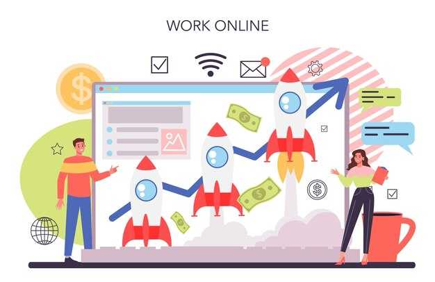
7 Beneficii ale Utilizării Paginilor de Aterizare pentru a Crește Conversiile


Folosiți o pagină de aterizare dedicată pentru fiecare campanie pentru a crește conversiile. Această abordare menține vizitatorul concentrat pe destinație și aliniază mesajul cu reclama, îmbunătățind ratele de răspuns și reducând frecarea dintre clic și conversie. Prin eliminarea navigării irelevante, creați un traseu clar de la interesul inițial la acțiune.
Știința din spatele paginilor de aterizare optimizate arată că potrivirea textului reclamei, vizualelor și beneficiilor cu nevoia vizitatorului crește încrederea. Într-un exemplu dintr-o campanie de produse exterioare de marcă, o astfel de pagină reflectă titlul reclamei, folosește aceeași paletă de culori și plasează un singur CTA proeminent, crescând conversiile cu 18-35%. Sursa de publicitate, intenția vizitatorului și produsele prezentate conduc toate această aliniere, făcând mai ușor pentru oameni să știe ce să facă în continuare și să comande sau să răspundă la ofertă.
Beneficiul doi: un singur obiectiv reduce motivele de a pleca. Un design focalizat elimină aglomerația de navigare, astfel încât vizitatorul rămâne pe traseu și evită distragerile. În teste, paginile cu un singur buton principal au înregistrat rate de conversie cu 20-40% mai mari comparativ cu layout-urile cu mai multe link-uri. Folosiți un formular concis și păstrați traseul simplu și de marcă pentru a consolida încrederea.
Beneficiul trei: simplificați formularele pentru a se potrivi cu nevoia utilizatorului. Formularele scurte cu 3-4 câmpuri cresc finalizarea cu 25-50% comparativ cu formularele lungi de intake. Oferiți produse sau conținut cu câmpuri opționale doar după consimțământul inițial. Arătați un rezumat clar al comenzii și o confirmare liniștitoare de răspuns pentru a închide bucla.
Beneficiul patru: semnalele de credibilitate cresc încrederea. Includeți câteva testimoniale de marcă, un rând de logo-uri recunoscibile și numere concrete. De exemplu, arătați un număr real de vizitatori sau o rată scurtă de răspuns alături de imagini cu produse pentru a ancora așteptările. Acest lucru reduce dubiile și îi determină pe oameni să acționeze mai rapid.
Beneficiul cinci: testarea continuă creează o buclă de învățare. Rulați teste A/B pe titluri, imagine hero și formularea CTA, concentrându-vă pe o singură metrică: conversiile. Cu fiecare test, veți ști care variante câștigă și de ce, permițând iterații mai rapide și cheltuieli de publicitate mai încrezătoare. O abordare practică: testați 2-3 variante odată, apoi scalați pagina câștigătoare la linii similare de produse.
Beneficiul șase: personalizarea deblochează un angajament mai mare pentru un public individual. Folosiți text dinamic, prețuri regionale sau recomandări de produse pentru a îmbunătăți relevanța. Când vizitatorii văd conținut care reflectă intenția lor, decalajul dintre clic și conversie se reduce, iar ROI va crește. Începeți cu un segment ușor, apoi adăugați noi segmente exemplu bazate pe comportament.
Beneficiul șapte: măsurarea clară face impactul evident. Urmăriți metrici precum rata de respingere, timpul pe pagină și procentul de vizitatori care iau acțiunea dorită. O bibliotecă de pagini de aterizare în cadrul campaniilor vă permite să comparați motivele succesului și să replicați șabloanele câștigătoare pentru alte campanii, extinzând efectul în întreg portofoliul dvs. de publicitate și crescând conversiile generale.
Planul Strategic pentru Pagini de Aterizare
Lansați o singură pagină de aterizare cu încărcare rapidă pentru fiecare ofertă, cu o propunție de valoare îndrăzneață și un singur CTA deasupra pliului. Acest lucru menține atenția focalizată și se aliniază cu mixul dvs. media, oferind un traseu curat de la impresie la acțiune. Veți vedea timpi de încărcare rapidi și un flux de utilizator mai lin când optimizați cu o bază de cod slabă.
Ce urmează este să mapați pâlna când traficul ajunge: surse de trafic, elemente de pagină de aterizare și pași de consimțământ. Urmăriți date despre viteza de încărcare, finalizarea formularului și timpul mediu până la conversie. Folosiți statistici din campaniile dvs. pentru a itera rapid; fiecare schimbare necesită un ciclu scurt de testare pentru a valida progresul.
Ierarhia vizuală contează: un titlu proeminent, un subtitlu de susținere, o imagine relevantă și un formular simplu. Construiți consistența de marcă în culori, tipografie și ton de voce. Mesajul ar trebui să fie explicit despre beneficii și pașii următori, fără ambiguitate.
Structurați pagina în jurul furnizării de valoare: includeți dovezi suplimentare precum logo-uri de clienți sau statistici rapide. Păstrați formularul scurt; reducerea câmpurilor crește conversiile și scade respingerea. Dacă rulați campanii plătite, asigurați-vă că pagina de aterizare se potrivește cu textul reclamei pentru a îmbunătăți relevanța și a reduce cheltuielile. Veți vedea costuri mai mici pe lead și rate mai mari de finalizare; banii economisiți pot fi reinvestiți în teste suplimentare.
Sfaturi operaționale: sincronizați cu rețeaua dvs. de parteneri și platforme; implementați un banner de consimțământ care respectă confidențialitatea în timp ce colectează date cheie. Nathan notează că verificările săptămânale pe viteză, angajament și conversie pe variantă contează, în timp ce Wolfe adaugă că vizualurile ar trebui să fie clare și aliniate cu mesajul. Folosiți active media, inclusiv vizualuri și videoclipuri scurte, pentru a comunica rapid. Întotdeauna actualizați pagina după confirmarea unei victorii bazate pe date.
Capturarea Rapidă a Lead-urilor: CTA-uri Clare și Focus Deasupra Pliului
Plasați un CTA îndrăzneț deasupra pliului și asociați-l cu un formular simplu cu un singur câmp care se încarcă în sub 1,3 secunde pentru capturarea rapidă a lead-urilor.
Încadrați oferta cu o linie simplă, directă precum „aflați despre șapte produse acum” și arătați un singur input pentru nume și email. Acest layout simplu crește atracția și se leagă de marca dvs., în timp ce datele vă ajută să rafinați follow-up-ul.
Păstrați câmpurile minime: întrebați pentru nume dacă aveți un motiv clar, altfel doar email. Conțineți formularul într-o carte compactă cu culori de contrast ridicat și un link rapid la politica de consimțământ. Urmăriți CTR și rata de umplere a formularului, comparați timpurile de capturare și aplicați layout-ul câștigător în campanii. Dacă optimizați pentru viteză, păstrați traseul scurt și aliniat cu titlul hero.
Roberge notează că consistența deasupra pliului crește încrederea și răspunsul. Aliniați copy-ul cu vocea de marcă și folosiți un stil de link recunoscibil pe care vizitatorii îl știu. Aplicați aceasta la șapte campanii pentru a evalua consistența cross-channel și viteza de capturare în experiențe de publicitate online.
Pentru implementare rapidă, pregătiți un text de header gata de utilizare, un buton CTA cu contrast ridicat și un formular minimal. Găzduiți activele pe un CDN rapid, testați header-ul în două variante și conectați rezultatele la platforma dvs. de date. După două săptămâni, folosiți câștigătorul ca implicit în cele șapte pagini principale și monitorizați creșterile în rata de lead cu fiecare actualizare.
Mesagerie Rafinată: Aliniați Titlurile cu Intenția Vizitatorului
Începeți cu titluri care declară nevoia exactă și beneficiul rezultat, ducând vizitatorii la un pas următor direct pe care software-ul dvs. îl permite.
Mapați fiecare titlu la una dintre cele trei intenții: viteza la valoare, claritatea rezultatului și încrederea în ofertă. Plasați titlul pe pagina unde aterizează vizitatorii și urmați cu un mesaj scurt care întărește valoarea pe care produsul dvs. o livrează.
Evitați mesageria care lucrează împotriva intenției clare; bazați copy-ul pe cercetare informată și date reale ale utilizatorilor pentru a prezenta oportunități pentru vizitatorii dvs.
Creați o listă de 3-4 variante de titluri pe intenție. Păstrați limba directă, omiteți umplutura și folosiți rezultate concrete pentru a crește conversiile. Asociați fiecare titlu cu un subtitlu de 1-2 propoziții care adaugă dovadă sau un beneficiu tangibil, păstrând tonul informai și credibil, și conectând eficient titlul la acțiune.
Exemple de titluri acționabile pe intenție vă ajută să mapați mesajul cu nevoile utilizatorului: pentru viteză, încercați „Aveți nevoie de onboarding mai rapid? Începeți în minute.” pentru claritate, „Vedeți exact ce obțineți înainte să semnați.” pentru încredere, „Alăturați-vă la peste 2.000 de echipe care se bazează pe soluția noastră.” Fiecare opțiune ar trebui să declare clar problema și rezultatul.
Plan de testare: rulați 1 titlu principal cu 2-3 variante pe paginile dvs. de aterizare pentru 1-2 săptămâni, comparați CTR și rata de conversie la demo sau înscriere. Câștigătorul ar trebui să crească performanța fără a sacrifica acuratețea. Folosiți rezultatele pentru a rafina mesageria în întreg site-ul și a captura mai multe oportunități pentru afaceri.
În final, asigurați consistența: mențineți alinierea între titlu și propunția principală de valoare pe fiecare pagină. Scopul este să ghidați vizitatorii de la titlu la acțiunea următoare lin, crescând conversiile în timp ce aveți grijă să reflectați produsul cu acuratețe.
Design Inteligent de Formular: Minimizați Câmpurile și Îmbunătățiți Înscrierile
Limitați formularul de înscriere la 3 câmpuri: nume, email și o singură alegere de interes, și asociați-l cu validare în timp real pentru a crește conversiile cu până la 35% pe homepage-uri.
Pentru ceea ce valorizează utilizatorii, prioritizați viteza: folosiți un layout cu o singură coloană, etichete vizibile și ținte mari de atingere pe mobil pentru a păstra fluxul lin și funcțional.
Ceea ce vor utilizatorii este un traseu rapid la înscriere, cu câmpuri minime și o propunție clară de valoare.
Ceea ce vor utilizatorii este un flux scurt, funcțional care păstrează branding-ul pe homepage-uri și în narațiunea serviciului.
Folosiți profilarea progresivă pentru a identifica punctele de date următoare după conversia inițială, astfel încât să puteți gestiona follow-up-urile fără a încetini utilizatorul și să adunați în continuare semnale valoroase pentru segmentare și țintire.
Revizuiți regulat analiticele de căutare și datele de pâlnie pentru a decide care câmpuri conduc conversiile, astfel încât formularul să rămână slab în funcție de sursele diferite de trafic și campanii.
În practică, aplicați astfel de pattern-uri UX precum validarea inline și profilarea progresivă pentru a reduce frecarea și a identifica ce conduce angajamentul de la prima atingere.
- Limitați câmpurile la 3 sau mai puține și testați 2, 3 și 4 pentru a determina diferența în conversii între variații; multe audiențe performează cel mai bine cu 3 câmpuri la prima înscriere.
- Activați validarea inline și indicii utile astfel încât erorile să fie identificate imediat, reducând punctele de întrerupere și păstrând formularul funcțional de la început.
- Întrebați doar ce contează la prima atingere; folosiți profilarea progresivă pentru a completa restul mai târziu într-un flux de serviciu, ceea ce îmbunătățește calitatea lead-urilor și acuratețea generală a datelor.
- Aplicați câmpuri condiționale astfel încât utilizatorii să vadă doar ce este relevant; pentru cereri de afaceri arătați câmpuri de companie, altfel săriți-le pentru a păstra așteptările clare.
- Creați butonul de submit cu text de acțiune clar și un link de confidențialitate care explică gestionarea datelor; această transparență îmbunătățită întărește branding-ul și încrederea utilizatorului.
- Folosiți placeholders și propoziții scurte care identifică ce date sunt necesare și ce se întâmplă după submitere, ajutând vizitatorii să se simtă în control și mai predispuși să convertească.
- Urmăriți metrici precum rata de abandon a formularului, conversiile și mixul de dispozitive pentru a compara performanța între homepage-uri și pagini de aterizare, apoi ajustați formularul în consecință.
Din perspectivă de marketing, designul inteligent de formular rămâne ușor, dar o ruptură puternică de aglomerație, livrând lead-uri țintite, valoroase pe care le puteți gestiona eficient prin CRM și fluxuri de serviciu.
Semnaluri de Încredere: Dovadă Socială, Badge-uri de Certificare și Confidențialitate
Plasați dovada socială și badge-urile în blocul principal al paginii dvs. de aterizare pentru a reduce frecarea pentru vizitatori și a-i ajuta să înțeleagă valoarea rapid. Arătați un panou concis cu un număr live de vizitatori, o mână de citate autentice și un link la un studiu de caz mai lung care susține afirmațiile dvs.
Semnalurile de dovadă socială construiesc încredere între dispozitive. Evidențiați testimoniale de la indivizi cu nume și rol; fie prezentați o persoană reală sau un alias clar. Un testimonial ar putea prezenta individul Roberge pentru a ilustra cum experimentează utilizatorii reali produsul dvs.
Badge-urile de certificare întăresc credibilitatea pe căile de plată și fluxuri de înscriere. Afișați PCI-DSS, ISO 27001 și sigilii de confidențialitate, cu o notă scurtă despre data ultimei auditări și scopul fiecărui badge. Cititorii înțeleg că site-ul dvs. urmează standarde definite pentru protecția datelor și procesarea securizată.
Semnalurile de confidențialitate elimină frecarea oferind controale clare. Includeți o notă transparentă de confidențialitate, controale pentru cookie-uri și o opțiune de opt-out pentru scopuri de colectare a datelor. Această abordare menține o porțiune de vizitatori confortabili în timp ce procedă cu acțiunea pe care doriți să o ia.
Semnalurile de încredere personalizate se aliniază cu marca și audiența dvs. Sunt proiectate să se potrivească stilului site-ului dvs., construite pentru consistență între canale și urmează ghiduri care reflectă numele mărcii dvs. și promisiunile. Folosiți semnale care promovează încrederea fără a promova excesiv. Pentru parteneriate afiliate, evidențiați badge-uri și urmăriți veniturile pentru a înțelege beneficiul în canalul afiliat, inclusiv campaniile viitoare.
Beneficiați de impact măsurabil. Urmăriți venitul pe vizitator, costul pe achiziție și creșterea de la semnalele de încredere în pâlnia principală. Folosiți un plan solid de date pentru a urmări schimbările și a ajusta semnalele pe măsură ce învățați ce rezonează cu vizitatorii individuali și partenerii afiliați.
| Tip de Semnal | Sfat de Implementare | Impact / Metrică |
|---|---|---|
| Dovadă Socială | Adaugați un widget rotativ în header-ul principal cu recenzii recente, rating-uri cu stele și un număr live de vizitatori; legați de oferte afiliate când este potrivit | Creștere conversii 5–15% în teste |
| Badge-uri de Certificare | Plasați badge-uri de securitate și confidențialitate lângă formulare; legați la documente de standarde; arătați data ultimei auditări | Scor de încredere sus cu 10–20% |
| Semnaluri de Confidențialitate | Oferiți controale clare pentru cookie-uri, opțiuni de acces la date și scopuri explicite pentru utilizarea datelor; activați opt-out | Respingere mai mică, începuturi de formular mai mari cu câteva puncte |
Tactici de Creștere a Listei: De la Înscrieri la Secvențe de Email Segmentate
Începeți cu un formular de înscriere clar, deasupra pliului pe pagina dvs. de aterizare și oferiți o valoare concisă pentru înscriere. Acest lucru vă ajută să capturați contactul unui vizitator și să creați oportunități pentru angajament continuu. Faceți înscrierea mai ușoară minimizând câmpurile și folosind un buton CTA direct, unic.
Explicați beneficiul în câteva cuvinte și plasați un buton proeminent care comunică clar pasul următor. Folosiți copy care vorbește despre ce va câștiga cititorul, nu doar ce vindeți.
- Tipuri de oferte de înscriere: alegeți din liste de verificare, șabloane, cursuri rapide sau insights exclusive; aliniați oferta cu audiența dvs. și promovați-o cu copy convingător.
- Plasare și design: testați plasarea deasupra pliului, formulare simple, buton cu contrast ridicat și un link la detalii de confidențialitate; păstrați landing-ul curat și focalizat.
- Calitatea datelor și ușurința: colectați doar câmpuri esențiale și activați profilarea progresivă; acest lucru face procesul mai ușor pentru vizitatori și îmbunătățește calitatea listei.
- Oportunități media: repurtați conținut pentru posturi de oaspeți, social media și parteneriate pentru a genera înscrieri fără cheltuieli plătite mari.
Treceți la segmentare începând cu un set mic de semnale: sursă, interes și comportament. Secvențele personalizate performează mai bine deoarece mesajele de marketing se potrivesc cu intenția și contextul.
- Declanșatoare de segmentare: definiți care acțiuni declanșează email-uri (descărcare, vizită pe o pagină de produs sau înregistrare la un webinar).
- Serie de bun venit: livrați valoare, explicați ce să așteptați și invitați cititorul să facă un pas următor cu frecare scăzută.
- Copy drip: creați mesaje personalizate care abordează puncte de durere comune și arată exemple de cum produsul dvs. le rezolvă.
- Aliniere de conținut: legați la resurse relevante precum studii de caz, ghiduri, tutoriale sau actualizări de produs care se potrivesc segmentului de vizitatori.
- Optimizare: testați linii de subiect, ore de trimitere și copy pentru a determina ce funcționează; testați împotriva unei baze pentru a cuantifica creșterea; măsurați rata de deschidere, rata de clic și conversia la vânzări pentru a rafina fluxul.
- Controale și consistență: setați un ritm rezonabil și includeți un opt-out explicit pentru a menține încrederea și angajamentul pe termen lung.
Prin alinierea tacticilor de înscriere cu secvențe de email segmentate, câștigați control asupra călătoriei și îmbunătățiți valoarea livrată fiecărui subscriber. Combinația de pagini de aterizare, copy și link-uri directe la pașii următori generează mai multe lead-uri în bucle de vânzări și întărește pâlnia dvs. de marketing.
Ready to leverage AI for your business?
Book a free strategy call — no strings attached.


