Îți costă site-ul lead-uri? 5 ucigași ai conversiilor de reparat acum

Rezolvă antetul paginii principale acum: fă propunerea ta de valoare vizibilă inconfundabilă la prima privire. Redesignează zona hero astfel încât audiența să citească un beneficiu concis și un singur buton orientat spre acțiune în câteva secunde. Acest lucru contează în timp și pe dispozitive, deoarece o primă impresie bună transformă vizitatorii în lead-uri angajate.
Greselile încep adesea cu o propunere de valoare neclară și un CTA vag. Soluția este concretă: rescrie titlul pentru a afirma un rezultat specific pentru audiența ta și folosește un singur CTA orientat spre acțiune în loc de un grup de link-uri, în loc de fraze largi. Plasează-l deasupra pliului și păstrează copia concisă și concentrată pe conversie.
Timpii lungi pe dispozitive mobile ucid implicarea. Pentru a întoarce situația, optimizează imaginile și fonturile, minimizează CSS/JS și servește activele dintr-un CDN astfel încât conținutul de deasupra pliului să se încarce în mai puțin de 2 secunde. Pe dispozitive cu conexiuni instabile, chiar și o mică întârziere halvează șansa ca un utilizator să facă următorul pas; urmărește Core Web Vitals și repară rapid infractorii principali.
Killer 3 este frecarea formularului: prea multe câmpuri alungă oamenii. Limitează la 3 câmpuri pentru lead-uri noi, activează auto-completare, oferă login social și folosește promptere concise cu validare inline. Acest lucru funcționează transformând interesul superficial în momentum real de conversie, în loc de un pas stagnant.
Killer 4 este lipsa semnalelor de încredere. Adaugă mărturii ale clienților, studii de caz, logo-uri recunoscute și un badge de confidențialitate vizibil. Copie clară și onestă despre manipularea datelor construiește încrederea audienței și îmbunătățește ratele de conversie pe dispozitive și momente ale zilei.
Killer 5 este o navigare încurcată și fundături. Simplifică meniurile, oferă pași următori evidenti și asigură că fiecare pagină are un drum clar către acțiune. O interfață grozavă ghidează utilizatorii către scop, și tu ști care pagini modelează cea mai bună practică. Dacă repari aceste cinci puncte, paginile tale vor funcționa mai bine într-o lume aglomerată.
5 Conversion Killers de Reparat Acum
Rezolvă paginile lente acum: o întârziere de 1 secundă poate reduce conversiile cu aproximativ 7%. Țintește LCP sub 2,5s pe dispozitive prin optimizarea imaginilor (WebP), minimizarea CSS/JS, activarea cache-ului server și folosirea unui CDN. Încarcă mai întâi conținutul de bază și păstrează textul concis; comunică beneficiul de bază în primul pli și asigură că etichetele CTA sunt clare. Folosește PageSpeed Insights pentru a vizualiza tendințele de performanță și elimină scripturile inutile care blochează randarea. Această schimbare simplă îmbunătățește calitatea percepută pe site-uri și poate crește finalizările.
Reduce frecarea formularului: limitează câmpurile la 3–5, activează validarea inline și oferă auto-completare. Folosește etichete clare, oferă un indicator de progres pentru formulare mai lungi și plasează CTA-ul principal la sfârșit. Dacă nu poți colecta toate datele în avans, oferă câmpuri opționale sau un pas de follow-up. Această abordare scade abandonul și face conversiile mai probabile. Sfaturi: rulează teste A/B pentru 2–3 variante CTA pentru a învăța care formulare și plasare funcționează cel mai bine pentru audiențele tale.
Îmbunătățește UX-ul mobil și accesibilitatea: implementează un layout responsiv, text lizibil, ținte de tap de 44px și evită pop-up-uri intruzive pe ecrane mai mici. Minimizează schimbările de layout astfel încât CLS să rămână scăzut și testează pe dispozitive iOS și Android pentru a verifica performanța. O experiență mobilă lină susține o implicare mai mare și o retenție mai bună pe site-uri și aplicații.
Clarifică valoarea și întărește CTA-urile: prezintă un singur beneficiu puternic deasupra pliului și asociază-l cu un CTA direct într-o etichetă contrastantă. Folosește text concis care comunică avantajul în primul ecran și testează formulările și culorile butoanelor pentru a crește ratele de click-through. Când măsori impactul, vei vedea cum schimbările mici pot conduce îmbunătățiri notabile pe audiențe mari și pe pagini diferite.
Elimină aglomerația de conținut și îmbunătățește navigarea: elimină secțiunile inutile, strânge titlurile și păstrează paragrafele scurte. Etichetele în meniuri ar trebui să ghideze utilizatorii către secțiunile potrivite, iar un sitemap simplificat ajută atât audiențele, cât și bot-ii de căutare. Pentru site-uri multilingve, include traduceri în chineză unde este relevant și analizează utilizarea pentru a asigura consistența pe etichete și text. Acest lucru păstrează site-urile accesibile pentru cataloage bogate de conținut și reduce bounce-ul când utilizatorii caută informații cheie.
Call-To-Action Ascuns sau Slab: Fă CTA-ul principal vizibil deasupra pliului

Mută CTA-ul principal deasupra pliului pe fiecare pagină; asigură-te că este primul element pe care audiența ta îl vede fără a derula.
Pe site-uri mobile-first, plasează CTA-ul în primul viewport astfel încât dispozitivele să aterizeze pe acțiunea potrivită în câteva secunde. Evită secțiunile aglomerate unde pasul următor se amestecă cu informațiile, cauzând ca clientul să plece fără să învețe ce să facă în continuare.
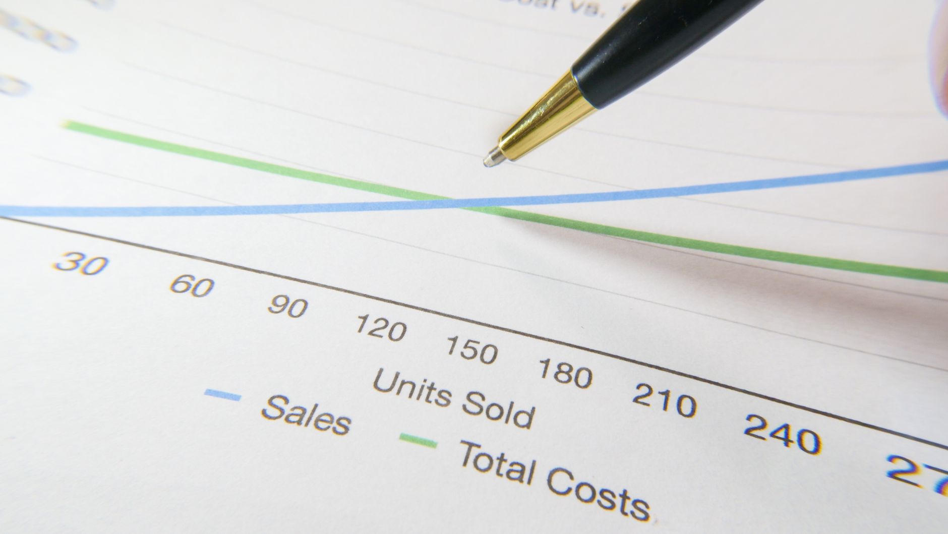
Sursă de date: analize interne pe 5 pagini de aterizare arată o creștere în CTR și lead-uri când CTA-ul principal este deasupra pliului cu contrast ridicat și copie clară. Acest lucru se traduce în impact real în vânzări pe audiență și pe dispozitive; asta înseamnă că poți converti mai des.
Pentru a câștiga aici, urmează un proces simplu: fă CTA-ul inconfundabil, testează variante și măsoară rezultatele astfel încât schimbarea să rămână. Mult din impact vine din claritate și un singur drum înainte pentru audiență.
- Audit fiecare pagină pentru a localiza CTA-ul principal curent, apoi mută-l deasupra pliului și păstrează-l în zona hero pentru desktop și mobil.
- Folosește o etichetă clară aliniată cu scopul, cum ar fi "Obține o Ofertă" sau "Află Mai Mult", asigurându-te că copia vorbește despre acțiunea potrivită și se potrivește cu intenția utilizatorului.
- Proiectează pentru contrast și ținte de tap: țintește o culoare cu contrast ridicat, tip lizibil și o zonă minimă de atingere de 44 pe 44 px; plasează butonul astfel încât să fie vizibil fără derulare pe majoritatea dispozitivelor.
- Elimină aglomerația în jurul CTA-ului: elimină link-urile sau blocurile concurente care atrag atenția; păstrează drumul către conversie scurt și bine definit.
- Testează 2-3 variante și urmărește CTR și lead-urile; confirmă o creștere înainte de a aplica varianta câștigătoare pe tot site-ul pe toate paginile.
Dacă te gândești de unde să începi, începe cu o singură pagină, verifică impactul, apoi implementează același CTA deasupra pliului pe alte pagini pentru a păstra experiența consistentă și a reduce scurgerile în funnel. Dacă ai testat abordarea, o poți aplica mai rapid pe site-urile tale și vei vedea aceeași tendință pozitivă.
Încărcare Lentă a Paginii: Comprimă imaginile, minimizează activele și activează cache-ul
Comprimă imaginile acum pentru a reduce timpii de încărcare a paginii și a crește conversiile. Țintește vizualurile hero mari prin redimensionarea la dimensiunile exacte de afișare și folosind WebP sau AVIF unde este suportat; apoi timpii de încărcare scad și utilizatorii rămân implicați. Acest lucru accelerează onboarding-ul clienților și crește șansa de a transforma vizitele în lead-uri. Pentru un site funcțional care țintește audiențe diferite, păstrează dimensiunile imaginilor mobile mici și clare pe desktop. Învață care formate performează cel mai bine prin teste și etichete care te ajută să compari timpii și rezultatele.
Minimizează activele: elimină spațiile albe, comentariile și CSS/JS neutilizat; combină fișierele unde are sens; activează gzip sau Brotli. În practică, minimizarea reduce payload-ul cu 20-40% în medie, iar eliminarea CSS-ului neutilizat poate tăia dimensiunea CSS cu până la 30%. Acest lucru reduce time-to-interactive și păstrează experiența lină pentru utilizatori. Apoi poți analiza cum aceste schimbări afectează timpii de încărcare pe dispozitive și rețele.
Activează cache-ul: setează durate lungi de cache pentru activele statice (de exemplu, un an) cu headere Cache-Control; folosește cache busting corespunzător pentru actualizări astfel încât utilizatorii să nu primească fișiere învechite. Când este făcut corect, încărcările inițiale scad cu 30-50%, iar vizitele repetate devin aproape instantanee, crescând reach-ul și retenția. Pentru dezvoltatori, etichetează grupurile de active și aplică politici consistente astfel încât schimbările să nu surprindă audiențele. Acest lucru nu este doar despre viteză; este despre păstrarea momentum-ului și reducerea timpului pe care clienții îl petrec așteptând. Asta este cum transformi experiențele mai rapide în rezultate tangibile.
Propunere de Valoare Neclară: Afirmă un singur beneficiu convingător în hero
Afirmă un beneficiu concret în hero: Crește conversiile cu 25% în 30 de zile. Această promisiune unică, măsurabilă ancorează mesajul tău și face valoarea evidentă în două secunde. Dacă încerci să repari mesajul slab, începe aici: hero-ul ar trebui să însemne ce livrezi, nu ce speri să realizezi.
Păstrează-l ușor de scanat și concis. Majoritatea site-urilor folosesc afirmații generale care amestecă scopul; un beneficiu unic, clar taie zgomotul și setează o așteptare clară pentru performanță. Folosește un mesaj îndrăzneț, apoi susține-l cu un subcap concis astfel încât cititorul să înțeleagă cine beneficiază și de ce.
Cum să implementezi: rafinează beneficiul de bază până când este suficient de strâns pentru a fi comprimat pe o linie, apoi testează două variante pentru 1–2 săptămâni. 1) alege beneficiul care înseamnă cel mai mult pentru audiențele tale țintă; 2) creează un hero de 2–6 cuvinte împerecheat cu un subcap de 8–12 cuvinte; 3) adaugă un punct de date sau dovadă (opțional) pentru a susține afirmația; 4) evită etichete multiple care diluează impactul.
Dacă ai o audiență chineză, localizează valoarea astfel încât promisiunea să rezoneze cu prioritățile și benchmark-urile lor. Nu te baza doar pe traducere directă – ajustează numerele și framing-ul pentru a reflecta nevoile reale pe acea piață păstrând mesajul concis și concentrat.
Exemple pe care le poți adapta: Crește conversiile cu 28% în 30 de zile; Crește înscrierile cu 25% în 3 săptămâni; Scade timpul de checkout cu 40% în 2 săptămâni. Alege unul și comprimă conținutul în jurul lui, apoi etichetează hero-ul cu un beneficiu unic, clar astfel încât să eviți mesajele conflictuale și să păstrezi atenția utilizatorului solidă pe rezultat.
Măsurarea succesului se reduce la semnale de performanță: urmărește CTR, începuturile de formulare și timpul pe pagină pentru a afla dacă hero-ul rezonează. Dacă ai identificat un beneficiu unic care mișcă acul, rafinează restul conținutului pentru a-l întări și îmbunătățește consistența pe serviciul site-ului și conținut, asigurându-te că mesajul este ușor, direct și credibil.
Frecare Formular: Taie câmpurile și oferă auto-completare sau login social
Taie câmpurile la 3–4 esențiale și oferă auto-completare sau login social. Lucrul de focus pentru liderii de afaceri este reducerea lungimii formularului deoarece ridică direct ratele. Lasă deoparte datele non-critice; nu forța utilizatorii să completeze câmpuri de care nu au nevoie pentru pasul următor. În teste, scurtarea formularelor de la 6–8 câmpuri la 3–4 a crescut ratele de finalizare mobile cu 25–40% și a îmbunătățit scorurile de pagespeed cu până la 15%. Dacă ai observat că utilizatorii abandonează la primul pas, această schimbare va ajuta.
Auto-completarea și login-ul social deblochează un drum puternic și rapid. Auto-completarea economisește secunde; login-ul social elimină frecarea parolei, mai ales pe dispozitive mobile-first. Care este focusul pentru următoarea ta actualizare? Oferă indicii de auto-completare și păstrează numărul de câmpuri redus. Folosește Google, Apple și Facebook login ca opțiuni și plasează-le deasupra pliului. Această abordare crește încrederea și finalizarea și poate ridica ratele de conversie cu o marjă semnificativă pentru majoritatea paginilor.
Implementare și măsurare: efectuează teste A/B. Rulează varianta A cu 4 câmpuri și varianta B cu 2 câmpuri plus auto-completare + login social. Urmărește rata de finalizare, abandonul și timpul mediu până la submit. Dacă ratele se îmbunătățesc cu 15–30%, implementează varianta câștigătoare pe pagini. De asemenea, optimizează pagespeed prin amânarea scripturilor non-critice și eliminarea elementelor de formular neutilizate. Mai întâi, asigură-te că fluxul mobile-first este prietenos cu tap-urile; concentrează-te pe etichete clare, ordine de focus accesibilă și validare rapidă. Prin aceste ajustări, vei crește încrederea și îi vei menține mișcându-se către conversie.
Experiență Mobilă Slabă: Asigură design responsiv și ținte tapabile
Implementează un layout mobile-first cu o țintă minimă tapabilă de 44x44 px, ideal 48x48 px, și 8 px spațiu între controale pentru a preveni mis-tap-urile. Plasează etichetele direct lângă controalele lor și păstrează zona de atingere înconjurătoare clară astfel încât clienții să poată interacționa rapid și precis. Când țintele rămân vizibile pe măsură ce derulează, se transformă în acțiuni puternice și rapide care cresc implicarea și comunică conținutul clar.
Comprimă imaginile și activele pentru a îmbunătăți performanța. Comprimă fișierele de imagine cu 40-60% unde calitatea rămâne bună și folosește tehnici de imagine responsivă (srcset, sizes) plus formate moderne precum WebP sau AVIF pentru a reduce ratele de date. Paginile mai rapide reduc bounce-ul și scăderea post-implicare; multe site-uri văd câștiguri măsurabile în timpii de încărcare și profunzimea sesiunii când activele sunt optimizate.
Fă conținutul ușor de scanat pe ecrane mici. Folosește headere concise, paragrafe mai scurte și spațiu alb generos. Asigură-te că elementele clickabile au zone de hit generoase chiar pe layout-uri dense, astfel încât să rămână puternice și ușor de atins. Ei se vor simți văzuți și valorizați, și acest lucru îmbunătățește încrederea și conversia.
Accesibilitate și vizibilitate: asigură-te că contrastul de culoare respectă ghidurile, păstrează textul lizibil și oferă contururi de focus pentru utilizatorii de tastatură. Elementele vizibile ajută toate audiențele să se miște eficient; rafinează spațierea, dimensiunea fontului și contrastul pentru a menține o experiență bună a utilizatorului pe dispozitive. Pentru a analiza tendințele, extrage analizele și ajustează.
citat: "viteza contează" pentru audiențele mobile. Folosește această perspectivă pentru a justifica deciziile de design echipelor și stakeholder-ilor; vrei să livrezi o experiență puternică care comunică valoarea rapid.
| Acțiune | Impact |
|---|---|
| Setează ținta minimă tapabilă la 44px, țintește 48px | reduce mis-tap-urile și crește conversiile |
| Folosește srcset și WebP/AVIF; comprimă activele | timpuri de încărcare mai rapide și performanță mai bună |
| Păstrează etichetele lângă controale și asigură ținte de atingere clare | îmbunătățește comunicarea cu clienții |
| Oferă text cu contrast ridicat, scalabil și contururi de focus | îmbunătățește vizibilitatea pe dispozitive |
Ready to leverage AI for your business?
Book a free strategy call — no strings attached.


