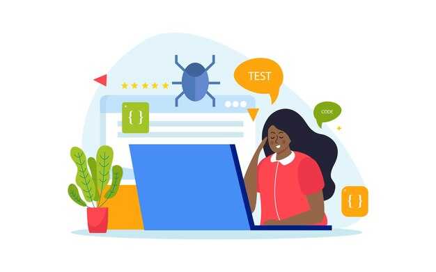
Ce este în neregulă cu site-ul meu? Lista de verificare a site-urilor web proaste

Efectuați un audit rapid acum: reparați elementele nepotrivite din meniu, îmbunătățiți consistența browserului și reparați o problemă evidentă care încetinește acoperirea.
Pentru profesioniști, primul accent este o experiență consistentă pe toate paginile, deoarece un model comun reduce confuzia și ajută site-ul să urce în clasamente menținând utilizatorii implicați mai mult timp și îmbunătățind acoperirea.
Auditați sistemul de design ca o bibliotecă de componente reutilizabile, asigurându-vă că elementele din meniu se potrivesc cu sarcini reale. Un clic al utilizatorului pe un link ar trebui să ducă la o pagină previzibilă fără puncte moarte și fără confuzie.
Testați pe medii reale de browser, inclusiv mobile, pentru a asigura o experiență digitală care rămâne consistentă în aspect, culoare și tipografie. Documentați problemele relevante probleme și prioritizați reparațiile într-o bibliotecă de acțiuni pentru a îmbunătăți clasamentele și acoperirea.
Nu există loc de presupuneri aici: listați elementele elemente, marcați problema, atribuiți proprietari și măsurați impactul cu date reale din analize și clasamente. Această metodă menține echipele concentrate și reduce confuzia.
Ce este în neregulă cu site-ul meu? Lista de verificare a site-urilor proaste; Cum să reparați greșelile comune
Începeți cu un audit focalizat al paginii de start: eliminați aglomerația, afișați o singură propunere de valoare clară deasupra pliului și plasați o acțiune principală în față și în centru. Folosiți grafică slabă și evitați elemente grele care încetinesc încărcarea; când testați, ar trebui să vedeți un timp mai rapid până la prima interacțiune.
Verificați profunzimea conținutului și a limbajului: înlocuiți jargonul cu limbaj simplu, prezentați un beneficiu distinct în primul paragraf și susțineți afirmațiile cu date actuale din rapoarte. Dacă simțiți absența detaliilor specifice privind prețurile, studiile de caz sau opțiunile de contact, adăugați-le.
Elemente vizuale și animații: graficele ar trebui să întărească mesajul, nu să distragă atenția; suprasolicitarea animațiilor poate încetini paginile și face interacțiunile inconsistente. Dacă folosiți animații, păstrați-le scurte și accesibile; asigurați-vă că clic pe un CTA oferă un pas următor util.
Navigare și structură: meniurile actuale ar trebui să fie consistente pe toate paginile; reduceți numărul de opțiuni, aliniați etichetele cu așteptările utilizatorilor și oferiți un proces de încredere pentru găsirea informațiilor. Afacerile citesc rapoarte și se bazează pe instrumente precum hărțile de căldură pentru a vedea unde cititorii abandonează și cum să netezească căile pentru clicuri.
Măsurare și reîmprospătare: stabiliți un ritm simplu de studiu – verificări lunare, revizuiri trimestriale – și bazați-vă pe rapoarte de la instrumente de analiză în loc de presupuneri. Monitorizați metrici precum timpul pe pagină, rata de respingere și rata de conversie; folosiți descoperirile pentru a reîmprospăta paginile una câte una în loc de o rescriere completă.
| Problemă | De ce contează | Reparație rapidă | Exemplu |
|---|---|---|---|
| Supraîncărcare cu grafice | Încetinesc încărcarea și distrag atenția de la mesaj | Comprimați activele, activați încărcarea leneșă, treceți la vector unde este posibil | Imagine hero 1200x630 redusă la 120 KB; folosiți WebP |
| Absența limbajului actual | Cititorii parcurg rapid; limbajul neclar provoacă abandonări | Rescrieți cu propoziții scurte; folosiți puncte; includeți un punct de date pe pagină | Pagina de produs arată preț și stoc actualizat; ștampile de dată pe postări |
| Navigare inconsistentă și suprasolicitare a animațiilor | Utilizatorii se pierd; mișcarea încetinește percepția | Standardizați etichetele meniului; limitați animațiile; adăugați opțiune de reducere a mișcării | Etichetele nav superioară se potrivesc cu footer-ul; animații prietenoase cu mobilul oprite |
| Lipsa pașilor următori după clic | Clicurile duc la puncte moarte; ratează oportunități | Linkați CTA-urile la pagini dedicate; asigurați încărcare rapidă | "Obțineți o ofertă" deschide un formular focalizat, nu o pagină generică |
Diagnostice practice și reparații pentru un site prost
Efectuați un audit rapid de securitate și performanță folosind jurnalele serverului și consola browserului pentru a identifica problemele și a mapa reparațiile care contează prin metrici de încredere.
Urmăriți problemele prin zone critice: performanță, conținut, accesibilitate, securitate și SEO; problemele au fost grupate în categorii pentru a evita extinderea scopului și pentru a atribui proprietari clari de echipă pentru fiecare zonă a site-ului.
Verificați dimensiunile activelor: optimizați dimensiunile imaginilor, comprimați CSS/JS și activați încărcarea leneșă pentru ca randarea să rămână fluidă pe conexiuni lente.
Auditați plasarea reclamelor și CTA-urilor plasare pentru a preveni îngroparea conținutului, evitând intruziuni precum modale agresive care întrerup interacțiunea.
Aplicați un set de măsuri pentru a întări securitatea și fiabilitatea: corectați dependențele, activați limitarea ratei, implementați un WAF de bază și înregistrați activitatea suspectă pentru analiza modelelor.
Revizuiți corectitudinea conținutului și alinierea cuvintelor cheie: asigurați-vă că titlurile, textul corpului și metadatele reflectă cuvintele cheie intenționate, că paginile de ofertă se aliniază cu intenția utilizatorului și că conținutul este creat cu o voce consistentă și scris corect.
Verificați activele create pentru accesibilitate: text alt pentru imagini, HTML semantic, contrast lizibil; asigurați-vă că activele create respectă ghidurile de dimensiune și evită schimbări de aspect.
Coordonați cu echipa pentru a implementa schimbări în iterații scurte: atribuiți proprietari, măsuri și validați îmbunătățirile cu date reale de la utilizatori și jurnale; creând progres vizibil prin ajustarea plasării și dimensiunilor după nevoie și menținând cuvintele cheie aliniate.
Urmăriți progresul cu metrici concrete metrici: încărcare pagină, CLS, timp până la primul octet, rate de erori și conversie pe categorie; mențineți o listă de verificare vie a îmbunătățirilor pentru a susține calitatea site-ului pe cicluri.
Folosiți feedback-ul pentru a rafina categoriile, paginile de ofertă și strategia de conținut astfel încât site-ul să rămână util și de încredere pentru vizitatori.
Identificați blocajele de viteză a paginii și reparații concrete
Efectuați un audit precis Lighthouse și reparați primele blocaje. Faceți-l pe fiecare pagină pentru a evita timpi inconsistenti. Dacă auditul semnalează timpi greșiți de răspuns al serverului, sarcini lungi sau active care blochează randarea, abordați-le imediat. Capturați informații precum TTFB, LCP, CLS și timpul total de blocare în consolă pentru a citi numere clare și a ști unde să acționați. Sigur, un pas separat este să verificați scripturile terțe și impactul lor asupra timpilor de încărcare.
Inspectați activele și temporizarea rețelei pentru a localiza principalii vinovați: vizuale supradimensionate, scripturi neminificate și CSS care blochează randarea. Folosiți consola pentru a detalia cererile și identificați care dintre ele fac pagina să pară lentă. Dacă o cerere încarcă conținut nnesecurizat sau se învârte de la un gazdă lentă, reparați ruta și asigurați-vă că identitatea site-ului este de încredere pentru cititori. Dacă sunteți pe găzduire partajată, luați în considerare upgrade-ul la un plan cu performanță CPU mai bună și mai multă memorie.
Imaginile ar trebui convertite la WebP sau AVIF, dimensionate la dimensiuni exacte și livrate cu srcset și atribute sizes responsive. Activați încărcarea leneșă pentru vizualurile de sub pliu și setați lățime și înălțime pe fiecare imagine pentru a rezerva spațiul de aspect. Comprimați activele pentru a reduce byte-urile cu o marjă măsurabilă fără pierdere vizibilă de calitate. Pentru icoane și ilustrații, preferați formate vectoriale sau foi de sprite mici unde este posibil. Pe lângă, păstrați vizualurile bine optimizate pe dispozitive pentru ca cititorii să nu aștepte pe fișiere mari.
Scripturi și stiluri: eliminați CSS nefolosit, tăiați elemente grele elemente, împărțiți codul în bucăți mai mici și amânați JavaScript non-critic. Minificați și comprimați CSS și JS și inline doar CSS critic pentru conținutul deasupra pliului. Folosiți un pas de build robust care bundlează, treeshake și elimină codul mort. Acest lucru reduce cantitatea de muncă pe care browserul trebuie să o facă la încărcare.
Fonturi și cale de randare: evitați fișiere de font mari; găzduiți fonturile local unde este posibil; preconnectați la origini necesare și preîncărcați cele mai importante fonturi. Mutați widgeturile terțe să se încarce după interacțiune sau eliminați-le complet dacă nu sunt esențiale. Acest lucru reduce timpul de blocare și îmbunătățește vizualurile pe dispozitive și rețele.
Livrare și găzduire: activați compresia Brotli sau gzip, activați HTTP/2 sau HTTP/3 dacă este disponibil și setați durate lungi de cache pentru active statice. Folosiți un CDN pentru a livra fișierele mai aproape de utilizatori și a reduce latența trans-regională. Verificați că toate resursele vin prin HTTPS pentru a preveni cererile nesecurizate, care dăunează încrederii și pot provoca avertismente de securitate pe site.
Validare și ajustări continue: după fiecare rundă, reverificați pe mai multe dispozitive și condiții de rețea. Citiți noile rapoarte, comparați cu linia de bază și ajustați formularea și apelurile la acțiune pentru a evita blocarea experienței de citire. Mențineți o strategie robustă, consistentă documentând reparațiile și auditând din nou la fiecare câteva săptămâni când eliberați schimbări.
Găsiți și reparați linkuri rupte, 404-uri și bucle de redirecționare
Efectuați un crawl acum pentru a identifica fiecare link rupt și redirecționare nepotrivită. Exportați lista de 404, apoi clasificați reparațiile după impact asupra utilizatorilor și paginilor cele mai vizitate. Tratați fiecare element ca o greșeală și atribuiți un proprietar clar pentru ca responsabilitatea să fie creată și susținută ani de zile.
Reparați 404-urile în 24 de ore unde este posibil; pentru destinații învechite, implementați o redirecționare 301 către cea mai bună potrivire și monitorizați pentru bucle. Construiți o hartă robustă de redirecționare și tăiați lanțuri lungi care cresc timpul de încărcare; evitați căi aglomerate care confundă utilizatorii și motoarele de căutare.
Folosiți culori pe dashboard pentru a evidenția nepotriviri, certificate expirate și active rupte. Separați problemele pe tip de pagină și mapați barierele care încetinesc reparațiile. Configurați verificări de monitorizare continue cu alerte automate pentru a nu rata niciodată un link prost din nou.
După reparații, programați un audit recurent și integrați-l în fluxul de lucru CMS. Antrenați creatorii de conținut să verifice linkurile înainte de publicare și cereți o verificare a certificatelor pentru paginile SSL. Acest lucru menține linkurile robuste și reduce frustrarea utilizatorilor pe dispozitive și ani.
Îmbunătățiți navigarea: structură clară, CTA-uri vizibile și meniuri consistente
Implementați o navigare superioară cu nu mai mult de șase elemente și un singur CTA proeminent vizibil pe fiecare pagină. Acest lucru clarifică imediat unde să mergeți și reduce timpul de căutare pentru acțiuni importante, făcând navigarea mai fluidă. Această navigare este proiectată să fie lizibilă și rapidă.
Imaginați un utilizator care ajunge frustrat de un header aglomerat. O structură curată taie zgomotul și semnalează opțiunile rapid, oferind o oportunitate semnificativă de a converti vizitatori curioși. Aplicați întotdeauna culori cu contrast ridicat pentru acțiuni noi; culoarea singură nu ar trebui să transmită sens. Rezultatul este etichete informative și interacțiune mai ușoară.
Iată o listă compactă de acțiuni concrete pe care le puteți implementa acum:
- Structură și semantică: construiți cu o regiune nav semantică, un link skip-to-content și o ordine de nivel superior scurtă și previzibilă. Păstrați logo-ul brandului legat de acasă și etichetați toate elementele clar pentru a reduce sarcina cognitivă pentru submeniurile de nivel doi.
- CTA-uri vizibile: stilizați acțiunea principală cu o culoare distinctă și o zonă de atingere mai mare. Furnizați text descriptiv (nu doar icoane), asigurați un contrast minim de culoare și mențineți forme consistente de butoane pe toate paginile. Furnizați etichetare care ajută utilizatorii să evite greșelile și este mai informativă decât indicii doar cu icoane.
- Consistența meniurilor: păstrați aceleași elemente în aceeași ordine pe fiecare pagină și folosiți indicatori clari pentru dropdown-uri. Utilizatorii de tastatură ar trebui să ajungă la fiecare element cu o singură secvență Tab, iar stările de focus ar trebui să fie evidente.
- Preveniți supraîncărcarea: limitați linkurile header la șase sau mai puține; mutați opțiunile rare într-o zonă secundară (footer, bibliotecă sau căutare) pentru a reduce aglomerația și a accelera deciziile.
- Grupare acțiuni cu butoane meniuri: plasați acțiunile care contează cel mai mult într-un singur bloc pentru a ghida comportamentul. Acest bloc distinct reduce frecarea și face sarcini precum logare sau checkout mai eficiente.
- Securitate și fiabilitate: verificați toate destinațiile externe, deschideți-le într-un tab nou când este potrivit și folosiți atribute rel sigure pentru a proteja utilizatorii de tabnabbing.
- Sistem de design și meta: bazați-vă pe o singură bibliotecă de design pentru culori, tipografie și controale astfel încât contrastul să rămână consistent și UI-ul să pară coerent pe măsură ce utilizatorii navighează prin site.
Îmbunătățirile rezultate includ respingere mai mică, sesiuni mai lungi și căi mai directe către conținut. Dacă analizați analizele, vă veți întreba cât de mult mai rapid navighează oamenii când meniurile rămân consistente și CTA-urile sunt clar vizibile. Această abordare este distinctă de ajustările ad-hoc și creează o bază creativă, durabilă pe care o puteți reutiliza pe pagini și variații meta.
Continuați testarea cu un obiectiv clar, măsurați profunzimea interacțiunii și actualizați biblioteca pentru a menține oportunitatea pe ani.
Îmbunătățiți claritatea conținutului: lizibilitate, relevanță și mesaje succinte

Rescrieți mesajul principal de pe fiecare pagină într-o singură propoziție focalizată pe beneficii care declară clar ce câștigă vizitatorul. Plasați-o în zona hero și aliniați numele, propunerea de valoare și apelul la acțiune cu aspectul pentru a construi încredere.
Identificați nevoile audienței combinând analize actuale, feedback direct și rapoarte de la puncte cheie de contact pentru a menține conținutul relevant și țintit pentru fiecare pagină.
Imaginați conținut care se adaptează pe canale digitale și dispozitive; păstrați limbajul concis și acționabil, cu verbe active care ghidează comportamentul cititorului.
Folosiți voce activă, propoziții scurte și paragrafe strânse; activați indicii vizuale precum headere bold și spațiere clară pentru a îmbunătăți scanabilitatea.
Testați pe browser și mobil pentru a asigura că secțiunile non-responsive nu degradează lizibilitatea; semnalați copy și vizualuri incorecte, nepotrivite sau greșite și reparați-le rapid.
Luați în considerare mai multe blocuri prezentate, mapați-le la etapele actuale ale căii utilizatorului și asigurați-vă că fiecare bloc răspunde la o întrebare distinctă pe care o are vizitatorul.
Când gestionați actualizările, mențineți un stil consistent de nume și verificați că copy-ul întărește încrederea și consolidează reputația cu vizitatorii.
Măsurați eficacitatea cu metrici simple: timp pe pagină, profunzime scroll și rată de conversie; generați rapoarte săptămânal pentru a urmări progresul și ajusta în consecință.
Ready to leverage AI for your business?
Book a free strategy call — no strings attached.


