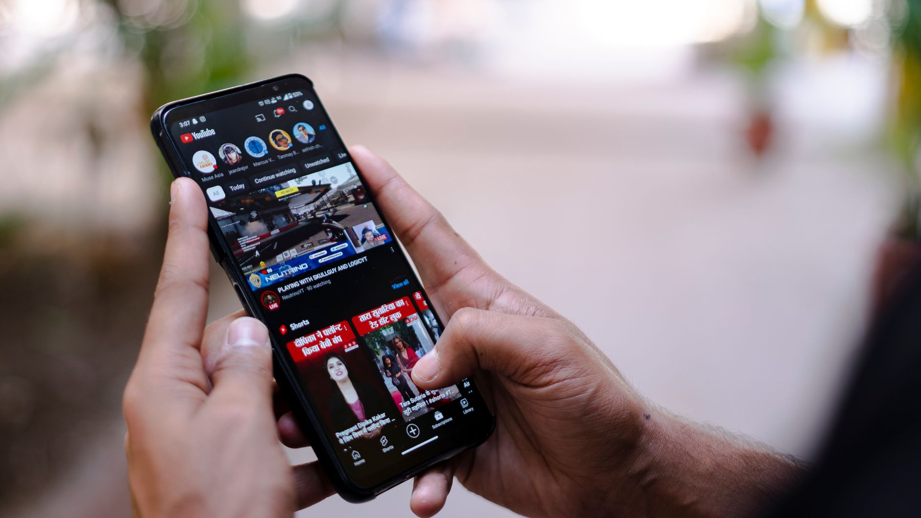
Как создать увлекательные вертикальные объявления для YouTube с помощью Simplified — Полное руководство

Запустите вертикальное объявление длительностью 9–15 секунд с видимым брендом в первые 2 секунды. Эта сила позволяет вам охватить аудиторию там, где они проводят время, и единое четкое ценностное предложение делает сообщение запоминающимся. Используйте шаблоны Simplified для быстрого создания вариантов, добавив сильный призыв к действию на последнем кадре и специальную кнопку, которая ведет на вашу посадочную страницу. Этот подход дает брендам быстрый путь для тестирования идей и экономии творческих циклов на разных платформах, включая Twitter. Если вам нужно протестировать больше идей, попробуйте 3 быстрых варианта и сравните результаты. Это не просто вещи; это данные, на которых вы можете действовать.
Кадры и визуалы имеют значение: используйте массив из 4–6 кадров, с 1,5–2,5 секундами на кадр, ограничивая текст 6–8 словами на кадр. Используйте композицию 9:16, типографику с высоким контрастом и субтитры для поддержки просмотра без звука. Внесите основную выгоду в первые 3 секунды и включите приглушенный сигнал бренда в углу. Используйте родные звуки или легкую музыку для повышения вовлеченности пользователей и полагайтесь на блоки Simplified для создания премиального вида на всех устройствах.
Стратегия аудитории: создайте 3 целевых варианта для разных аудиторий, таких как покупатели, педагоги и хоббиисты. Отслеживайте производительность по аудиториям и быстро корректируйте креативы. Держите сообщения краткими и включайте четкий призыв к действию, соответствующий пути на посадочную страницу. Если аудитория видит слово о выгоде в первом кадре, они с большей вероятностью нажмут кнопку и изучат дальше. Если создатель не комфортно чувствует себя с длинным текстом, держите кадры краткими.
Тестирование и метрики: запускайте 3–5 вариантов в неделю, измеряйте CTR, время просмотра и конверсии. Для вертикальных объявлений YouTube стремитесь к CTR около 1,2–2,5% и времени просмотра выше 60% от видео, с сильным призывом к действию на последнем кадре. Распределяйте бюджет на основе ранних сигналов; перенаправляйте бюджет на лучшие исполнители, чтобы сэкономить расходы и максимизировать охват. Тегируйте активы по кампании, набору объявлений и варианту, чтобы держать данные организованными по аудиториям и размещениям. На основе ранних данных отсеивайте слабых исполнителей в течение 7–10 дней, чтобы держать портфель lean. Активы, которые были протестированы неоднократно, подтверждают, что работает.
Рабочий процесс и ресурсы: Создайте библиотеку шаблонов в Simplified, повторно используйте компоненты и добавляйте новые варианты еженедельно. Хорошо организованный массив активов экономит время и помогает брендам поддерживать стабильный вывод. Держите пользовательский опыт плавным, тестируя сначала на мобильных устройствах, соответствуя ожиданиям интерфейса и обеспечивая быстрое время загрузки. Этот подход поддерживает пожизненную вовлеченность с аудиториями, которые любят ваши продукты, превращая зрителей в повторных клиентов.
Настройка проекта вертикального объявления YouTube в Simplified
Создайте вертикальный проект 9:16 в Simplified, обрежьте клипы до 6-15 секунд и разместите хук в первые 2 секунды для доставки воздействия. Используйте вертикальное полотно с разрешением 1080x1920, 30-60fps, и экспортируйте как MP4 (H.264) с аудио AAC для четкого воспроизведения.
Интерфейс удобный и интуитивный, позволяя корректировать визуалы несколькими кликами и специальным инструментом обрезки. Используйте генератор для создания вариаций копии и смены сцен, затем сопоставьте 3-5 сцен в последовательность, которая ощущается быстрой и убедительной. Этот процесс помогает вашему объявлению выглядеть профессионально, экономя время. Вы также можете добавить четкую кнопку CTA и протестировать разные музыкальные треки, чтобы увидеть, на что реагируют ваши пользователи.
Чтобы достичь правильной аудитории, настройте демографию, такую как возраст, пол и география, затем добавьте интересы и устройства. Свяжите ваши креативные активы с сегментами рекламы Facebook, чтобы поддерживать последовательность на всех каналах. Подготовьте массив вариантов объявлений, сосредоточенных на вашем основном предложении, затем полагайтесь на данные для руководства корректировками. Факт в том, что более короткие, энергичные объявления часто дают более высокие ставки завершения среди интернет-пользователей, особенно когда первые кадры захватывают внимание.
Конфигурация активов
Загрузите ваш материал, затем обрежьте для импульса. Держите текстовые наложения минимальными: максимум 2 строки, с жирными шрифтами sans и высоким контрастом. Разместите ваш логотип в ненавязчивом углу для повышения доверия к бренду. Добавьте музыку, которая соответствует атмосфере, но остается достаточно тихой, чтобы голос или субтитр пробивался. Используйте прямой призыв к действию, такой как "Купить сейчас" или "Узнать больше", привязанный к нажимаемой кнопке наложения. Используйте массив шаблонов в Simplified для быстрого создания 3-5 вариантов, меняя цвет, копию и зацепляющее начало, чтобы увидеть, что резонирует.
Экспорт, обзор и публикация
Экспортируйте активы в MP4 с 1080x1920, 30fps, и проверьте, что битрейт остается выше 8 Мбит/с для четкости. Предварительный просмотр на мобильных устройствах, чтобы обеспечить читаемость и избежать переполнения на маленьких экранах. Генерируйте альтернативные субтитры и строки субтитров для пользователей, которые смотрят без звука. Сохраняйте каждую версию с четким именованием, затем публикуйте активы на YouTube и кросс-промотируйте в рекламных кампаниях Facebook для последовательности. После запуска отслеживайте производительность по CTR, ставке просмотра и демографическому разбору, и итеративно на основе результатов.
Выберите формат 9:16 и определите безопасные зоны для текста и брендинга
Начните с 9:16 как базовой и зафиксируйте две безопасные зоны, чтобы предотвратить обрезку на мобильных экранах. Держите критический текст и брендинг внутри центральной области от 20% до 80% ширины кадра и 16% до 84% высоты кадра, чтобы все сообщение оставалось читаемым во время прокрутки и когда аудитория смотрит вживую на маленьких устройствах.
Для стандартного полотна 1080x1920 разместите направляющие на 216px с обеих сторон и на 307px от верха и низа. Это создает центральную безопасную зону шириной 648px и простирающуюся от 307px до 1613px вертикально. Все заголовки, текст на экране и логотипы должны оставаться внутри этой зоны для сохранения видимости на всех устройствах и платформах.
Советы по размещению: держите заголовки и текст на экране внутри горизонтальной полосы 20%–80% и вертикальной полосы 16%–84%. Кнопка (CTA) должна располагаться в нижней части безопасной зоны, примерно в диапазоне 64%–84% вертикально и все еще между 20%–80% ширины, чтобы она оставалась нажимаемой без загромождения нижнего края.
Типографика и брендинг требуют четкого контраста и масштабируемых размеров. Используйте заголовки 26–34px для мобильных, основной текст 14–18px и жирный логотип 18–24px. Держите брендинг внутри центральной полосы для поддержания последовательности при прокрутке через фид и на разных экранах. Этот подход улучшает делимость и опыт для зрителей, когда они смотрят и публикуют контент на интернет-платформах.
Рабочий процесс и инструменты: проектируйте с помощью специального инструмента, чтобы отметить безопасные зоны рано в процессе. Если вам нужен быстрый вариант, попробуйте Wondershare для быстрого экспорта при сохранении макета. Это держит весь проект компактным и лучше сохраняет текст и брендинг на всех устройствах, что помогает командам создателей производить последовательные результаты с меньшим количеством переписки.
Планируйте окно выпуска в пятницу, чтобы просмотреть окончательное расположение с командой. Они оценят чистые заголовки, стабильные уровни аудио и четкий CTA, который приглашает зрителей публиковать и взаимодействовать. Помните: цель — максимизировать просмотры с первого кадра, сохраняя опыт живым и доступным на всех социальных фидах, без ущерба для целостности бренда.
Создайте хук 0–3 секунды, который захватывает внимание
Начните с смелого однострочного сообщения, показанного в первом кадре, которое обещает четкий результат, например "получите больше кликов сейчас". Сочетайте его с характерным звуковым сигналом и быстрым движением, чтобы зафиксировать внимание в окне 0–3 секунды. Используйте типографику с высоким контрастом и один узнаваемый элемент, чтобы избежать беспорядка. Делайте это без усилий, держа кадр компактным и перетаскивание одного инструмента или значка простым.
Основы кадра
Держите кадр простым: один субъект, одна основная идея, без лишнего текста за пределами сообщения. Используйте жест перетаскивания или быстрое раскрытие, чтобы намекнуть на выгоду; это можно сделать быстрым перетаскиванием инструмента или слайдера. Покажите голову бренда в углу для обеспечения узнавания. Звуки должны совпадать с движением; краткий поп или клик может повысить удержание. Эта настройка работает на всех форматах и размещениях платформ, и она поможет всем запомнить сообщение в их жизни.
Шаги реализации
Определите центральное сообщение и визуал в вашем рабочем процессе создателя, затем опубликуйте короткий пост на платформе, который генерирует клики и вовлеченность. Сочетайте кнопку на экране с четким призывом к действию и безопасной ссылкой на ваш сайт. Тестируйте на диапазоне форматов и устройств, и сравнивайте результаты в вашем руководстве по более широким целям рекламы. Используйте финальный кадр для укрепления доверия с простым сообщением, значком или иконкой наград и головой логотипа. Вы измерите результаты в кликах и посмотрите, как они смещаются, когда вы оптимизируете: держите изменения маленькими, итеративно быстро и продолжайте помогать вашей аудитории контентом, который ощущается родным и полезным.
Соберите визуалы в стиле бренда: Цвет, типографика и наложения в Simplified
Зафиксируйте базовый 2-цвет с 1-2 акцентными цветами и настройте типографику для читаемости. Сохраните эти правила в Brand Kit Simplified, чтобы каждый актив сохранял один и тот же вид на кампаниях и каналах. Эта последовательность помогает пользователям быстрее узнавать ваш бренд, и делает объявления более способными завораживать аудитории на более широком рынке. Используйте royalty-free активы, когда возможно, и рассмотрите платные шрифты, если они повышают читаемость на маленьких экранах. Когда вы готовите, вы обеспечиваете, что контент попадает в фиды Facebook с 60 процентами доминирования основного цвета и четкими блоками CTA, которые направляют их к вашему продукту.
Согласование цвета и типографики в Simplified
Стратегия цвета держит визуалы сфокусированными и делимыми. Используйте 60 процентов основного цвета, 30 процентов вторичного и 10 процентов акцента для создания контраста без загромождения кадра. Текст должен располагаться на поверхностях с высоким контрастом, с помощью наложений при необходимости. Согласуйте выборы цвета с вашим рынком и линейкой продуктов, чтобы вид оставался специфичным для вашего бренда на всех размещениях.
- Определите hex-коды бренда в Brand Kit для автоматического применения ко всем активам.
- Ограничьте палитру 2–3 цветами бренда плюс нейтральные тона для читаемости и баланса.
- Держите цвета CTA отличительными; резервируйте акцент для одного четкого действия на объявление.
- Когда вы комбинируете цвет с наложениями, убедитесь, что наложение снижает шум фона без вымывания изображения.
Типографика поддерживает ту же цель. Выберите 1–2 шрифта, доступные в Simplified; предпочитайте sans-serif для заголовков и основного текста, с жирными весами для акцента. Поддерживайте щедрую высоту строки и большие размеры заголовков для читаемости на мобильных. Используйте белый или почти черный текст на наложениях или темных блоках для улучшения окончательной читаемости, и держите одну пару шрифтов на кампаниях для последовательности бренда.
Наложения для завораживания
Наложения направляют внимание и улучшают читаемость без кражи фокуса у продукта. Применяйте полупрозрачные блоки за текстом (около 25–40% непрозрачности) и используйте subtle градиент для унификации кадров. Предпочитайте royalty-free текстуры или встроенные формы для добавления глубины при сохранении стиля бренда. Эти наложения должны быть understated, чтобы они не перегружали контент на экране.
- Протестируйте 2–3 стиля наложений на пробных кадрах и сравните удержание и кликабельность для вашего рынка. Позволяет вам идентифицировать, что резонирует с пользователями больше, чем другие.
- Автоматизируйте пресеты наложений, чтобы финальные экспорты оставались последовательными на всех видео.
- Для платных кампаний держите cohesive стиль наложений, который хорошо работает на Facebook и других сетях, помогая продажам и узнаваемости бренда.
- Размещайте CTA на наложениях, где они четко выделяются на фоне, направляя их к финальному действию.
Завершите быстрым проходом экспорта, который сохраняет точность цвета и читаемость текста, затем просмотрите на мобильных и десктопах, чтобы подтвердить сильный, делимый вид, который приближает их к вашему продукту.
Добавьте субтитры и подписи для зрителей без звука и автопроигрывания
Включите подписи на каждом вертикальном видео и обрежьте длинные диалоги, чтобы они помещались в две строки на экране. Это повышает внимание в первые секунды и увеличивает процент завершения среди пользователей, которые смотрят без звука. Подписи напрямую генерируют делимость, делая контент доступным, и они подходят для мобильного времени. Не полагайтесь только на авто-генерированные подписи; включите версию, проверенную человеком, для обеспечения точности и естественного ритма. Эффективный рабочий процесс экономит минуты на видео и дает редакторам четкое представление о тайминге. Используйте шаблоны для поддержания стиля последовательным на эпизодах, игровых клипах или мемах, при этом адаптируя к контексту каждого видео. Эта идея позволяет вам генерировать ценность для рекламодателей и улучшает общую производительность.
Практический рабочий процесс
Напишите краткий сценарий подписи, согласованный с действиями на экране; обрежьте фоновый шум и включайте только essential цитаты, звуки и сигналы. Сгенерируйте файл подписи, который подходит для всей последовательности, и убедитесь, что строки текста остаются читаемыми; проверьте, что текст помещается в каждый экран и является наименее отвлекающим. Просмотрите с специалистом, чтобы поймать ошибки тайминга; стремитесь преобразовать план в готовый к загрузке файл за минуты. Затем перейдите к следующему видео и повторно используйте шаблоны для ускорения производства, поддерживая высокое внимание аудитории и улучшая делимость. Сравните автоматизацию с ручным таймингом, чтобы увидеть, быстрее ли это, чем ручное редактирование.
Инструменты и форматы
Используйте ПО вроде Filmora для тайминга подписей, смены шрифтов и прямого экспорта как file.srt или .vtt. Этот подход делает подписи проще в редактировании и повторном использовании для других клипов. Держите шаблоны последовательными и меняйте шаблоны, когда тон видео меняется; экспортируйте финальные подписи вместе с видео, чтобы обеспечить синхронизацию файла. Субтитры должны быть включены в трек видео и также предоставлены как отдельный файл подписи для платформ, которые это принимают; это дает зрителям гибкость и увеличивает время на автопроигрыве. Результат — более инклюзивный опыт, который помогает вам достичь больше пользователей и повысить общую производительность.
Проводите A/B-тесты и интерпретируйте метрики вовлеченности в Simplified
Запустите 50/50 A/B-тест на первых 1000 показах в Simplified, отслеживая клики, просмотры и ставку завершения, чтобы решить, какой хук масштабировать.
Настройте два варианта, A и B, с одинаковой длиной (15–20 секунд), но разными открытиями и CTA. Используйте сильную, видимую кнопку CTA и держите основное сообщение постоянным, чтобы вы могли приписать различия измененной переменной. Тестируйте это на платформе на разных устройствах, чтобы обеспечить сравнения apple-to-apple.
Используйте разнообразные потоки контента: клипы, сгенерированные потребителями, для аутентичности и клипы производства, сгенерированные ИИ, для полировки. Это невероятно проясняет, как выборы формата влияют на вовлеченность в вертикальном формате. Держите оба варианта в более широких кампаниях, чтобы избежать перекрестного загрязнения.
Собирайте данные из фида аналитики источника в Simplified и экспортируйте в простую таблицу. Сосредоточьтесь на трех основных метриках: клики (CTR), просмотры (общее время просмотра и среднее время просмотра) и сохранения или шеры. Также отметьте ставку завершения и поведение прокрутки-к-просмотру, чтобы понять, где зрители отваливаются. Постройте обширный вид, отслеживая на несколько дней и аудиторий.
Проводите тесты как минимум в двух кампаниях и, если возможно, на более широком выборе аудиторий. Тестируйте на разных миниатюрах, подписях и обрезках, чтобы увидеть, как каждый элемент влияет на производительность. Убедитесь, что ваши креативные активы остаются в стиле бренда и используйте клипы, которые подходят для вертикального аспекта 9:16; качество производства должно быть последовательным на вариантах — освещение, аудио и темп имеют значение для credible результатов. Вы можете использовать Filmora для быстрого редактирования или предпочтительный редактор, но держите спецификации вывода идентичными при сравнении вариантов.
Интерпретируйте результаты, приоритизируя вашу цель: если цель — клики и трафик, выберите вариант с более высоким CTR и ранним удержанием; если цель — подъем бренда или конверсия, отдайте предпочтение более длинному времени просмотра и более высоким сохранениям. Если один вариант показывает более высокий CTR, но более низкое среднее время просмотра, рассмотрите сокращение интро выигрышной версии и усиление CTA в середине видео. Используйте data-driven линзу для информирования будущих экспериментов вместо полагания только на интуицию.
Как только вы идентифицируете победителя, обрежьте любые underperforming элементы интро или аутро, экспортируйте отполированную версию и масштабируйте на 100% бюджета. Используйте подход, сгенерированный ИИ или потребителями, в зависимости от результатов, и смешивайте форматы в новых кампаниях для поддержания интереса зрителей. Сохраните выигрышный актив как reusable шаблон в Simplified для ускорения производства и сокращения времени поворота.
Кроме того, документируйте уроки в общем источнике: тегируйте источник истины для тестов, отметьте, что работает для какой аудитории, и постройте репозиторий успешных хуков, CTA и выборов клипов для будущих кампаний. Используйте более широкие уроки для информирования вашего календаря контента и рассмотрите попытку интернет-трендов или форматов, driven технологией, в контролируемом方式, чтобы избежать переобучения. Подход невероятно actionable и помогает вам экономить время на будущих производствах.
📚 Больше о маркетинге в социальных сетях
- Как создать водяной знак для видео YouTube в 2026 году - Пошаговое руководство
- Экраны окончания YouTube - Краткое и простое руководство | Посмотреть краткий обзор
- Как писать заголовки YouTube, которые НА САМОМ ДЕЛЕ получают клики - Руководство для новичков
- Как создавать YouTube Shorts в 2026 году - Руководство для начинающих
- Карточки YouTube - Типы, преимущества и лучшие практики - Полное руководство
Ready to leverage AI for your business?
Book a free strategy call — no strings attached.


