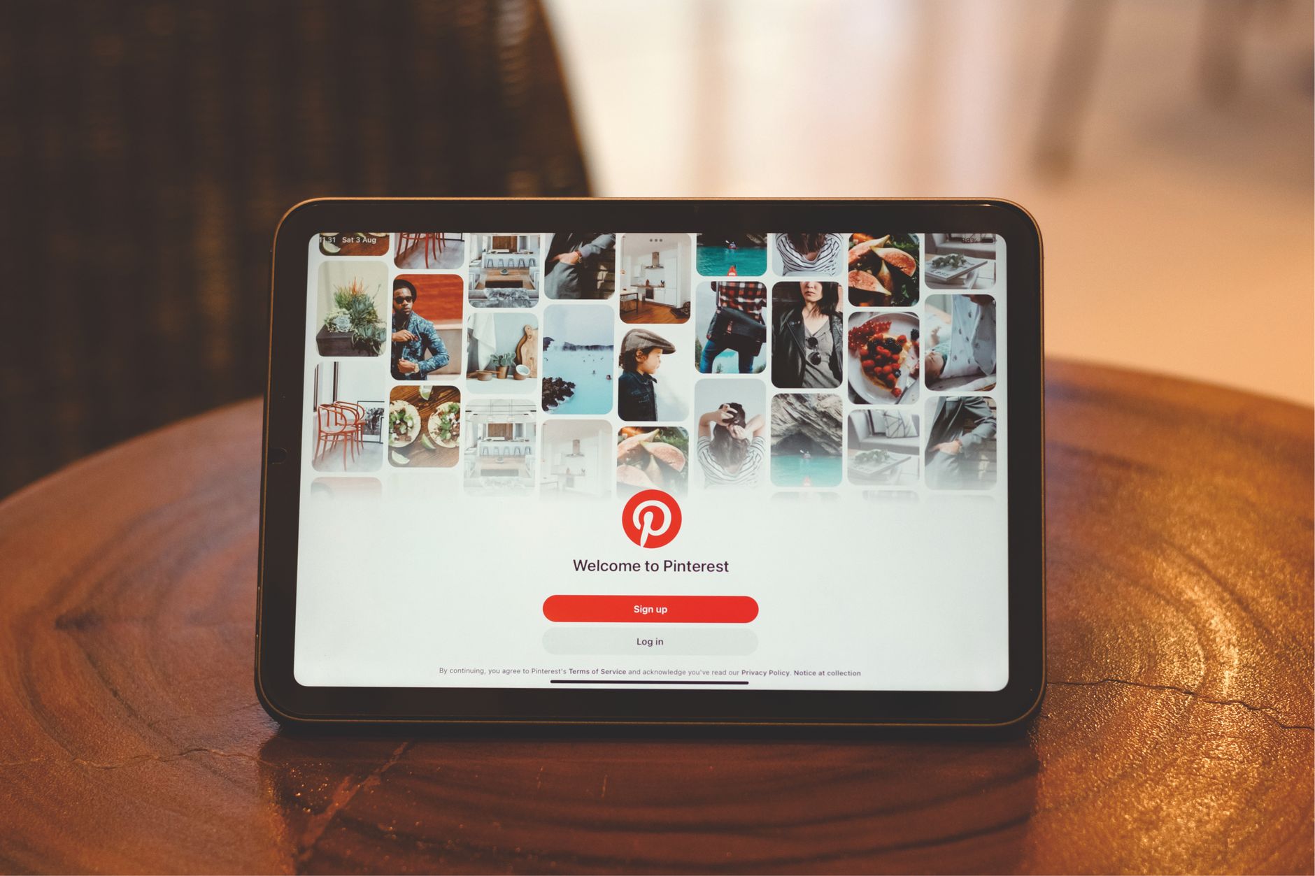
Идеи для досок Pinterest — Креативные темы на основе ИИ и практические советы для потрясающих пинов

Начните с четкой рекомендации: создайте специальную доску под названием «Креативные пины на основе ИИ» и заполните ее 10 пинами, которые объединяют визуальные эффекты, сгенерированные ИИ, с лаконичными текстовыми наложениями, адресованными тем, кто ищет идеи для домашнего декора. Эти пины должны последовательно следовать одному правилу дизайна: одна основная палитра, одна типографская пара и подпись менее 15 слов, объясняющая идею. Эта доска помогает домовладельцам быстро находить идеи и экономит время.
Используйте AI генераторы, чтобы предлагать 4 семейства тем за цикл генерации: четкий минимализм, теплый хюгге, смелая геометрия и природные текстуры. Введите короткий текстовый запрос и соберите 8-12 вариантов для каждого семейства. Эти генераторы работают с общей системой стилей, обеспечивая постоянно согласованные результаты при расширении вариантов. Используйте эти выходные данные для заполнения дополнительных досок и поддержания высокого охвата вашей аудитории.
Внедрите практические советы: установите еженедельный график предварительного просмотра новых пинов, заменяйте улучшенные текстовые наложения и тестируйте 2-3 кадрирования изображения. Всегда проверяйте показатели кликабельности и охвата; делитесь лучшими результатами с членами команды или в других каналах. Рекомендуется объединять пины с описанием в 2–3 строки, а также отслеживающие ссылки linksat для измерения рефералов.
Оптимизация на основе данных: отслеживайте 3 показателя для каждой доски: охват, сохранения, коэффициент кликабельности. Определите набор цветов/шрифтов, которые вы повторно используете в пинах, чтобы повысить узнаваемость. Эти шаги помогут вам последовательно предоставлять более качественные пины, привлекать больше возможностей для кликов и расширять охват среди домовладельцев и любителей декора.
Разработка тем Pinterest и рабочий процесс создания досок настроения на основе ИИ
План из трех шагов для быстрого старта разработки тем на основе ИИ: используйте генераторы для создания концептуальных основ, курируйте интегрированную доску настроения и проведите тестирование, чтобы убедиться, что концепции находят отклик у вашей целевой аудитории.
Шаг 1: создание концептуальных основ с помощью простых подсказок. Определите три основных столпа: намерение аудитории, категория продукта и естественная атмосфера. Позвольте генераторам предоставить визуальные эффекты, охватывающие текстуру, цвет и типографику; соберите 12–15 лучших вариантов для обсуждений и будущих итераций.
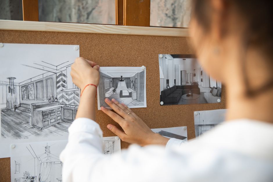
Шаг 2: Курирование и управление доской настроения. Создайте три раздела на доске: цветовые схемы, текстурные подсказки и идеи макетов. Отметьте каждый пин конкретными деталями: название палитры, тег атмосферы, примечания к композиции и предполагаемое воздействие. Используйте целостный, естественно согласованный макет, который поддерживает видение и предоставляет готовые к публикации активы для членов команды.
Шаг 3: тестирование и итерация. Проведите упрощенные эксперименты, изменяя заголовки пинов, альтернативные тексты и кадрирование изображений. Отслеживайте три показателя: сохранения, коэффициент кликабельности и время до совершения действия. Используйте результаты для улучшения подсказок, корректировки цветовых палитр и оптимизации доски настроения. Каждый цикл приносит знания, которые определяют следующие подсказки и действия.
Преимущества интегрированного рабочего процесса: формирование общего видения всей командой, обмен информацией о ходе работы с заинтересованными сторонами и обеспечение соблюдения политик именования пинов и доступности. Обеспечение четкой структуры управления, которая поддерживает согласованность активов с более широкой стратегией и помогает новым участникам быстро вносить свой вклад.
Практические советы для поддержания целенаправленности этого подхода: придерживайтесь трех цветовых схем, связанных с естественными и винтажными оттенками, избегая при этом беспорядка. Убедитесь, что визуальные эффекты находят отклик у вашей аудитории, протестировав их на мобильных устройствах и компьютерах; используйте простые подсказки для ускорения итераций. Поддерживайте простую стратегическую систему именования для поддержки управления и обмена активами и стремитесь к успешному, повторяемому циклу, который естественным образом масштабируется.
Конкретные подсказки для создания тем досок с помощью инструментов ИИ
Начните с краткой подсказки, фиксирующей концепцию и текстуры, затем точно настройте два варианта, чтобы увидеть, какой из них находит отклик у вашей аудитории. Прежде чем начать публикацию, установите устойчивое настроение и переведите доску в состояние, готовое к загрузке.
Подсказка 1: Создайте тему доски «Уютная минимальная жизнь» с такими текстурами, как лен, джут и шлифованное дерево, цветовой палитрой из слоновой кости, овсянки и древесного угля, а также чистой функциональной планировкой. Сосредоточьтесь на 8–12 пинах с простой типографикой и 2 крупными планами текстуры; частота публикации: 5 пинов в неделю; потребности: связные границы и устойчивое кадрирование; эта концепция создает спокойное, практичное пространство для подписчиков, жаждущих порядка.
Подсказка 2. Создайте пляжную, залитую солнцем доску для обновления в теплую погоду. Текстуры: ротанг, керамическая глазурь, омытый морем лен. Палитра: песок, небесно-голубой, теплый белый. Концепция: яркая, но расслабленная; целевые подписчики: любители побережья и жители городов, ищущие света и воздуха. Загружайте активы с естественным освещением; опубликуйте 6–9 элементов; рекомендации: балансируйте цветовые акценты с нейтральными якорями для поддержания последовательности; независимо от того, публикуете ли вы из студии или дома, сохраняйте одинаковую ширину границы.
Подсказка 3: Создайте модульное рабочее пространство, сочетающее в себе текстуры теплого дерева с войлоком и матовым металлом. Палитра: бледно-серый, шалфей, древесный уголь. Концепция: масштабируемая для квартир и домашних офисов; план публикации: 4–6 досок в месяц; рекомендации: объедините каждый пин с практичной подписью; помогает подписчикам быстро понять идеи макета; преображенный вид возникает из-за балансировки разнообразия текстур и интервалов.
Подсказка 4: Кухня в деревенском стиле с камнем, терракотой и лозой; Палитра: оливковый, кремовый, ореховый. Концепция: теплые, привлекательные линии с четкими краями. План публикации: 8–10 пинов, включая 2 снимка «до/после»; используйте волшебство в освещении и последовательной обрезке, чтобы поддерживать высокий уровень вовлеченности; этот подход поддерживает потребности домашних поваров и организаторов развлечений, которым нужны действенные идеи; результатом является обновленное настроение на доске.
Рекомендации. Четко маркируйте каждую доску, протестируйте три подсказки, следите за вовлеченностью (сохранения, клики, подписчики) и со временем настраивайте текстуры и цветовые якоря, чтобы ваша доска процветала. Составление подсказок и тестирование вариантов помогает вам уточнить потребности вашей аудитории, а короткая, привлекательная подпись к каждой публикации укрепляет концепцию и приглашает аудиторию к участию.
Как выбрать цветовые палитры, которые передают настроение вашей доски
Начните с трехцветной основы, соответствующей вашему настроению: доминирующий оттенок, акцент и нейтральный. Это трио придает пинам четкий характер во всех направлениях и городских пейзажах.
-
Определите настроение и соберите вдохновение. Создайте обширный справочный фрагмент из реальных фотографий и досок с той же атмосферой. Сравнение палитр показывает, какие оттенки выглядят спокойными, смелыми или угрюмыми на экранах и в печати.
-
Постройте палитру. Выберите основной цвет (доминирующий), вторичный акцент и два нейтральных цвета для глубины и наложений. Сохраняйте основной цвет в 1–2 шестнадцатеричных значениях, акцент — в 1 шестнадцатеричном значении, нейтральные цвета — в 2–3 оттенках. Планирование и согласование стратегии размещения пинов требуют последовательности в презентации и услугах, которые вы предлагаете клиентам или сотрудникам. Если вы работаете с палитрами, помеченными ИИ, пометьте каждый набор для простоты создания и контроля будущих улучшений.
-
Проверьте доступность с помощью измерений. Проверьте коэффициент контрастности для основного текста (4,5:1) и крупного текста (3:1) с помощью бесплатных инструментов. Проверьте сочетания цветов для читателей с дальтонизмом и попробуйте рендеринг в оттенках серого, чтобы убедиться, что настроение остается читаемым.
-
Итерируйте с данными. Примените палитру к фрагменту пинов и оцените уровень вовлеченности. Сравните сохранения, клики и показатели конверсии, чтобы уточнить баланс оттенков. Такой подход, основанный на данных, улучшает стратегию и привлекательность вашей доски.
-
Поддерживайте стандарт, ориентированный на визуальные эффекты. Создайте простое руководство по стилю, в котором кодируется настроение, правила основной части и акцента, а также пороговые значения контрастности. Это помогает командам и службам поддерживать фирменный стиль во всех направлениях и на поверхностях пинов.
- Пример спокойной прибрежной палитры: основа №2B5D8A, акцент №F2D9B5, нейтральные цвета №F8FBFE, №1A1F24.
- Пример энергичной городской палитры: основа №D35400, акцент №FFD166, нейтральные цвета №FAFAFA, №2A2A2A.
- Пример угрюмой вечерней палитры: основа №5A3A83, акцент №F2D0A3, нейтральные цвета №EBEEF5, №2C2C2C.
- Пример игривой солнечной палитры: основа №28A745, акцент №FFC857, нейтральные цвета №FFFFFF, №1F1F1F.
Композиция пина: макет, типографика и советы по обработке изображений
Выберите вертикальный пин с соотношением сторон 2:3 с чистым макетом сетки и поместите заголовок в верхнюю треть для удобства чтения на мобильных устройствах; расположите изображение не по центру, чтобы создать баланс по всему кадру; зарезервируйте нижнюю область для краткого описания, которое побуждает к щелчку.
Руководство по типографике: используйте максимум два шрифта — один полужирный для заголовка и один более светлый для основного текста. Сохраняйте размер заголовка в диапазоне 28–42 пикселей, а размер основного текста — около 12–16 пикселей, с высотой строки около 1,15–1,25 для удобства чтения. Объедините sans с простым шрифтом с засечками или другим вариантом sans. Протестируйте как минимум два примера сочетаний, чтобы почувствовать, что выглядит чисто и современно. Этот выбор позволит вам сочетать контраст с четкостью. Создайте несколько примеров по темам для сравнения воздействия.
Обработка изображений: обрежьте до 2:3 и сохраните объект четко распознаваемым; используйте визуальные эффекты, созданные ИИ, или улучшенные фотографии для разнообразия; визуальные эффекты можно преобразовать с помощью тонкой цветовой градации, соответствующей вашей палитре. Примените тонкую виньетку, чтобы сохранить фокус, и убедитесь, что текст расположен на разборчивом фоне, при необходимости используя полупрозрачное наложение.
Разделы макета: главное изображение, жирный заголовок, вспомогательная строка и небольшой блок призыва к действию. Сделайте публикацию лаконичной, используя одно основное сообщение для каждого пина, и повторите согласованный стиль для ряда пинов. Используйте наложения, которые сбалансируют стоимость и воздействие, и по возможности опирайтесь на популярные визуальные эффекты.
Тестирование и оптимизация: спланируйте заранее, создайте 3–5 визуальных вариантов, сгенерированных ИИ, или стандартных визуальных вариантов и сравните сохранения, клики и показы в течение нескольких минут. Используйте независимое принятие решений: выберите два претендента на раздел, объедините лучшие элементы и примените к ряду размеров публикаций. Соберите предложения от пар сегментов аудитории, чтобы доработать будущие пины.
Оптимизация производства: шаблоны, пакеты и советы по автоматизации
Внедрите основной пакет шаблонов сегодня: три шаблона для пинов (портретный, квадратный, обложка для инфографики) и пять оболочек заголовков, которые можно повторно использовать в разные сезоны. Этот более разумный подход, обеспечивающий комплексную основу, сокращает время проектирования на 30–40% и поддерживает целостность всей доски. Сезонно обновляйте пакет, чтобы он оставался привлекательным в зависимости от сезона и соответствовал тенденциям. Объедините с установленными рекомендациями для поддержания согласованности.
Пакетное производство: выделяйте два 90-минутных блока еженедельно для создания 20 пинов и 6–8 каруселей, а затем перерабатывайте заголовки и визуальные элементы в разных частях. Эта рутина, ориентированная на действия, устраняет постоянное переключение контекста и ускоряет запуск, сохраняя при этом качество на всю неделю.
Автоматизация: подключите свою учетную запись к календарю и используйте такие инструменты, как Zapier или функции планирования платформы, чтобы автоматически публиковать пины в часы пик. Определите токены в своих шаблонах для автоматического заполнения заголовков, описаний и ссылок, обеспечивая единообразие без ручного редактирования. Не используйте в описаниях язык продаж; сохраняйте ориентированный на ценность текст. Создайте выделенную страницу ресурсов на своем веб-сайте со ссылками на шаблоны, рекомендации и примеры пинов; это уменьшает переписку и обеспечивает более плавный ход производства.
Реконструкция и тестирование: запланируйте квартальную реконструкцию 1–2 шаблонов и протестируйте два варианта эскизов в течение двухнедельного периода. Сравните производительность между досками, отслеживайте подробные показатели и быстро корректируйте визуальные эффекты и копии. Установите цель развернуть ноябрьский цикл для следующей итерации.
Измерение и управление: поставьте цель увеличить сохранения на 15% и коэффициент кликабельности на 5% за 60 дней. Используйте единую панель для отслеживания показателей и поддержания согласованности команды с помощью простого вопроса: Что здесь работает? Ответьте на этот вопрос и верните идеи в пакет шаблонов.
Курирование активов: источники изображений, значков, текстур и макетов
Создайте централизованную библиотеку активов с четкими примечаниями о лицензировании и простой структурой папок: изображения, значки, текстуры и макеты. Определите три основных источника: бесплатные, платные и коллекции, которыми делится сообщество, и прикрепите к каждому элементу краткую запись о политиках.
Изображения: откройте для себя высококачественные варианты от Unsplash, Pexels и Pixabay, а также проверенные архивы, такие как Wikimedia Commons. В каждом источнике укажите разрешенное использование, требуемые атрибуции и типичное разрешение (не менее 2000 пикселей по длинному краю). Ведите базу знаний, в которой суммируются лицензии и ограничения на использование. Изображения могут поступать из бесплатных, платных или смешанных источников для балансировки разнообразия и скорости.
Значки: изучите The Noun Project, Flaticon, Icons8 и Feather для векторных наборов. Фильтруйте по категориям и скачивайте форматы (SVG или PNG). Добавьте теги ключевых слов и четкие примечания о лицензировании; быстрый щелчок подтверждает условия лицензирования и требования к атрибуции.
Текстуры: курируйте из textures.com, ambientCG и Subtle Patterns. Отдавайте предпочтение бесшовным текстурам и вариантам с разрешением 2048–4096 пикселей для покрытия пинов Pinterest. Протестируйте текстуры в блоках из трех стилей, чтобы сохранить настроение в вашей системе дизайна. Рассмотрите пакеты текстур, соответствующие цветовым палитрам и идеям досок, чтобы повысить единообразие.
Макеты: собирайте из Placeit, Mockuuups Studio, Smartmockups и шаблонов сообщества Figma. Убедитесь, что макеты поддерживают многослойный экспорт и простую смену цветов; храните ссылки на источники и условия лицензии. Если шаблон включает в себя цвета бренда, обратите внимание на то, как адаптировать заголовки и описания для коммерческой или некоммерческой презентации.
Структура и система: Очертите схему активов: такие поля, как источник, категория, лицензия, разрешение, цвета, ключевое слово, заголовки, примечания. Система использует алгоритмическую маркировку для автоматического назначения ключевых слов и категорий, а затем этап проверки человеком. Это выстраивает повторяемый рабочий процесс, который можно повторить на досках в команде.
Исследования и изучение: изучите различных поставщиков, сравните условия лицензии и запишите результаты исследований. Используйте эти данные для создания идей и предложений для пинов; согласуйте текстуры и значки с названиями досок. Поддерживайте от трех до пяти альтернативных активов для каждой концепции для тестирования производительности.
Качество и сохранения: установите минимальное разрешение; проверьте цветовой профиль; убедитесь, что активы правильно отображаются на эскизах Pinterest. Сохраняйте активы с согласованным именованием и системой сохранения версий. Создайте контрольную цепочку, чтобы члены команды могли вернуться к предыдущей версии при необходимости.
Изменение и обслуживание. Внедрите ежемесячный аудит; удалите устаревшие элементы; обновите лицензии; ведите журнал изменений. Отслеживайте изменения в библиотеке, а не только отдельные активы, чтобы поддерживать надежность и масштабируемость системы.
Советы и рекомендации: избегайте коммерческого тона в описаниях активов пинов; сохраняйте фактические заголовки и согласуйте их с идеями и названиями. Используйте трехэтапный рабочий процесс: найдите, изучите и улучшите. Используйте различные источники, помните о политиках и поддерживайте базу знаний в актуальном состоянии. Эти шаги помогут вам находить высококачественные текстуры, значки и изображения, которые поддерживают привлекательные пины и не кажутся навязчивыми.
Ready to leverage AI for your business?
Book a free strategy call — no strings attached.


