Formát e-mailového newslettera – Čo robiť a čo nerobiť pre efektívne kampane


Udržujte štruktúru jednoduchú a čitateľnú na prvý pohľad. Jednokolónový layout široký približne 600–650 px, s jasnou hlavičkou, štedrou výškou riadkov a ostrými okrajmi pomáha čitateľom rýchlo prehliadať. Tento dizajn znižuje šancu na chybu pri rolovaní a robí vašu správu ľahko absorbovateľnou. Na udržanie pozornosti umiestnite najdôležitejšie detaily na vrch a použite biely priestor na oddelenie sekcií.
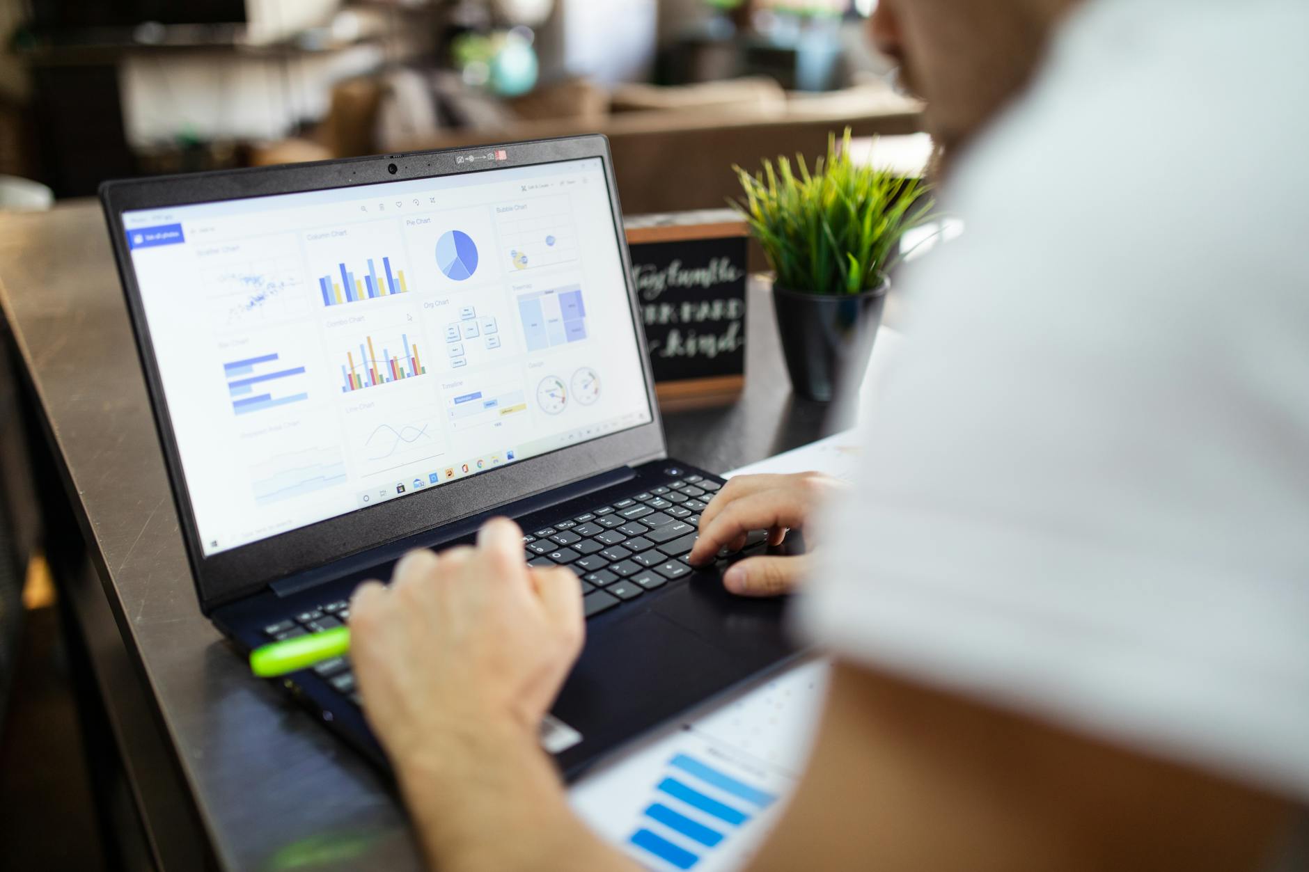
Robte: Udržujte predmetové riadky krátke a orientované na akciu. Píšte jednoduchým jazykom, používajte krátke vety a udržujte vysokú čitateľnosť. Namiesto ťažkých blokov textu používajte krátke odseky; namiesto toho používajte jednoduchý jazyk a krátke vety. Zahrňte jeden alebo dva vizuály, ktoré podporujú vašu správu, ale udržujte veľkosť súborov malú a spoliehajte sa na testovanie, aby ste vybrali to, čo funguje. Umiestnite odkazy na zrejmé miesta a zabezpečte, aby ich čitatelia mohli ľahko klepnúť. Vytvorte rytmus naprieč sekciami, aby sa čitatelia necítili zahltení.
Nerobte: Nezaťažujte newsletter obrázkami alebo dlhými blokmi textu. Nerušite rytmus malými písmenami, nekonzistentným zarovnaním alebo vágne jazykom. Vyhnite sa vágne volaniu k akcii a príliš mnohým odvážnym tvrdeniam, ktoré sa zdajú senzáciechtivé. Ak musíte zahrnúť viacero odkazov, zoskupte ich jasne a otestujte, či fungujú na mobile aj na desktopu. Nezabudnite otestovať finálne čítanie pred odoslaním.
Testovanie a detaily: Používajte skutočných odberateľov na rýchle kontroly a potvrďte čitateľnosť na mobile. Overte, či má každý obrázok alt text a či načítanie obrázka nerozbije layout. Používajte správne nástroje na meranie mier open rate a click paths, potom preložte výsledky do konkrétnych zmien. Táto realita je dôležitá pre kampane zamerané na mladé publikum, kde rýchla inšpirácia a ľahký prístup k obsahu poháňajú zapojenie.
Konzistencia a ďalšie kroky: Vytvorte jednoduchú šablónu, ktorú môžete opätovne používať, a udržujte zvyk testovania. Udržujte rovnakú štruktúru a tón naprieč vydaniami, aby čitatelia rozpoznali váš hlas bez námahy. Udržujte svoj text stručný, odkazy fungujúce a vizuály čisté, pretože stabilné detaily budujú dôveru a zlepšujú odpoveď v priebehu času.
Formát e-mailového newslettera: Čo robiť a čo nerobiť pre kampane - ROBTE Používajte obrázky vysokej kvality
Používajte jeden obrázok vysokej kvality na sekciu, aby ste ukotvili svoju správu a zvýšili rozpoznanie. Jasný obrázok podporuje váš cieľ, znižuje váhanie a robí vášho odosielateľa výrazným. Udržujte ho ostrý, vystrednený a správne orezaný pre mobily, aby ste zabránili rozmazaniu, ktoré škodí všimnutiu a dôvere.
Vyberte ľahký obrázok a otestujte ho naprieč klientmi. Cieľte na menej ako 200 KB a šírku 600–800 px; používajte responzívne veľkosti, aby sa obrázok škáloval od stoviek pixelov na mobily po väčšie displeje na desktopu. Pre fotografie používajte JPEG; pre grafiku s málo farbami PNG; zvážte WebP tam, kde je podporovaný, na zlepšenie kvality bez zväčšenia veľkosti súboru.
Alt text je dôležitý: poskytnite opisný text pre každý obrázok, aby ste zlepšili prístupnosť a doručiteľnosť. Alt text by mal vysvetliť, čo je v obrázku a ako sa týka obsahu, aby čitatelia, ktorí nemôžu obrázok načítať, stále dostali správu a spojili sa s príbehom. Používajte stručný jazyk, ktorý môže byť rýchlo všimnutý.
Overte spoľahlivosť hostingu: hosťujte obrázok na dôveryhodnej doméne, udržujte odkazy stabilné a skontrolujte, či odkazy nie sú rozbité v náhľadoch. Tieto kroky pomáhajú vyhnúť sa ikonám rozbitých obrázkov, ktoré frustrovať čitateľov a škodia skúsenosti. Ak sa obrázok nepodarí načítať, zabezpečte, aby bol prítomný sprievodný text, ktorý sprostredkuje hodnotu a obsahuje jasný cieľ kliknutia ako tlačidlo, aby tí, ktorí sa spoliehajú na text, stále dostali vašu správu.
Umiestnenie a kontext: umiestnite obrázok blízko silného CTA; kotviaci text alebo tlačidlo by malo jasne označiť ďalší krok. Zabezpečte, aby boli cieľe kliknutia ľahko poklepateľné na mobily; urobte tlačidlá vizuálne odlišné farbou a kontrastom. Testovanie naprieč zariadeniami pomáha potvrdiť, že obrázok netlačí správu mimo zobrazenia a že CTA zostáva viditeľné, čím sa zachováva doručiteľnosť a zapojenie naprieč stovkami príjemcov.
Udržujte rovnováhu: vyberte obrázok, ktorý posilňuje správu, ale nepreťažuje text. Ak používate hero obrázok, zabezpečte, aby alt text a okolný text poskytli plnú hodnotu bez potreby obrázka. Tento prístup zlepšuje skúsenosť a vyhýba sa spoliehaniu sa len na vizuály na sprostredkovanie ponuky.
Prístupnosť a analýza: označte každý obrázok alt textom, ktorý popisuje scénu a účel. To pomáha tým, ktorí rýchlo skenujú, a zlepšuje všimnutie medzi čitateľmi a e-mailovými klientmi. Medzitým udržujte celkovú veľkosť súboru nízku, aby ste udržali rýchle načítanie, čo podporuje lepšie zapojenie pre čitateľov v mobilných kontextoch.
Vizuály a stratégia obrázkov
Začnite s jedným jasným hero obrázkom na vrchu, ktorý komunikuje ponuku a hodnotu. Udržujte veľkosť súboru pod 150 KB a šírku okolo 600–700 px, s pomerom strán 16:9. Pridajte alt text, ktorý popisuje scénu na podporu rozpoznania a prístupnosti.
Obmedzte počet vizuálov na udržanie ľahkého načítania a čistej čitateľskej skúsenosti. Používajte číslo: jeden hero obrázok plus až dva podporné obrázky; to udržuje layout jednoduchý na mobile aj desktopu.
Písma a typografia: používajte 1-2 webové písma; nastavte telesný text na 16–18 px s výškou riadkov 1.4–1.6; zabezpečte vysoký kontrast medzi textom a pozadím; minimalizujte zmeny písma a udržujte nadpisy jasne odlišné.
Prispôsobiteľné šablóny: vyberte prispôsobiteľný layout, ktorý umožňuje rýchle výmeny obrázkov na zhodu s paletou odosielateľa. Pomocou tohto prístupu pripravte 2-3 varianty obrázkov a spustite test s nástrojom na určenie, ktorý dosiahne vyššie skóre od čitateľov.
Umiestnenie CTA: zarovnajte obrázky na podporu CTA blízko okraja a pozdĺž stredného textového bloku na vedenie akcií. Tento bod pomáha zdokonaľiť tok a zvýšiť zapojenie čitateľov.
Optimalizácia a výkon: používajte lazy loading, komprimujte obrázky a vyhnite sa automaticky prehrávajúcim médiám. Používajte krátke zoznamy na rýchle referencie – opens, clicks, skóre rozpoznania. Sledujte metriky ako opens, clicks a skóre rozpoznania; to, čo chce čitateľ, sa objaví, keď alt text a vizuály sú v súlade so správou; použite výsledky na úpravu vizuálov podľa toho, čo chcú čitatelia.
Nerobte preplňte hlavičku viacerými vizuálmi alebo logami; udržujte jeden fokálny obrázok a jednoduchý značkový znak na zachovanie rozpoznania.
Používajte obrázky vysokej kvality s alt textom pre prístupnosť
Pri písaní alt textu by ste mali popísať subjekt a príbeh, ktorý obrázok podporuje, čím zabezpečíte, že čitatelia s blokovanými obrázkami stále pochopia význam. Čitatelia s otvorenými obrázkami budú mať prospech z alt textu, ktorý pridáva hodnotu namiesto opakovania hlavičky.
Dodržujte tieto praktické kroky na zlepšenie čitateľnosti a zapojenia bez spomalenia open rate, pričom udržujte popisky jednoduché:
- Vyberte vizuály vytvorené vo vysokej rezolúcii, ale optimalizované pre e-mail. Udržujte ťažké súbory pod 150 KB a zabezpečte, aby šírka bola najmenej 600 px pre desktop, s responzívnym škálovaním pre mobile.
- Smernice pre alt text: pre každý obrázok popíšte subjekt najprv, potom akciu alebo výsledok. Udržujte to jednoduché, zvyčajne 1–2 krátke vety, a cieľte na 125 znakov alebo menej. To, čo je najrelevantnejšie pre text, by malo byť zahrnuté, a vyhnite sa frázam ako „obrázok z“ alebo „fotka z“.
- Dekoratívne vizuály: ak aktívum nepridáva informácie, nastavte alt="" na zabránenie preplnenia pre čítačky obrazovky. To pomáha čitateľnosti pre tých, ktorí čítajú s blokovanými obrázkami.
- Písma a čitateľnosť: vyberte web-safe písma a zabezpečte vysoký kontrast; alt text nenahrádza vizuály, ale podporuje porozumenie, keď sa obrázky nepodaria načítať. Používajte jednoduché layouty, ktoré vedú oko k hlavičke a hlavnému textu.
- Kontext blízko hlavičky: umiestnite obrázok blízko jeho hlavičky na posilnenie správy; pridajte krátky popis, ktorý pridáva hodnotu bez duplikovania alt textu.
- Čo je najlepšia prax? Určite testujte naprieč hlavnými klientmi, aby ste overili, či je alt text čítaný v sekvencii s vizuálmi; upravte, ak je potrebné, aby čitatelia, ktorí sa pozerajú na hlavičku, stále dostali podstatu.
- Pripomínanie tímom: zahrňte alt text ako súčasť návrhového briefu; spojte pisateľov a dizajnérov skoro; zabezpečte, aby mal každý vizuál alt text vytvorený pred finálnym dodaním.
- Meranie a následovanie: monitorujte čitateľnosť a zapojenie a hľadajte zlepšenia v open rates, keď je alt text konzistentne aplikovaný a vizuály sú dobre vyvážené s textom. Takmer každý klient profituje z tohto zarovnania.
Zarovnajte rozlíšenie obrázkov so šírkou e-mailu a layoutom
Navrhnite každý obrázok na 600 px široký, aby sa zmestil do hlavného stĺpca e-mailu, a poskytnite 2x verziu (1200 px) pre obrazovky s vysokou hustotou bodov. To udržuje layout konzistentný a zrýchľuje časy načítania naprieč stovkami adries. Ostrý obrázok nad záhybom vedie s silným háčikom a chytí pozornosť, zatiaľ čo irelevantné vizuály zostávajú mimo rámca.
Udržujte veľkosti súborov malé: cielte na 80-150 KB na obrázok, v závislosti od typu obsahu. Používajte vhodné formáty: JPG pre fotografie, PNG pre logá s priehľadnosťou. Pre displeje s vysokou hustotou bodov poskytnite 2x obrázok na zachovanie detailov; nástroje vo vašom workflow umožňujú ladenie kvality bez viditeľných strát. Ukladajte adresy obrázkov do vášho CMS alebo CDN na zrýchlenie doručenia.
Urobte obrázky responzívne nastavením width: 100%; height: auto; v inline štýloch, aby sa obrázok škáloval s layoutom. Používajte opisný alt text na udržanie pozornosti, kde sú obrázky blokované. Obrázok by mal podporovať správu, nie ju preťažovať. Nezabudnite overiť, na ktoré odkazy obrázky ukazujú, a zabezpečiť, aby používali správne adresy. Táto potreba ovplyvňuje, ako vyvažujete vizuály a text.
Kreativita by mala žiariť bez obetovania výkonu. Používajte viacero obrázkov, keď je to užitočné, ale vyhnite sa preplneniu. Nerobte zahŕňajte nadrozmerné GIFy, ťažké prekrytia a značenie, ktoré rozptyľuje čitateľov. Väčšina firiem vidí úspech, keď vizuály zostávajú zarovnané s layoutom a vašou jadrovou správou, rýchlo načítané naprieč zariadeniami pre tisíce odberateľov.
Nasleduje rýchly cross-client test, potvrďte, že každý obrázok sa zhoduje s layoutom na mobile a desktopu. Skontrolujte časy načítania, jasnosť a že adresy obrázkov sa správne rozlišujú. Vede s ostrými vizuálmi nad záhybom a udržujte zvyšok čistý na udržanie sústredenia čitateľa. Nezabudnite zhromažďovať metriky a iterovať na základe toho, čo vaša audience chce najviac.
Nespoliehajte sa na obrázky pre kľúčové správy; poskytnite textové alternatívy
Vždy poskytnite stručný textový variant jadrových správ v tele e-mailu; rovnaké informácie by mali zostať viditeľné, aj keby sa obrázky nepodarili načítať, a tento text sprostredkuje zamýšľaný význam bez oneskorenia. S ohromným dosahom naprieč tisíckami odoslaní tento prístup udržuje vašu viditeľnosť v preplnených schránkach.
Štruktúrujte s hlavičkami a krátkymi riadkami. Rozdeľte ťažký obsah na stráviteľné kúsky a umiestnite 3–5-riadkový súhrn pod každú hlavičku, aby mnohí čitatelia, ktorí sa zdajú prehliadať najprv, stále pochopili podstatu. Toto nastavenie podporuje čítanie na malých obrazovkách a pomáha mladším audience zostať zapojeným, zatiaľ čo vaši priatelia skenujú volanie k akcii.
Pre každú grafiku zahrňte textové alternatívy: popis, alt text alebo venovaný textový blok, ktorý opakuje kľúčové správy. Ak obrázok obsahuje odkaz, ukážte adresu v obyčajnom texte blízko obrázka, aby čitatelia mohli skopírovať, keď sú obrázky blokované. To udržuje tisíce odberateľov zapojených a vyhýba sa strateným smerom.
Navrhovanie newslettera s prístupným textom zvyšuje čitateľskú skúsenosť naprieč hlavičkami a sekciami a rovnaké informácie zostávajú konzistentne jasné, či je layout jednoduchý alebo bohatý na funkcie. Čitatelia nebudú musieť dekódovať vizuály, aby pochopili požiadavku, čo absolútne zlepšuje udržanie naprieč zariadeniami.
V testoch s gabys a gaby z rôznych prostredí textové signály zlepšili porozumenie čítania. Mnoho odberateľov z mladých audience a ich priatelia reaguje rýchlejšie, keď je čokoľvek dôležité uvedené jednoducho v riadkoch a popiskoch. Ak správa sa zdá neistá, upravte text, aby čokoľvek kľúčové sa objavilo aj v obyčajnom texte.
| Element | Benefit |
|---|---|
| Obyčajné textové ekvivalenty pre obrázky | Zachováva význam, podporuje prístupnosť, znižuje vypadnutia |
| Jasné hlavičky + krátke riadky | Uľahčuje skenovanie a rýchle porozumenie |
| Obyčajné textové odkazy/adresy | Udržuje referencie použiteľné bez načítania obrázka |
Vyhnite sa veľkým súborom; komprimujte obrázky bez viditeľnej straty
Komprimujte obrázky na menej ako 100 KB pre väčšinu vizuálov. Zmenšite na maximálnu šírku 600 px pred exportom, potom uložte v modernom formáte ako WebP alebo AVIF s fallback JPEG alebo PNG.
Pre fotografie exportujte WebP na kvalitu 60–75%. Pre jednoduché grafiky používajte PNG-8 alebo WebP, keď priehľadnosť nie je potrebná. Ak musíte použiť JPEG, nastavte kvalitu na 60–70% a povoľte progresívne renderovanie na zlepšenie vnímanej rýchlosti.
Odstráňte metadáta a farebné profily, aby ste oholili 5–20 KB na obrázok. Zakážte vložené ICC profily a EXIF dáta počas exportu. To udržuje dekódovanie rýchle na mobilných sieťach bez kompromitovania zobrazenia na väčšine klientov.
Testujte naprieč Gmail, Outlook a Apple Mail pri 100% zväčšení. Overte čitateľnosť textu a presnosť farieb; ak sa objavia artefakty, re-exportujte s nižšou kvalitou alebo iným formátom.
Automatizujte proces vo vašom workflow: spustite aktíva cez kompresor ako Squoosh alebo ImageOptim a ukladajte optimalizované verzie popri origináloch. Ak hosťujete na CDN, povoľte content negotiation pre WebP/AVIF s spoľahlivým fallbackom.
Obmedzte počet veľkých aktív na e-mail; cielte na jeden hlavný obrázok a niekoľko malých ikon pod 20 KB každá, aby ste udržali časy načítania rýchle a skúsenosť plynulú pre čitateľov.
Testujte obrázky naprieč hlavnými e-mailovými klientmi a zariadeniami
Testujte obrázky naprieč viacerými hlavnými e-mailovými klientmi a zariadeniami, aby ste zabezpečili, že vizuály sa správne renderujú a otvorený banner zostáva čitateľný.
Používanie kurátorskej sady obrázkov uloženej v priečinku gabys zrýchľuje overenie a uľahčuje meranie pravdepodobného vplyvu na čitateľnosť naprieč platformami. Tento prístup podporuje informované úpravy po spätnej väzbe.
To podporuje udržanie súvislého príbehu naprieč zariadeniami a schránkami, pretože používatelia vidia rôzne otvorenie v závislosti od nastavení klienta. Potenciálne niektorí klienti ukážu jemné posuny farieb alebo rozdiely v medzerách, ktoré ovplyvňujú čitateľnosť; zachyťte tieto v poznámkach.
- Väčšina rozdielov v renderovaní nastáva naprieč Gmail (web/app), Outlook (Windows/mac), Apple Mail (iOS/mac), Yahoo, AOL, Proton Mail a Samsung/Android mail apps. Pre každý overte zobrazenie, alt text a či sa banner škáluje na vhodnú šírku – väčšina layoutov cieli na 600–650 px.
- Testujte naprieč viacerými šírkami: 320 px, 360 px, 600 px a 768 px, aby ste pokryli otvorenie na mobile a desktopu. Udržujte základnú šírku 600–650 px a poskytnite 2x variant pre obrazovky s vysokou hustotou.
- Skontrolujte správanie načítania obrázkov: mnohí klienti blokujú externé obrázky predvolene. Zabezpečte, aby otvorený riadok sprostredkoval jadrovú správu prostredníctvom alt textu, ktorý popisuje zobrazenú vec.
- Formáty súborov a veľkosti: používajte JPEG pre fotografie, PNG pre logá alebo ploché grafiky; vyhnite sa animovaným GIFom, pokiaľ nie sú potrebné. Udržujte celkovú záťaž pod 150 KB na obrázok a pod 500 KB na sekciu e-mailu na zachovanie časov načítania.
- Prístup inline štýlov: aplikujte šírku a výšku inline na vedenie renderovania, pretože mnohí klienti ignorujú head alebo externé CSS. To pomáha udržať vizuály stabilné naprieč prostrediami.
- Pripravenosť na Retina: poskytnite 2x obrázok (~1200 px široký) a spárujte ho s 1x verziou; používajte rovnakú schému pomenovania na zjednodušenie správy.
- Správa aktív: udržujte aktíva v priečinku gabys a udržujte venovaný subpriečinok testov na vyhnutie sa irelevantným súborom. Dokumentujte výsledky na centrálnom mieste pre tím.
- Kontrola pokroku: spustite test s viacerými členmi tímu; zhromaždite spätnú väzbu na jednom mieste; potom upravte vizuály banneru podľa toho, čím sa finálna verzia stane silnejšou pre ďalšie otvorenie.
Vyhnite sa držať sa jedného hero obrázka; zahrňte viacero vizuálov na porovnanie výkonu naprieč klientmi.
Nezabudnite dokumentovať výsledky a poznámky v zdieľanom priečinku, aby členovia tímu mohli ľahko odkazovať na problémy a rozhodnutia.
Pre mladé značky rýchlosť a jasnosť majú význam; open rates sa zlepšujú, keď vizuály sú v súlade s otvorenou správou a vec, ktorú čitateľ vidí najprv, je zmysluplná.
📚 Viac o e-mailoch a reklame
- Ako navrhnúť e-mailový newsletter na maximalizáciu zapojenia (2026)
- 5 krokov k úspešným e-mailovým marketingovým kampaniam s príkladmi
- 20 nevyhnutných štatistík e-mailového marketingu - Použite dáta na posilnenie vašich kampaní
- 7 efektívnych spôsobov integrácie e-mailového marketingu so sociálnymi médiami
- ConvertKit Kompletný sprievodca - Ovládnite e-mailový marketing &
Ready to leverage AI for your business?
Book a free strategy call — no strings attached.