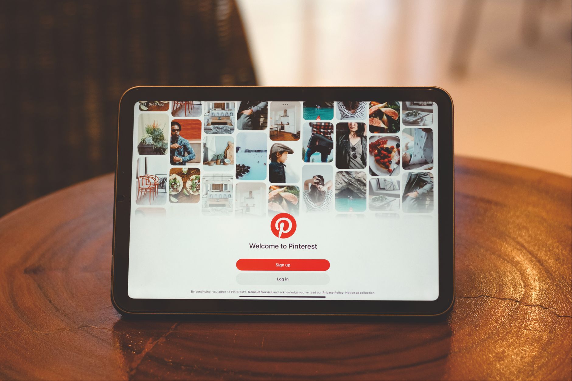
Pinterest-tavlaidéer – AI-drivna kreativa teman och praktiska tips för slående pinnar

Börja med en tydlig rekommendation: skapa en dedikerad tavla med namnet 'AI-Driven Creative Pins' och fyll den med 10 pinnar som kombinerar AI-genererade visuella element med koncisa textöverläggningar som talar till de som söker efter heminredningsidéer. Dessa pinnar bör konsekvent följa en enda designregel: en kärnpalett, en typografiparning och en bildtext under 15 ord som förklarar idén. Denna tavla hjälper husägare att snabbt identifiera idéer och sparar tid.
Använd AI generatorer för att föreslå 4 temafamiljer per generationscykel: skarp minimalism, varm hygge, djärv geometri och naturtexturer. Mata in en kort textprompt och samla 8–12 variationer för varje familj. Dessa generatorer arbetar med ett delat stilssystem, vilket säkerställer konsekventa sammanhängande resultat samtidigt som alternativen utökas. Använd dessa utdata för att fylla ytterligare tavlor och hålla din publikräckvidd hög.
Implementera praktiska tips: sätt en veckovis takt för att förhandsgranska nya pinnar, byt ut bättre textöverläggningar och testa 2–3 bildbeskärningar. Kontrollera alltid klickfrekvens och räckviddsmätvärden; dela de bästa presterarna med lagkamrater eller på andra kanaler. Rekommendera att para pinnar med en 2–3 rader lång beskrivning, plus linksat spårningslänkar för att mäta hänvisningar.
Datadriven optimering: spåra 3 mätvärden per tavla: räckvidd, sparanden, klickfrekvens. Definiera ett färger/typografikit som du återanvänder över pinnar för att öka igenkänningen. Dessa steg hjälper dig att konsekvent leverera bättre pinnar, attrahera fler klickmöjligheter och bredda räckvidden bland husägare och inredningsentusiaster.
AI-drivet Pinterest-temabrainstorming och moodboard-arbetsflöde
Tre-stegsplan för att kickstarta AI-drivet temabrainstorming: använd generatorer för att bygga konceptfrön, kurera en integrerad moodboard och utföra tester för att validera att koncepten resonerar med din avsedda publik.
Steg 1: bygga konceptfrön med enkla prompts. Definiera tre kärnpelare: publikens avsikt, produktkategori och en naturlig vibe. Låt generatorer visa visuella element över textur, färg och typografi; fånga 12–15 toppalternativ för att så diskussioner och framtida iterationer.
Steg 2: moodboard-kurering och hantering. Skapa tre sektioner på tavlan: färghistorier, texturindikationer och layoutidéer. Märk varje pin med specifika detaljer: palettnamn, vibbetikett, kompositionsnoter och avsedd inverkan. Använd en sammanhängande, naturligt anpassad layout som stöder visionen och ger delningsklara tillgångar för lagkamrater.
Steg 3: testning och iteration. Kör lätta experiment genom att variera pinrubriker, alt-texter och bildbeskärningar. Spåra tre mätvärden: sparanden, klickfrekvens och tid-till-åtgärd. Använd resultaten för att förfina prompts, justera färgpaletter och strama åt moodboarden. Varje cykel ger lärdomar som informerar nästa prompts och åtgärdsobjekt.
Integrerade arbetsflödesfördelar: bygga en delad vision över teamet, dela framsteg med intressenter och verkställa policys för pin-namngivning och tillgänglighet. Ger en tydlig hanteringsstruktur som håller tillgångarna i linje med den bredare strategin och hjälper nya bidragsgivare att bidra snabbt.
Praktiska tips för att hålla detta tillvägagångssätt fokuserat: behåll tre färghistorier knutna till naturliga och vintage-indikationer samtidigt som du undviker rörighet. Se till att visuella element resonerar med din publik genom att testa på mobil och desktop; håll prompts enkla för att påskynda iterationer. Behåll en enkel strategisk namngivningskonvention för att stödja hantering och delning av tillgångar, och sikta på en framgångsrik, upprepningsbar cykel som naturligt skalar.
Konkreta prompts för att generera tavlateman med AI-verktyg
Börja med en koncist prompt som fixerar konceptet och texturerna, sedan finjustera två variationer för att se vilken som resonerar med din publik. Innan du börjar posta, sätt en etablerad mood och höj tavlan till ett uppladdningsredo tillstånd.
Prompt 1: Generera ett tavlatema kring Mysig Minimalistisk Boende med texturer som linne, jute och borstad trä, en färgpall på elfenben, havregrynsgrå och kol, och en ren, funktionell layout. Fokusera på 8–12 pinnar, med enkel typografi och 2 texturnära-upptag; postningstakt: 5 pinnar per vecka; behov: sammanhängande ramar och stadig inramning; detta koncept skapar ett lugnt, praktiskt utrymme för följare som längtar efter ordning.
Prompt 2: Bygg en strandig, solupplyst tavla för varm väderförfriskning. Texturer: rotting, keramisk glasyr, havstvättat linne. Palette: sand, himmelsblå, varm vit. Koncept: livfull men avslappnad; målföljare: kustälskare och stadsboende som söker ljus och luft. Ladda upp tillgångar med naturligt ljus; posta 6–9 objekt; rekommendationer: balansera färgpops med neutrala ankare för att upprätthålla konsistens; oavsett om du postar från en studio eller hemma, håll samma ram bredd.
Prompt 3: Skapa ett modulärt arbetsutrymme som blandar varma trädtexturer med filt och matt metall. Palette: blekgrå, salvia, kol. Koncept: skalbart för lägenheter och hemmakontor; postningsplan: 4–6 tavlor per månad; rekommendationer: para varje pin med en praktisk bildtext; hjälper följare att snabbt greppa layoutidéer; det transformerade utseendet kommer från att balansera texturvariation och mellanrum.
Prompt 4: Rustik-modern kökskrypin med sten, terrakotta och korg; Palette: oliv, grädde, valnöt. Koncept: varma, inbjudande linjer med en ren kant. Postningsplan: 8–10 pinnar, inklusive 2 före/efter-bilder; använd magi i belysning och konsekvent beskärning för att hålla engagemanget högt; detta tillvägagångssätt stödjer behoven hos hemmakockar och underhållare som vill ha handlingsbara idéer; resultatet är en förfriskad mood över hela tavlan.
Rekommendationer: märk varje tavla tydligt, testa tre prompts, övervaka engagemang (sparanden, klick, följare) och justera texturer och färgankare över tid för att hjälpa din tavla att blomstra. Att sätta ihop prompts och testa variationer hjälper dig att förfina behoven hos din publik, medan en kort, engagerande bildtext för varje post förstärker konceptet och inbjuder till publikdeltagande.
Hur man väljer färgpaletter som förmedlar stämningen i din tavla
Börja med en tre-färgsbas som matchar din mood: dominant nyans, en accent och en neutral. Denna trio ger pinnar en tydlig signatur över destinationer och stadsbilder.
-
Definiera mood och samla inspiration. Bygg en omfattande referensdel från verklighetsfotografi och tavlor med samma vibe. Jämförda paletter avslöjar vilka nyanser som läses som lugna, djärva eller moody på skärmar och i tryck.
-
Konstruera paletten. Välj en basfärg (dominant), en sekundär accent och två neutraler för djup och överläggningar. Håll basen till 1–2 hex-värden, accenten till 1 hex, neutraler till 2–3 nyanser. Planering och pinstrategi-anpassning behöver konsistens över presentationen och tjänster du erbjuder till kunder eller samarbetspartners. Om du arbetar med ai-märkta paletter, märk varje uppsättning för enkel generation och kontroll av framtida förbättringar.
-
Testa tillgänglighet med mätning. Kontrollera kontrastförhållanden för brödtext (4.5:1) och stor text (3:1) med gratisverktyg. Verifiera färgparningar för färgblinda läsare och prova gråskale-rendering för att bekräfta att mooden förblir läsbar.
-
Iterera med data. Applicera paletten på en del pinnar och observera engagemangsgrader. Jämför sparanden, klick och konverteringsmätvärden för att förfina nyansbalansen. Detta datadrivna tillvägagångssätt förbättrar strategin och attraktionen hos din tavla.
-
Behåll en visuell-först standard. Skapa en enkel stilguide som kodifierar mooden, bas-och-accent-reglerna och kontrasttrösklarna. Detta hjälper team och tjänster att behålla det signaturutseendet över alla destinationer och pinytor.
- Lugn kustpalett-exempel: bas #2B5D8A, accent #F2D9B5, neutraler #F8FBFE, #1A1F24
- Energetisk urban palett-exempel: bas #D35400, accent #FFD166, neutraler #FAFAFA, #2A2A2A
- Moody kvällspalett-exempel: bas #5A3A83, accent #F2D0A3, neutraler #EBEEF5, #2C2C2C
- Lekfull solskenpalett-exempel: bas #28A745, accent #FFC857, neutraler #FFFFFF, #1F1F1F
Pin-komposition: layout, typografi och bildbehandlingstips
Välj en 2:3 vertikal pin med ett rent rutnät och placera rubriken i den övre tredjedelen för att behålla läsbarhet på mobil; positionera bilden off-center för att skapa balans genom hela ramen; reservera det nedre området för en koncist beskrivning som uppmuntrar till ett klick.
Typografiriktlinjer: använd maximalt två typsnitt – ett fet för rubriken och ett lättare för brödtext. Håll rubrikstorlekar i intervallet 28–42 px och brödtext runt 12–16 px, med radavstånd nära 1.15–1.25 för läsbarhet. Para sans med en enkel serif eller en annan sans-variant. Testa minst två exempelkombinationer för att se vad som känns rent och modernt. Dessa val låter dig kombinera kontrast med klarhet. Skapa några exempel över ämnen för att jämföra inverkan.
Bildbehandling: beskär till 2:3 och håll subjektet tydligt igenkännbart; använd ai-genererade visuella eller uppgraderad fotografi för variation; visuella kan transformeras med en subtil färggradering anpassad till din palett. Applicera en subtil vinjet för att hålla fokus, och se till att texten sitter på en läsbar bakgrund genom att använda en genomskinlig överlagring vid behov.
Layoutsektioner: hjältebild, fet rubrik, stödjande rad och en liten uppmaning-till-åtgärd-block. Håll inlägget tight genom att använda ett enda fokalt meddelande per pin och upprepa en konsekvent stil över ett intervall pinnar. Använd överläggningar som balanserar kostnad och inverkan och luta dig mot trendande visuella när möjligt.
Testning och optimering: planera i förväg, skapa 3–5 ai-genererade eller stock-visuella variationer och jämför sparanden, klick och visningar inom minuter. Använd oberoende beslutsfattande: välj två kandidater per sektion, kombinera de bästa elementen och applicera på ett intervall poststorlekar. Samla förslag från par av publiksegment för att förfina framtida pinnar.
Rationalisera produktion: mallar, batchar och automatiseringstips
Anta ett kärnmallpaket idag: tre pin-mallar (porträtt, fyrkant, infografik-omslag) och fem bildtextskal du kan återanvända över säsonger. Detta smartare tillvägagångssätt, som ger en omfattande baslinje, minskar designtid med 30–40% och håller hela tavlan sammanhängande. Uppdatera paketet säsongsmässigt för att förbli säsongsmässigt tilltalande och anpassat till trender. Para med etablerade riktlinjer för att upprätthålla konsistens.
Batch-produktion: reservera två 90-minutersblock veckovis för att producera 20 pinnar och 6–8 karuseller, sedan återanvänd bildtexter och visuella element över bitar. Denna åtgärdsfokuserade rutin eliminerar konstant kontextväxling och gör lanseringar snabbare samtidigt som kvalitet upprätthålls för hela veckan.
Automatisering: koppla ditt konto till en kalender och använd verktyg som Zapier eller plattformens schemaläggningsfunktioner för att auto-publicera pinnar vid topp-tider. Definiera tokens i dina mallar för att auto-fylla titlar, beskrivningar och länkar, vilket ger konsistens utan manuella redigeringar. Använd inte säljande språk i beskrivningar; håll värdedrivet copy. Skapa en dedikerad resurssida på dina webbplatser med länkar till mallar, riktlinjer och exempel-pinnar; detta minskar fram-och-tillbaka och erbjuder ett smidigare produktionsflöde.
Renovering och testning: planera en kvartalsvis renovering av 1–2 mallar och testa två miniatyrvariationer för ett tvåveckorsfönster. Jämför prestanda mellan tavlor, spåra detaljerade mätvärden och justera visuella och copy snabbt. Sätt ett mål att rulla ut november-cykeln för nästa iteration.
Mätning och styrning: sätt ett mål att öka sparanden med 15% och klickfrekvens med 5% på 60 dagar. Använd en enda dashboard för att spåra mätvärden och hålla teamet i linje med en enkel fråga: Vad fungerar här? Svara på det och mata insikter tillbaka i mallpaketet.
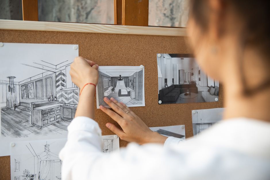
Kurera tillgångar: källor för bilder, ikoner, texturer och mockups
Bygg ett centraliserat tillgångsbibliotek med tydliga licensnoter och en enkel mappstruktur: bilder, ikoner, texturer och mockups. Etablera tre kärnkällor: gratis, betalda och community-delade samlingar, och bifoga en koncist policysregister till varje objekt.
Bilder: upptäck högkvalitativa alternativ från Unsplash, Pexels och Pixabay, plus godkända arkiv som Wikimedia Commons. Inom varje källa, notera tillåtna användningar, erforderliga attributioner och typiska upplösningar (minst 2000 px på den långa kanten). Behåll en kunskapsbas som sammanfattar licenser och användningsbegränsningar. Bilder kan komma från gratis, betalda eller blandade källor för att balansera variation och hastighet.
Ikoner: utforska The Noun Project, Flaticon, Icons8 och Feather för vektorset. Filtrera efter kategorier och nedladdningsformat (SVG eller PNG). Lägg till nyckelordstaggar och tydliga licensnoter; ett snabbt klick bekräftar licensvillkoren och attributionskraven.
Texturer: kurera från textures.com, ambientCG och Subtle Patterns. Föredra sömlösa texturer och 2048–4096 px-alternativ för att täcka Pinterest-pinnar. Testa texturer i block om tre stilar för att hålla mooden inom ditt designsystem. Överväg texturpaket som anpassas till färgpaletter och tavlaidéer för att förbättra konsistensen.
Mockups: samla från Placeit, Mockuuups Studio, Smartmockups och Figma community-mallar. Verifiera att mockups stödjer lagerbaserade exporter och enkla färgändringar; lagra källlänkar och licensvillkor. Om en mall inkluderar varumärkesfärger, notera hur man anpassar titlar och beskrivningar för en säljande eller icke-säljande presentation.
Outline och system: Outline ditt tillgångsschema: fält som källa, kategori, licens, upplösning, färger, nyckelord, titlar, noter. Systemet använder algoritmdriven taggning för att tilldela nyckelord och kategorier automatiskt, sedan ett mänskligt granskningssteg. Detta bygger ett upprepningsbart arbetsflöde som kan replikeras över tavlor inom teamet.
Forskning och utforskning: utforska olika leverantörer, jämför licensvillkor och registrera forskningsresultat. Använd denna data för att generera idéer och förslag för pinnar; anpassa texturer och ikoner till taveltitlar. Behåll tre till fem alternativa tillgångar för varje koncept för att testa prestanda.
Kvalitet och sparanden: sätt minimupplösning; kontrollera färgprofil; se till att tillgångar renderas korrekt på Pinterest-miniatyrer. Spara tillgångar med konsekvent namngivning och ett versionshanterat sparandesystem. Bygg en revisionsspårning så att lagkamrater kan återgå vid behov.
Ändring och underhåll: implementera en månatlig revision; ta bort föråldrade objekt; uppdatera licenser; upprätthåll en ändringslogg. Spåra ändringar i biblioteket, inte bara individuella tillgångar, för att hålla systemet pålitligt och skalbart.
Tips och bästa praxis: undvik en säljande ton i pin-tillgångars beskrivningar; håll bildtexter faktabaserade och anpassade till idéer och titlar. Använd ett tre-stegsarbetsflöde: upptäck, utforska och förfina. Använd olika källor, var medveten om policys och håll kunskapsbasen uppdaterad. Dessa steg hjälper dig att upptäcka högkvalitativa texturer, ikoner och bilder som stödjer övertygande pinnar utan att kännas påträngande.
Ready to leverage AI for your business?
Book a free strategy call — no strings attached.


