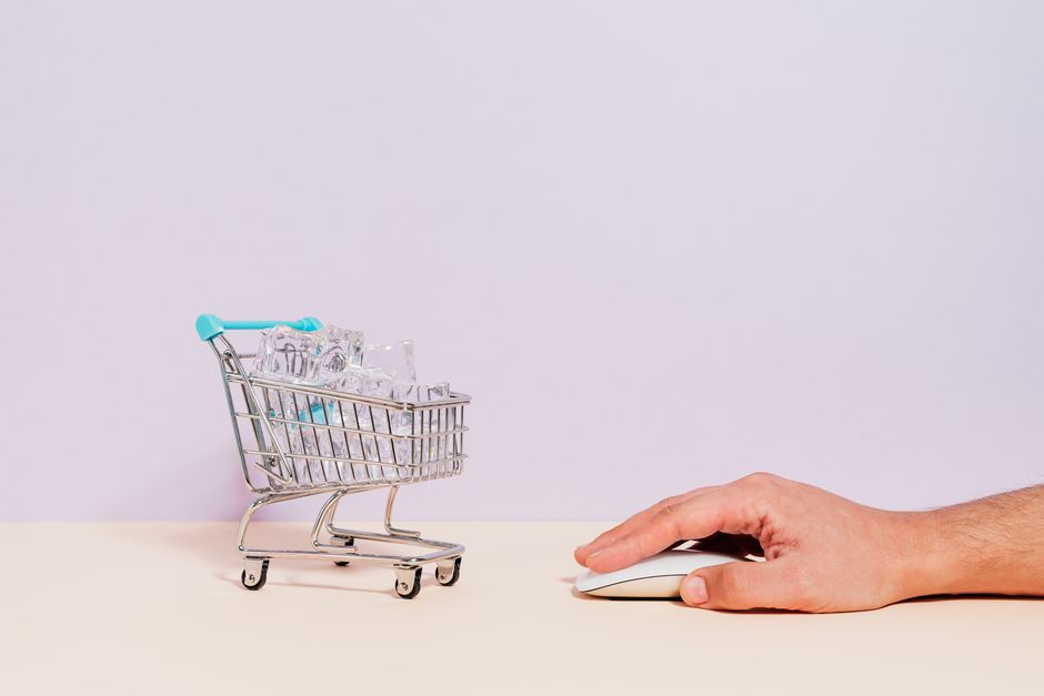
27 种科学证明的提升电商转化率的方法

从快速、无摩擦的结账开始,使用一键登录并将步骤最小化至三个。 这种具体的改变通常可以将完成率提高高达 25%,将浏览者转化为潜在客户。结账路径的流畅性可以减少放弃率,当路径简短且清晰时,他们会表现出更高的意图。
投资于数据驱动的设计:高分辨率产品图像、简洁的 bullet 规格,以及透明的总成本。这种清晰度可以减少犹豫,在受控测试中增加加购和后续购买 12–18%。
展示社会证明和真实结果在产品页面:评论、评分,以及功能揭示结果。保持品牌在视觉上的连贯性以强化信任,通常会带来明显的转化提升。
在关键时刻使用轻推:购物车提醒、退出意图提示和限时优惠。将这些甜蜜轻推与清晰的价值主张配对,以避免疲劳,并测试阈值以最大化提升而不引发 раздражение。
通过联盟和共同品牌活动扩展影响力。为合作伙伴提供清晰的推销和流畅的价值主张有助于驱动合格的潜在客户并扩展分销。
分析跨设备和页面的漏斗数据,然后实施迭代测试以改进最具影响力的区域。跨细分测试,表明微小改进会累积成有意义的收益,并跟踪整体指标,如转化率和每访客收入。
在产品页面包含清晰的功能集:实时库存变化、价格轻推、ETA 可见性和透明的退货条款。这种品牌对齐减少认知负荷并增加购买信心。
在 Parker 案例研究中,简化的产品卡和精简的结账带来了移动转化的重大提升。这展示了如何连贯的设计和品牌在跨设备中回报。
除非您优化速度和可访问性,否则增长会停滞。改进移动点击目标、图像权重和结账可读性,以保持势头并减少离开。
精简结账以在不丢失购物者的情况下转化更多
为您的 Shopify 构建的商店启用跨设备的 一键结账,以减少摩擦并增加完成的订单,在不强制购物者创建账户的情况下提供更高的转化。
将结账字段限制为基本数据(电子邮件、运送、支付),并从保存的配置文件自动填充。这种平衡加速了过程并降低了放弃率,测试显示当表单长度减少时,完成的结账改善 20–40%。
及早显示清晰的价格明细,包括运送选项和税费显示在前面。这解决了犹豫时刻并保持信心高涨,同时向完成推进。在结账上使用进度指示器显示购物者距离完成还有多远。
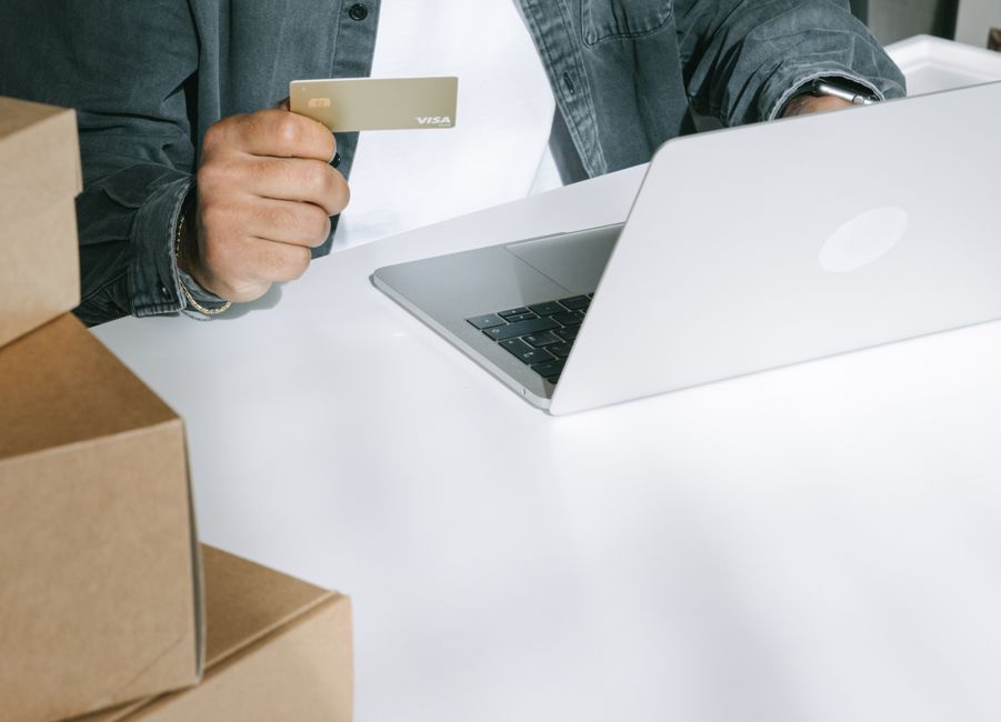
提供多种支付选项,包括 Google Pay 和 Apple Pay、PayPal 和本地方法。确保启用并优化 Shopify Payments 以适应移动设备。这种多样性增加了购物者首次尝试完成支付的可能性,从而提升转化。
通过显示保存的偏好和最近查看的项目来个性化结账体验,定制运送选项和促销代码。使推荐对时尚购物者引人入胜且相关,这样个性化帮助他们成功并感到被理解。
显示信任信号:清晰的安全徽章、透明的退货条款和简明的隐私政策。显示的总计、地址确认和简单的退货承诺安抚购物者。这解决了结账期间的常见担忧,支持忠诚的、保留的客户。
包含社会证明和忠诚轻推:在结账时显示最近购买、顶级评论或忠诚积分余额。这种独特的方法支持在结账中间时刻保留和忠诚客户。
运行科学设计的测试:A/B 测试结账布局、按钮文案和字段数量。使用 Google Analytics 和 Shopify 报告跟踪完成的订单、购物车放弃和平均订单价值,并与您的团队一起迭代。
时尚品牌的实施说明:优化地址验证、自动填充、移动友好设计和清晰的价格信号;提及快速结账的好处,用于减少放弃购物车和更高的忠诚度。
映射您的当前结账流程以识别摩擦点
在一周内开始映射您的当前结账流程,使用简单图表记录从购物车到订单确认的每个屏幕、字段和决策点。这个基线让您计算购物漏斗中每个栏的放弃百分比,并针对最高摩擦步骤提高销售并驱动时尚物品的更高转化。
使用分析量化购物者放弃的位置:购物车阶段、地址提示、运送成本和支付错误。结合热图、会话回放和错误说明以获得更深入的洞察,按周显示跨设备和到达来源,以优先考虑改善桌面和移动转化的变化。折上提示影响早期决策,并在用户承诺前揭示摩擦点。
减少摩擦的样本变化包括缩短表单、启用访客结账和自动填充地址字段。通过模拟每个步骤 10–15% 的放弃减少来计算提升,并堆叠效果以估计每个会话的更多收入。这些选项对具有高购物意图的时尚品牌表现良好。
使外观与您的品牌一致,并使用简洁的错误说明和内联验证。将这些与材料提示配对–清晰的排版、可访问的对比度和明显的按钮状态。使用进度条显示购物者距离完成的距离,减少焦虑并几乎消除结账期间的来回。这些更新对用户有帮助,并减少他们在过程中前进时的困惑。
优先考虑损失最大的步骤的更改。这些包括运送选项、地址自动完成和支付方式多样性。在结账整合奖励程序以加速获得重复购买并改善客户体验。寻找新时尚系列到达的机会以保持目录感觉新鲜,并识别下一个冲刺中要处理的另一个摩擦点。
与产品和营销协调开发下一个冲刺的样本变化。使用简单的说明和条形图向您的社区展示影响,建立信任并收集反馈以加速学习和部署。
跟踪指标:购物车到结账转化、平均订单价值和支付时间。要计算每个变化的提升,按影响排名改进并为下一个冲刺设置每周目标。目标是在保留目录中新到达的强大外观的同时减少购物流程中的摩擦。
这些步骤将摩擦洞察转化为具体行动,为时尚及其他领域的客户提供更高的销售和更好的购物体验。
最小化表单字段:仅询问所需信息
将结账表单限制为您完成购买所需的最低限度。只询问电子邮件用于收据、姓名用于个性化,以及主要流程中授权订单所需的支付细节;将所有其他数据收集移至可选步骤或购买后流程。使用自动填充和地址查找技术保持字段精简,同时保持准确性。
测试显示将字段从六个或更多输入修剪到三个或四个可以使结账完成率提高两位数。如果购物者通过搜索到达,短表单保持势头。较少的字段减少摩擦并保持客户通过整个发现流程的参与。如果您显示短表单,您仍然可以通过显示实时验证和进度指示创建强大的价值展示,这鼓励完成而不是放弃。这种修剪可能以明显的幅度提升转化。
采用渐进披露:首先仅呈现所需字段;让客户选择提供额外细节。智能设计的默认值和内联验证加速输入并减少错误,因此表单本身感觉有帮助而不是繁琐。合作伙伴集成–如单点登录或社交登录–可以节省秒数并支持更顺畅的转化。
成功订单后,使用奖励程序鼓励未来购买而不重新询问数据。交叉销售和变体推荐可以在结账后显示,而不是在初始表单中。使用愿望清单捕获意图细节并显示相关优惠。这保持客户体验的引人入胜。购买后显示的奖励和 upsell 优惠强化与客户的参与。
运行小变体以确认影响:测试 3 字段表单与 5 字段版本,跟踪结账率、平均订单价值和购买后参与。目的是保持动机清晰并尽可能缩短完成时间。当给定细分不需要字段时,默认隐藏它并比较受控结果。这种方法帮助合作伙伴技术栈在跨设备和渠道提供一致的收益。
提供访客结账并带有简单账户选项
默认启用访客结账,并在结账结束时呈现简单账户路径。清晰的“作为访客结账”按钮与最小注册选项配对减少摩擦,提升动机并改善首次访问的表现。对于幸运的购物者子集,这种精简路径也增加信任和返回的可能性。
突出的访客选项:在结账屏幕上将明亮的“作为访客结账”按钮放置在“创建账户”和“登录”旁边。使用简短、直接的文案和更大的点击区域;当物品可见且购物车粘性时,这增加完成率。按钮应可访问并跨设备一致。
轻量级账户选项:仅要求电子邮件或提供社交登录;在访客路径中移除密码提示,以便购物者在访问时 2–4 分钟内完成。这也有助于您以同意方式收集潜在客户用于跟进。
使用粘性购物车保留物品:切换模式时保持物品稳定;允许编辑而不丢失进度。
使用热图和漏斗分析:跟踪点击、表单交互和放弃;收集洞察,拉取针对性改进,并在广泛 rollout 前测试快速 hack。
坚实的文案写作和信任提示:以短行呈现好处–速度、隐私、控制–使用按钮附近的简洁消息。只在它清楚地为购物者之旅添加价值时,为注册呈现高级感觉。
对话和结账后势头:提供简短测验以定制优惠和偏好,增强与购物者的对话并支持针对性跟进。
技术和性能保障:确保令牌化支付,允许在没有完整账户的情况下保存支付方式,并保持结账时间紧凑。使用转化率、平均订单价值 (AOV) 和重复访问指标衡量性能。
跟进激励和测量:测试高级忠诚福利以鼓励稍后账户创建;跟踪注册和重复购买的提升以证明 ROI。
启用自动填充和地址建议以加速输入
在所有结账字段启用自动填充和地址建议,以将输入时间减少高达 40% 并增加完成的支付。
- 3 层自动填充实施
- Layer 1 – 客户端自动完成:应用精确的自动完成属性(例如,name、email、address、city、state、postal-code)以确保可靠地重用用户配置文件中的现有数据。
- Layer 2 – 地址建议:集成具有全球覆盖的可靠工具,呈现最近和准确的匹配;显示 3–5 个选项,突出顶级匹配,并预填充 address_line1、city、state 和 postal code 以创建难忘、无缝的输入。
- Layer 3 – 服务器端验证和回退:验证邮政编码和国家,标记不匹配,并提供快速确认步骤而不是阻塞结账;这种科学的三层方法最小化意外错误并保持流程顺畅。
- 移动优先 UX 和可访问性
- 启用适当的输入模式和键盘布局(例如,postal codes、email 和 address 字段的 inputmode);在地址上禁用不必要的自动更正以避免偏离目标的编辑,同时保持自动填充活跃。
- 使用特殊、轻量级的地址小部件适应窄屏幕;以紧凑下拉菜单呈现顶级匹配以保持注意力集中并在字段搜索过程中减少认知负荷。
- 数据治理、可靠性和隐私
- 仅在明确同意下存储保存的地址;提供易于删除选项和透明控制以管理现有数据;这增加信任并使返回客户的体验更可靠。
- 关键合规说明:最小化数据保留,加密令牌,并将保存数据与支付细节隔离以保护用户隐私同时保留速度。
- 跟踪、指标和持续改进
- 跟踪每个字段的输入时间、表单完成率和整体结账转化;量化归因于自动填充的收入增加,并在最近活动中运行 A/B 测试以识别峰值影响窗口。
- 监控支付结果和地址验证错误;使用最近测试的搜索洞察发现摩擦点并与产品和技术团队快速迭代。
- 联盟、忠诚度和现有客户
- 为联盟提供一致、可靠的自动填充体验以提升推荐转化;在共享会话中同步保存的地址,并在用户选择保存地址时奖励忠诚积分。
- 将此视为补充您现有漏斗的工具,帮助联盟在高峰季节触达更广泛的受众,而不在结账添加摩擦。
- 跟进和发现
- 发送轻量级跟进确认保存的地址并突出 一键结账选项;使用此接触点收集反馈并推动进一步摩擦点的发现以供未来更新。
显示清晰的安全提示和预先成本摘要
在购物车顶部放置突出的、品牌化的安全提示和简洁的预先成本摘要。使用清晰的挂锁道具和简短行如“SSL 加密 • 30 天退货 • 隐私盾牌”,使用与您的创意对比的颜色。这对旨在减少会话摩擦并在结账提升信任的商店不是可选的。
使提示跨屏幕和设备一致,在桌面和移动上实时显示,并在会话的最初时刻显示它们。标题中的小、伙伴型徽章和 CTA 附近的快速安全说明可以影响行为而不抢夺焦点。使用季节性颜色匹配的印章并保持消息简单,以便用户在一秒内扫描。
保持预先成本故事紧凑:在用户承诺前,以单行总结如运送、税费和任何费用的行项目。显示今天的订单现实总计,如果他们想要,提供完整明细的链接。这种透明度减少购买后摩擦并在决策点降低放弃。
实施取决于几个关键赌注。创建一小套经过证明、可重用的创意,将安全提示与您的品牌颜色和文案配对。在标题和表单字段附近显示这些提示,然后测试变体以查看哪些道具和放置表现最佳。跟踪提示变化如何与会话和转化相关联,并使用归因按来源、季节和页面路径隔离影响。
计算的胜利来自可见提示和价格清晰的紧凑组合。对于运行多个本地化的商店,呈现本地化的成本估算和货币格式以保持语气和感觉的一致性。当提示显示时,客户报告更高的感知安全,并在高流量小时或销售事件期间更可能完成结账。
| 组件 | 预先成本 | recurring | 实施时间 | 说明 |
|---|---|---|---|---|
| SSL/TLS 证书 | 0–$100/年 | 年度 | 1–3 小时 | 选择 Let’s Encrypt 以零成本或选择付费选项以获得保修;显示安全徽章 |
| 隐私政策 & 条款 | 0–$40 一次性 | 按需持续更新 | 1–2 小时 | 政策生成器或法律审查;保持语言简单和可访问 |
| 安全印章/信任徽章 | 0–$25 一次性 | 无或低 | 0.5–1 小时 | 使用验证加密和数据保护的印章 |
| PCI 扫描 / 漏洞检查 | 0–$30 | $0–$50/月 | 1–2 小时 | 自动化检查;与商店平台集成 |
| 安全提示的弹出窗口 | 0–$15 一次性 | $0–$10/月 | 0.5–2 小时 | 非侵入性,专注于结账的信任信号 |
| 购买后确认(安全文案) | 0–$20 一次性 | 低 | 1 小时 | 清晰收据、隐私通知和加密提醒 |
| 颜色 & 布局调整(结账页面) | 0–$50 一次性 | 无 | 1–2 小时 | 将提示与品牌视觉对齐以提升识别 |
📚 更多关于电商 & 商业
Ready to leverage AI for your business?
Book a free strategy call — no strings attached.


