BLOG
Insights & Articles
Expert knowledge on AI, digital marketing, SEO, legal consulting, and business growth.(1182 articles)

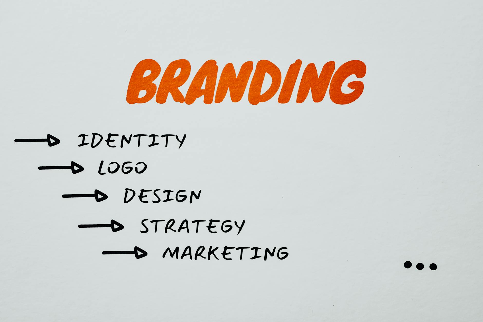
Digital Marketing
How to Keep Your Users Happy - A Complete Guide to Customer Retention
Dec 16, 202510 min

Digital Marketing
Mo Reza Ali - Biography, Career Highlights, and Notable Contributions
Dec 16, 20256 min
Digital Marketing
Content Marketing - 17 Actionable Tips to Boost Your Traffic
Dec 16, 202511 min

Digital Marketing
The Future of Green Marketing - Top Trends to Watch in 2026
Dec 16, 20259 min
Digital Marketing
Email Copywriting - Examples & Templates to Boost Conversions
Dec 16, 202511 min

Digital Marketing
26 Amazing Product Page Design Examples for eCommerce - Expert Advice
Dec 16, 202512 min

Digital Marketing
How to Promote Your Blog in 2026 - 21 Proven Traffic Strategies
Dec 16, 202514 min

Digital Marketing
Product Marketing Manager - Roles, Skills, and Career Path for 2026
Dec 16, 20258 min

Digital Marketing
7 Proven Customer Retention Strategies to Learn From in 2026
Dec 16, 202512 min

Digital Marketing
17 Best Travel Affiliate Programs to Inspire Your 2026 Travel
Dec 16, 202512 min
Digital Marketing
What Is an Epic in Agile? Definition, Examples and Best Practices
Dec 16, 20259 min

Digital Marketing
15 Types of Social Media Content to Try in 2026
Dec 16, 202511 min