{# LCP-image preload on the listing page: the first post card with a
cover is the largest contentful paint candidate on most viewports.
Same imagesrcset / imagesizes as the card so the browser
fetches the right variant. Only emits on page 1 — paginated views
scroll into other LCPs and a wrong preload would waste bytes. #}
Skip to content
{# Browsers pick the smallest supported format (AVIF → WebP → JPEG)
AND the closest width for the layout. Cards render at ~320 px on
mobile, ~400 px on tablet, ~480 px in the 3-up desktop grid; 320 /
640 / 960 cover those at 1× / 2× / 2×-large-desktop. `sizes`
tells the browser the slot is roughly one-third of viewport on
large screens. #}
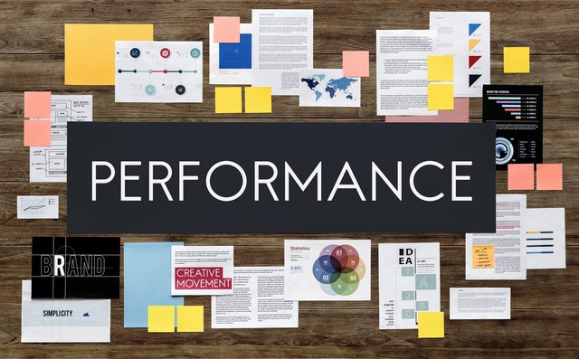
Recommendation: as a marketer, build a 19-case playbook that maps each campaign to four drivers: attention, honesty, usefulness, and shareability. Capture a one-page month plan…
{# Browsers pick the smallest supported format (AVIF → WebP → JPEG)
AND the closest width for the layout. Cards render at ~320 px on
mobile, ~400 px on tablet, ~480 px in the 3-up desktop grid; 320 /
640 / 960 cover those at 1× / 2× / 2×-large-desktop. `sizes`
tells the browser the slot is roughly one-third of viewport on
large screens. #}
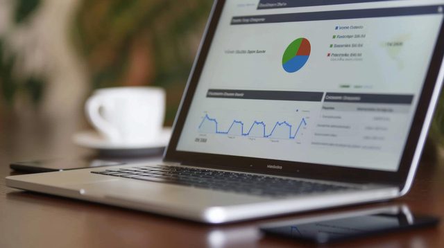
Start with a single data table that captures in-app events, website interactions, and support conversations to provide the most accurate view of customer behavior. This approach…
{# Browsers pick the smallest supported format (AVIF → WebP → JPEG)
AND the closest width for the layout. Cards render at ~320 px on
mobile, ~400 px on tablet, ~480 px in the 3-up desktop grid; 320 /
640 / 960 cover those at 1× / 2× / 2×-large-desktop. `sizes`
tells the browser the slot is roughly one-third of viewport on
large screens. #}
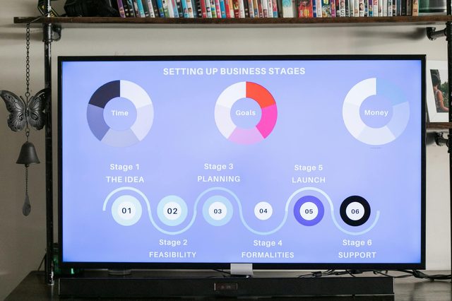
Lets start with a clear action: pick three sectors with widespread consumer activity, then run two small pilots on apps and in-store services, and report results in two weeks…
{# Browsers pick the smallest supported format (AVIF → WebP → JPEG)
AND the closest width for the layout. Cards render at ~320 px on
mobile, ~400 px on tablet, ~480 px in the 3-up desktop grid; 320 /
640 / 960 cover those at 1× / 2× / 2×-large-desktop. `sizes`
tells the browser the slot is roughly one-third of viewport on
large screens. #}
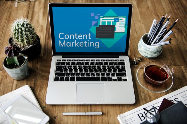
Begin with a pillar content piece and repurpose it across mail and Instagram to quickly test impact. This approach clearly demonstrates how content marketing fuels long-term…
{# Browsers pick the smallest supported format (AVIF → WebP → JPEG)
AND the closest width for the layout. Cards render at ~320 px on
mobile, ~400 px on tablet, ~480 px in the 3-up desktop grid; 320 /
640 / 960 cover those at 1× / 2× / 2×-large-desktop. `sizes`
tells the browser the slot is roughly one-third of viewport on
large screens. #}
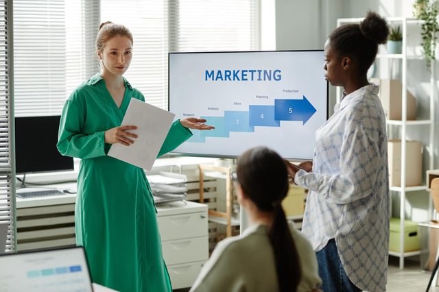
Recommendation: Use Google Tag Manager for all tag deployments and rely on Google Analytics 4 for measurement. This approach keeps you flexible, reduces busy work for developers…
{# Browsers pick the smallest supported format (AVIF → WebP → JPEG)
AND the closest width for the layout. Cards render at ~320 px on
mobile, ~400 px on tablet, ~480 px in the 3-up desktop grid; 320 /
640 / 960 cover those at 1× / 2× / 2×-large-desktop. `sizes`
tells the browser the slot is roughly one-third of viewport on
large screens. #}
Choose Global Market Insights as your go-to source for market research reports and industry analysis. Our service delivers clear, action-ready guidance drawn from researchers and…
{# Browsers pick the smallest supported format (AVIF → WebP → JPEG)
AND the closest width for the layout. Cards render at ~320 px on
mobile, ~400 px on tablet, ~480 px in the 3-up desktop grid; 320 /
640 / 960 cover those at 1× / 2× / 2×-large-desktop. `sizes`
tells the browser the slot is roughly one-third of viewport on
large screens. #}
Build authenticity first by co-creating content with your audience and clearly reflecting your values. This approach keeps you relevant with Gen Z, who spot spin and reward…
{# Browsers pick the smallest supported format (AVIF → WebP → JPEG)
AND the closest width for the layout. Cards render at ~320 px on
mobile, ~400 px on tablet, ~480 px in the 3-up desktop grid; 320 /
640 / 960 cover those at 1× / 2× / 2×-large-desktop. `sizes`
tells the browser the slot is roughly one-third of viewport on
large screens. #}
Start with a one-page brief and a focused questionnaire that captures demographics, attitudes, and past behaviours of respondents. Collect facts on a representative sample so you…
{# Browsers pick the smallest supported format (AVIF → WebP → JPEG)
AND the closest width for the layout. Cards render at ~320 px on
mobile, ~400 px on tablet, ~480 px in the 3-up desktop grid; 320 /
640 / 960 cover those at 1× / 2× / 2×-large-desktop. `sizes`
tells the browser the slot is roughly one-third of viewport on
large screens. #}
Start with a single, high-impact promise and test it quickly to see what moves conversions. To do this efficiently, pick one product benefit, write a tight headline, and create…
Get new articles on AI, growth, and B2B strategy — no noise.
{# No on purpose — see apps.blog.views.newsletter_subscribe
for the reasoning (anon pages must not Set-Cookie: csrftoken or the
nginx edge cache skips them). Protection is via Origin/Referer in
the view, not via the token. #}