{# LCP-image preload on the listing page: the first post card with a
cover is the largest contentful paint candidate on most viewports.
Same imagesrcset / imagesizes as the card so the browser
fetches the right variant. Only emits on page 1 — paginated views
scroll into other LCPs and a wrong preload would waste bytes. #}
Skip to content
{# Browsers pick the smallest supported format (AVIF → WebP → JPEG)
AND the closest width for the layout. Cards render at ~320 px on
mobile, ~400 px on tablet, ~480 px in the 3-up desktop grid; 320 /
640 / 960 cover those at 1× / 2× / 2×-large-desktop. `sizes`
tells the browser the slot is roughly one-third of viewport on
large screens. #}
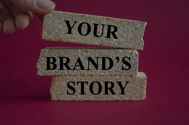
Define a 15-second brand promise your audience can recall. Write it in simple language for the consumer and validate it with 12 managers and 6 experts to sharpen tone and…
{# Browsers pick the smallest supported format (AVIF → WebP → JPEG)
AND the closest width for the layout. Cards render at ~320 px on
mobile, ~400 px on tablet, ~480 px in the 3-up desktop grid; 320 /
640 / 960 cover those at 1× / 2× / 2×-large-desktop. `sizes`
tells the browser the slot is roughly one-third of viewport on
large screens. #}
Start with a two-tier metric system: implement tracking of micro-conversions alongside macro-conversions to steer decisions toward growth. This structure lets you see how…
{# Browsers pick the smallest supported format (AVIF → WebP → JPEG)
AND the closest width for the layout. Cards render at ~320 px on
mobile, ~400 px on tablet, ~480 px in the 3-up desktop grid; 320 /
640 / 960 cover those at 1× / 2× / 2×-large-desktop. `sizes`
tells the browser the slot is roughly one-third of viewport on
large screens. #}
Recommendation: Begin with a concrete approach–use blogs for quick, actionable updates and articles for in-depth analysis. This choice informs readers and helps you present the…
{# Browsers pick the smallest supported format (AVIF → WebP → JPEG)
AND the closest width for the layout. Cards render at ~320 px on
mobile, ~400 px on tablet, ~480 px in the 3-up desktop grid; 320 /
640 / 960 cover those at 1× / 2× / 2×-large-desktop. `sizes`
tells the browser the slot is roughly one-third of viewport on
large screens. #}
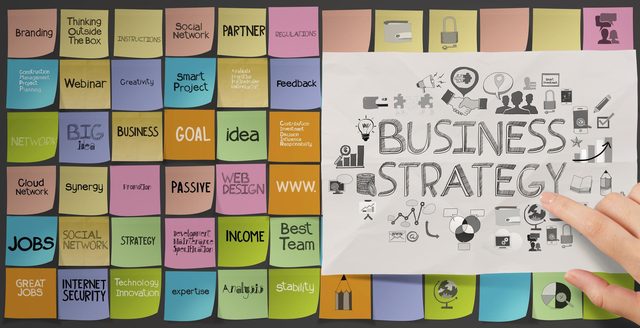
Align PR and content marketing around a single, measurable core message to maximize reach across channels. This move builds branding consistency and gives your product teams a…
{# Browsers pick the smallest supported format (AVIF → WebP → JPEG)
AND the closest width for the layout. Cards render at ~320 px on
mobile, ~400 px on tablet, ~480 px in the 3-up desktop grid; 320 /
640 / 960 cover those at 1× / 2× / 2×-large-desktop. `sizes`
tells the browser the slot is roughly one-third of viewport on
large screens. #}
Start by loading a clean dataset and building a matrix where time-based columns show trends and categories describe groups. Apply a color scale to the values so the highest…
{# Browsers pick the smallest supported format (AVIF → WebP → JPEG)
AND the closest width for the layout. Cards render at ~320 px on
mobile, ~400 px on tablet, ~480 px in the 3-up desktop grid; 320 /
640 / 960 cover those at 1× / 2× / 2×-large-desktop. `sizes`
tells the browser the slot is roughly one-third of viewport on
large screens. #}
Identifying your primary customer segment and their top problem, then align campaigns around a single, compelling message to drive profitability. Use a go-to-market template that…
{# Browsers pick the smallest supported format (AVIF → WebP → JPEG)
AND the closest width for the layout. Cards render at ~320 px on
mobile, ~400 px on tablet, ~480 px in the 3-up desktop grid; 320 /
640 / 960 cover those at 1× / 2× / 2×-large-desktop. `sizes`
tells the browser the slot is roughly one-third of viewport on
large screens. #}
Recommendation: Start with a 60/40 media invest split, allocating 60% to brand-building formats and 40% to performance formats for the first 12 weeks. This approach focuses on…
{# Browsers pick the smallest supported format (AVIF → WebP → JPEG)
AND the closest width for the layout. Cards render at ~320 px on
mobile, ~400 px on tablet, ~480 px in the 3-up desktop grid; 320 /
640 / 960 cover those at 1× / 2× / 2×-large-desktop. `sizes`
tells the browser the slot is roughly one-third of viewport on
large screens. #}
Begin with a tight portfolio: three concise samples, a clear niche, and a brief about your process. The page should convey the emotion your writing aims to spark and include a…
{# Browsers pick the smallest supported format (AVIF → WebP → JPEG)
AND the closest width for the layout. Cards render at ~320 px on
mobile, ~400 px on tablet, ~480 px in the 3-up desktop grid; 320 /
640 / 960 cover those at 1× / 2× / 2×-large-desktop. `sizes`
tells the browser the slot is roughly one-third of viewport on
large screens. #}
Given that customers interact with brands at multiple points, integrate marketing channels to deliver a seamless experience. Map the points across social, email, storefronts, and…
Get new articles on AI, growth, and B2B strategy — no noise.
{# No on purpose — see apps.blog.views.newsletter_subscribe
for the reasoning (anon pages must not Set-Cookie: csrftoken or the
nginx edge cache skips them). Protection is via Origin/Referer in
the view, not via the token. #}