{# LCP-image preload on the listing page: the first post card with a cover is the largest contentful paint candidate on most viewports. Same imagesrcset / imagesizes as the card so the browser fetches the right variant. Only emits on page 1 — paginated views scroll into other LCPs and a wrong preload would waste bytes. #} Skip to content

cat /var/log/keygroup.log

Notes on AI, growth, and product.

Field reports from the KeyGroup team — what we ship, how we measure it, and the patterns that survive contact with production.

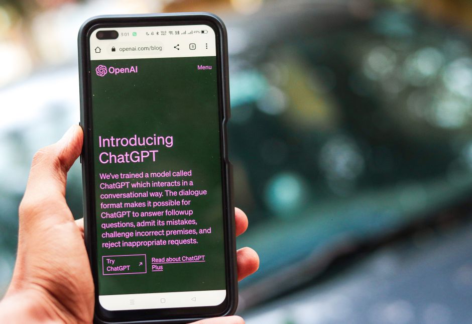
{# Browsers pick the smallest supported format (AVIF → WebP → JPEG) AND the closest width for the layout. Cards render at ~320 px on mobile, ~400 px on tablet, ~480 px in the 3-up desktop grid; 320 / 640 / 960 cover those at 1× / 2× / 2×-large-desktop. `sizes` tells the browser the slot is roughly one-third of viewport on large screens. #} How Generative AI Should Fit Into Your Marketing Strategy

How Generative AI Should Fit Into Your Marketing Strategy

Integrate generative AI into your marketing workflow now to automate writing and messaging, while keeping outputs timely and reliability. For английский audiences, this approach…

~/ai-engineering 13 min
{# Browsers pick the smallest supported format (AVIF → WebP → JPEG) AND the closest width for the layout. Cards render at ~320 px on mobile, ~400 px on tablet, ~480 px in the 3-up desktop grid; 320 / 640 / 960 cover those at 1× / 2× / 2×-large-desktop. `sizes` tells the browser the slot is roughly one-third of viewport on large screens. #} Product Marketing vs Marketing - Key Differences and Similarities

Product Marketing vs Marketing - Key Differences and Similarities

Recommendation: Build a cross-functional group and formalize roles so the two disciplines share a single, clear brief for every product release. Use standardized templates for…

~/digital-marketing 11 min
{# Browsers pick the smallest supported format (AVIF → WebP → JPEG) AND the closest width for the layout. Cards render at ~320 px on mobile, ~400 px on tablet, ~480 px in the 3-up desktop grid; 320 / 640 / 960 cover those at 1× / 2× / 2×-large-desktop. `sizes` tells the browser the slot is roughly one-third of viewport on large screens. #} Netflix Marketing Strategy - Growth, Personalization, and Global Expansion

Netflix Marketing Strategy - Growth, Personalization, and Global Expansion

Start with a three-month, data-driven test of personalized recommendations across phone and desktop, paired with targeted promotions to boost access and trial in america, while…

~/digital-marketing 14 min
{# Browsers pick the smallest supported format (AVIF → WebP → JPEG) AND the closest width for the layout. Cards render at ~320 px on mobile, ~400 px on tablet, ~480 px in the 3-up desktop grid; 320 / 640 / 960 cover those at 1× / 2× / 2×-large-desktop. `sizes` tells the browser the slot is roughly one-third of viewport on large screens. #} Marketing vs Advertising - Key Differences Explained for Your Marketing Strategy

Marketing vs Advertising - Key Differences Explained for Your Marketing Strategy

First, define your core objective and implement a plan that treats marketing and advertising as distinct, complementary tracks. Marketing builds the long-term brand engine…

~/digital-marketing 11 min
{# Browsers pick the smallest supported format (AVIF → WebP → JPEG) AND the closest width for the layout. Cards render at ~320 px on mobile, ~400 px on tablet, ~480 px in the 3-up desktop grid; 320 / 640 / 960 cover those at 1× / 2× / 2×-large-desktop. `sizes` tells the browser the slot is roughly one-third of viewport on large screens. #} 7 Great Email Marketing Campaign Examples for 2026 - Campaigns, Case Studies & Best Practices

7 Great Email Marketing Campaign Examples for 2026 - Campaigns, Case Studies & Best Practices

Begin with a behavior-driven welcome series that engages new subscribers within 24 hours and uses a three-email sequence to educate and convert. Build workflows that adapt…

~/digital-marketing 16 min
{# Browsers pick the smallest supported format (AVIF → WebP → JPEG) AND the closest width for the layout. Cards render at ~320 px on mobile, ~400 px on tablet, ~480 px in the 3-up desktop grid; 320 / 640 / 960 cover those at 1× / 2× / 2×-large-desktop. `sizes` tells the browser the slot is roughly one-third of viewport on large screens. #} How to Become a Content Writer - A Complete Guide to Everything You Need to Know

How to Become a Content Writer - A Complete Guide to Everything You Need to Know

Begin with a concrete 90-day plan: publish one article per week, build a series of four pieces on a focused topic, and review results at the end of each month. Set a practical…

~/digital-marketing 19 min
{# Browsers pick the smallest supported format (AVIF → WebP → JPEG) AND the closest width for the layout. Cards render at ~320 px on mobile, ~400 px on tablet, ~480 px in the 3-up desktop grid; 320 / 640 / 960 cover those at 1× / 2× / 2×-large-desktop. `sizes` tells the browser the slot is roughly one-third of viewport on large screens. #} 3 Critical Product Launch Phases - A Step-by-Step Guide to a Successful Launch

3 Critical Product Launch Phases - A Step-by-Step Guide to a Successful Launch

Begin with a concrete, phase-aligned plan and cross-functional collaboration from the start. Align goals, owners, and timelines to reduce friction and ensure immediate progress…

~/digital-marketing 13 min
{# Browsers pick the smallest supported format (AVIF → WebP → JPEG) AND the closest width for the layout. Cards render at ~320 px on mobile, ~400 px on tablet, ~480 px in the 3-up desktop grid; 320 / 640 / 960 cover those at 1× / 2× / 2×-large-desktop. `sizes` tells the browser the slot is roughly one-third of viewport on large screens. #} Content Marketing Trends - What's In and What's Out This Year (2026)

Content Marketing Trends - What's In and What's Out This Year (2026)

") Recommendation: Prioritize optimizing short-form video and practical explainers across your top channels within hours of publishing to boost trust and engagement. Content in…

~/digital-marketing 16 min
{# Browsers pick the smallest supported format (AVIF → WebP → JPEG) AND the closest width for the layout. Cards render at ~320 px on mobile, ~400 px on tablet, ~480 px in the 3-up desktop grid; 320 / 640 / 960 cover those at 1× / 2× / 2×-large-desktop. `sizes` tells the browser the slot is roughly one-third of viewport on large screens. #} How to Perform an SEO Audit - A Step-by-Step Checklist

How to Perform an SEO Audit - A Step-by-Step Checklist

Run a quick, easy audit of your top 5 pages to lock in the basics, validate indexability, and spot immediate risk. A concrete start like this creates a reliable baseline and…

~/seo 18 min

subscribe

Stay in the loop

Get new articles on AI, growth, and B2B strategy — no noise.

{# No on purpose — see apps.blog.views.newsletter_subscribe for the reasoning (anon pages must not Set-Cookie: csrftoken or the nginx edge cache skips them). Protection is via Origin/Referer in the view, not via the token. #}